Do you think your company’s website is boring? Does it fail to generate as much traffic as expected? These are the signs of boring websites and they should be redesigned to conform to the most recent web standards. Always remember, your website is and must be the digital Mecca for your business.
That is why it is critical to invest in design or redesign when you find that your boring websites are not functioning properly. These five indicators are a clear sign that it is time for a shift.

Warning Signs To Look For Boring Websites
Users will not remain or return to boring websites if they are bored. These are the two most significant variables in boosting sales, therefore keep your websites helpful, collective, and engaging for people to visit and remain longer.
❗Higher Bounce Rate
The number of visitors who come to your site or see and navigate different pages is measured by bounce rates. If a visitor leaves your website after reading only one or two pages, which results in sales and client loss, you should never overlook this situation. Moreover, if your website visitors do not spend enough time on it, it is most likely that your content is tedious. To lower bounce rates, update valuable and helpful material with lovely websites. This is the first red flag for boring websites.
⚠️ Low Average Time On Pages
Calculate the average time visitors spend on your website to determine whether it is useful or uninteresting. If your visitors are spending less time on your website, you should think about it before you lose them. Use Google Analytics to determine the average amount of time visitors spend on your website. The shorter time consumers spend on boring websites, the less likely they are to be impressed.
📃 No New Blog Post In Ages
A blog is an excellent approach to not only attract readers but also to optimize your site so that potential clients can discover you as simply as possible. You can simply increase your trust by writing scannable, easy-to-read blogs. If you don’t have a blog section or your most recent article was in 2016, it’s time to start one. Boring websites can be transformed into something special by proper blog articles.

🛑Poor Color Choice & Font Size
If the colors on your website are excessively bright, they may blind your visitors, causing them to click away. On the other side, if your website lacks color, the user may eventually assume your branding is dull without even realizing it.
The web is largely made up of sans-serif fonts. They’re simpler to read on screens and have a more contemporary appearance than serif fonts. As a result, when a website uses a serif font, it might be off-putting and lead to the consumer assuming your organization is out of touch with your intended audience. This is good practice to get rid of dull and boring websites.
⛔Not A Mobile-Friendly Website

We can’t stress this enough: most website visitors today use their cell phones. If your website is inefficient on tiny displays, you’ve already lost. This is why many designers choose to create a mobile-friendly design first and then optimize it for larger displays later.
To solve this issue, you can easily turn your WordPress website into a mobile app to ensure responsiveness. Or, you can implement the best practices for responsive web design as well.
Easy Ways To Make Any Boring Website More Interesting
Sure, your website contains all of the information you wish to communicate with your customers. But it just seems so…boring. It’s not interesting or lively. Perhaps it appears outdated, uninteresting, or similar to that English essay you did in high school, complete with eight pages of padding out text.
Here are four methods to improve the design and functionality of a website, which can keep potential clients interested and help them discover more about you.
⚡Have A Clear Call To Action
When we urge visitors to DO something, a website becomes considerably more engaging. When visitors arrive at your home page, there should be a clear button to click. It should direct them to your primary offering, whether it’s a product to purchase, an appointment to schedule, or a newsletter to subscribe to.
The most crucial aspect, however, is that we are providing visitors with the opportunity to take action. Buttons like these, all directed to the same action, should be used often on all pages.
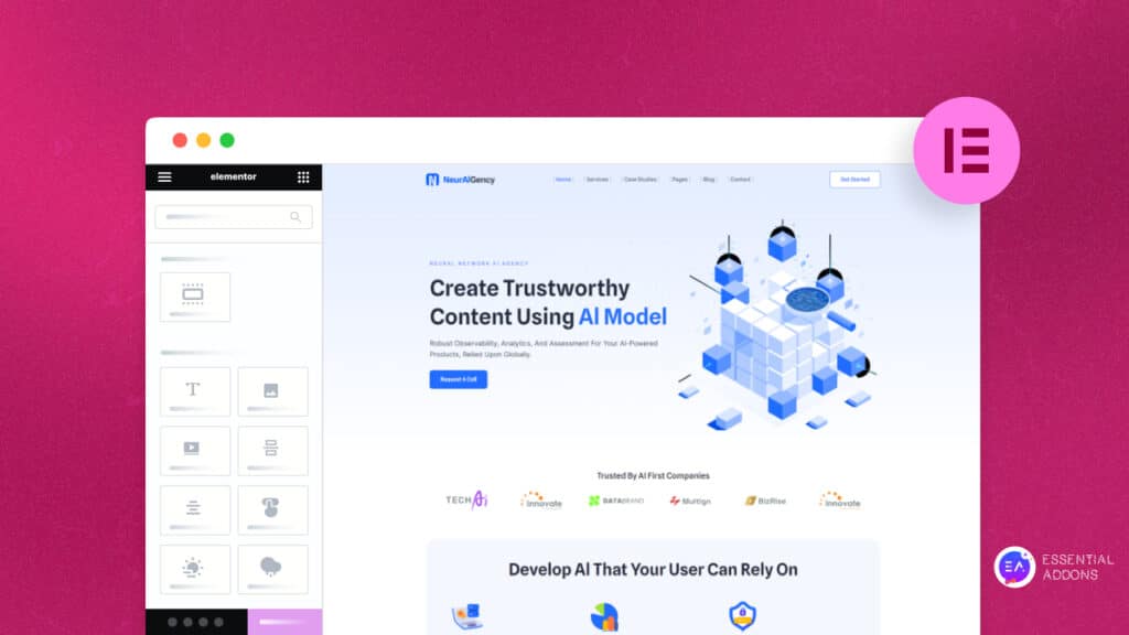
⚙️Add Some Stunning Visuals
A picture is worth a thousand words, therefore don’t be afraid to use a lovely shot or two to replace or enhance your content. Images can be utilized in a number of areas (left, right, and center) to create an intriguing text flow with movement.

Consider incorporating images of people’s faces wherever feasible. Your customers want to meet you and your employees; they want to get to know the people behind the company. And they want to see photos of satisfied customers (or even stock photos of future consumers) to become enthused about your products and services.
🎨Use A Variety Of Color Palettes & Fonts
Color is not anything to be afraid of! Color blocks give visual appeal and assist to emphasize key elements. Colored text creates intriguing breaks in the information flow and may help make headers and subheadings stand out, as long as it is still easy to read.

Fonts are another excellent technique to make quotations or headlines stand out on a page and keep your customers’ eyes engaged. However, confine it to no more than two typefaces; any more and your information becomes an illegible, jumbled mess.
🖼️Incorporate Fun Visual Elements
As humans are naturally visual beings, using stunning visuals on your website can significantly liven up a drab design. Most people visualize a website with images when they think about visuals and web design.
However, depending on your company’s demands, web designers may integrate a number of visual features, such as films and infographics. Additionally, if your sector or company strategy is extremely complicated, graphics such as elegant flowcharts or graphs help clarify concepts and make your services easier to understand.

Bonus: Ultimate Checklist For Your Landing Page Optimization
Creating an engaging landing page can tremendously boost your website’s engagement. All you have to do is ensure that your landing page SEO is properly verified and completed. The question is, how can you determine whether your landing page is properly optimized? Read this article all the way to the end to get the complete checklist for landing page optimization.
So boring websites can be a big obstacle to flourishing your business. You need to make sure that your website is interesting and engaging enough to attract your visitors.
If you have liked this article then subscribe to our blog page for more interesting content and join our Facebook group for more exciting updates.