At first glance, the thing that attracts visitors the most about a website is its design. While creating a website, you need to choose the proper layout; how your content is displayed on the site can impact engagements and conversions just as much as the content itself. But not to worry because Elementor, the website builder, is here to help you stay on top of your web design game. Check out one of its recently introduced widgets, the Elementor Grid Container: a multi-element container that can hold multiple cells laid in rows and columns.
This Elementor widget can be exactly what you need to modernize your website, replacing the traditional design strategies. In this blog, we’ll walk you through the ins and outs of the Grid Container widget by Elementor, along with how you can create multi-element design layouts on your website design using this multi-functional widget.
What Is Elementor Grid Container: Benefits Of Using This Widget
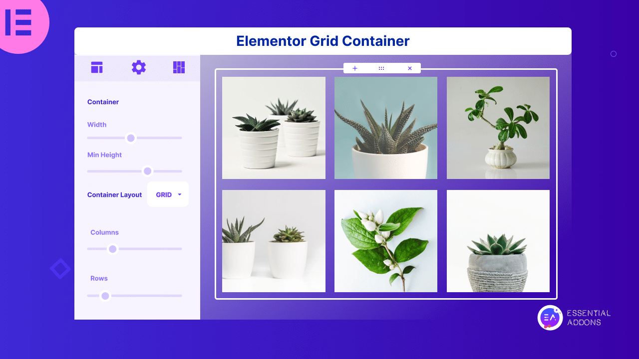
A Grid Container serves as a versatile two-dimensional layout mechanism employed for the organization and alignment of elements on a webpage. It encompasses a container housing an array of cells, thoughtfully arranged in both rows and columns, wherein each cell is capable of housing various elements, be it text, images, or other advanced widgets. But that’s not all for the Grid Container; it offers a greater host of advantages, including:
🏆 Flexibility: Grid Containers empower designers to tailor the dimensions, widths, and heights of individual rows and columns while enabling precise horizontal and vertical alignment of elements within these cells.
🏆 Responsive Design: The inherent adaptability of Grid Containers makes crafting responsive layouts a breeze, ensuring seamless transitions across diverse screen sizes and devices.
🏆 Precision Control: For layouts demanding meticulous control over element positioning and sizing, Grid Containers shine as an ideal choice.
🏆 Custom Layouts: Beyond the confines of conventional section/column/inner section models, Grid Containers prove to be a valuable tool for crafting custom layouts that defy standard structures.
Moreover, one of the notable advantages associated with the utilization of Grid Containers is their exceptional performance. These grid layouts harness the power of CSS Grid, a robust and efficient layout system seamlessly integrated into modern web browsers.
How To Use Grid Container Widget To Create Multi-Element Layout?
Creating a multi-element layout using the Grid widget is easier than you even think. If you’ve basic Elementor experience, it will not be a mammoth task for you. However, to make things easy for you, here is our step-by-step guide on using the Grid Container to create the multi-element layout.
Step 1: Activate The Grid Container From Elementor Settings
Before activating the Grid Container, please remember to activate both the Grid Container and Flexbox Container simultaneously. To activate, enter your WordPress dashboard, navigate to ‘Elementor’ → ‘Settings’ → ‘Features,’ and finally activate the required experiments.
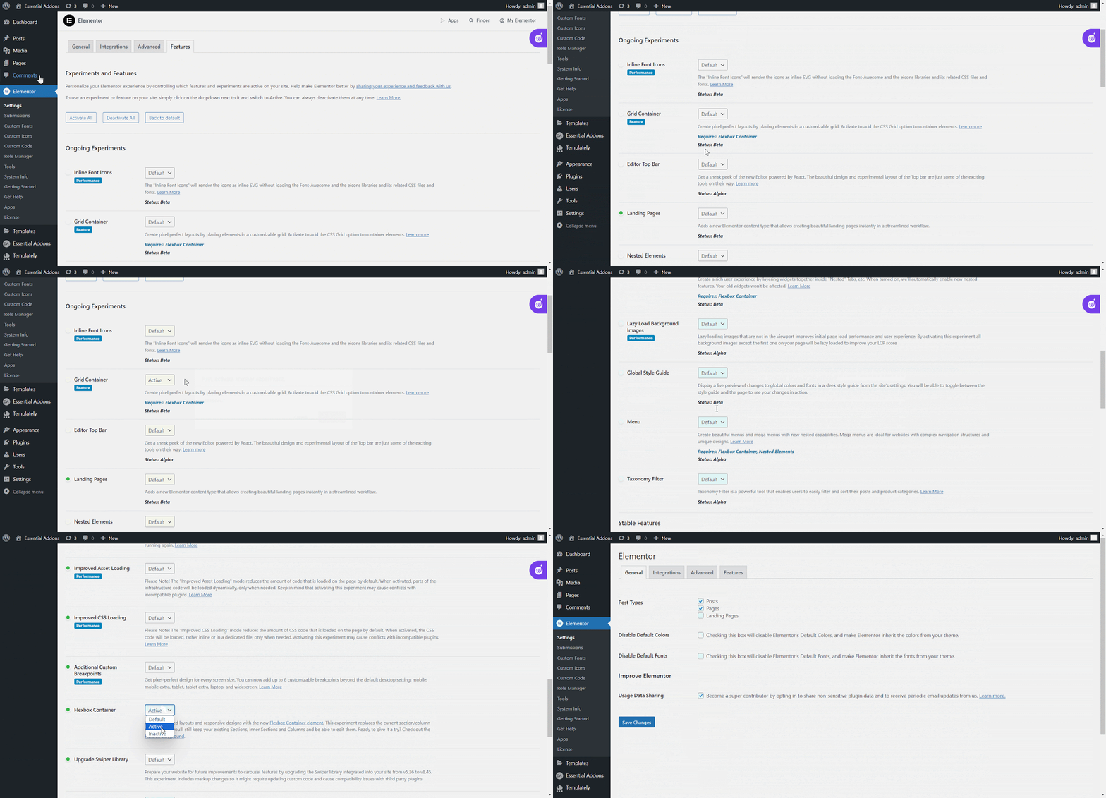
Once you activate both containers, your traditional Section/Column layout will be replaced automatically. No need to drag any Section widget to the page anymore, when you have Grid Container by Elementor. With the containers activated, you can design anything you dreamt of since the containers allow nest containers within containers.
Note: Disabling the Flexbox Container and Grid Container functionality will result in removing any content you’ve incorporated through these features. Conversely, re-enabling them will bring back the previously deleted content.
Step 2: Add Grid Container On Your Web Page
To add the Grid Container, open a page in Elementor by navigating ‘Pages’ → ‘Add New.’ And you’ll get the Grid Container widget at the very top of the widgets panel. Now drag and drop the widget on the Elementor Canvas as you do with other elements.
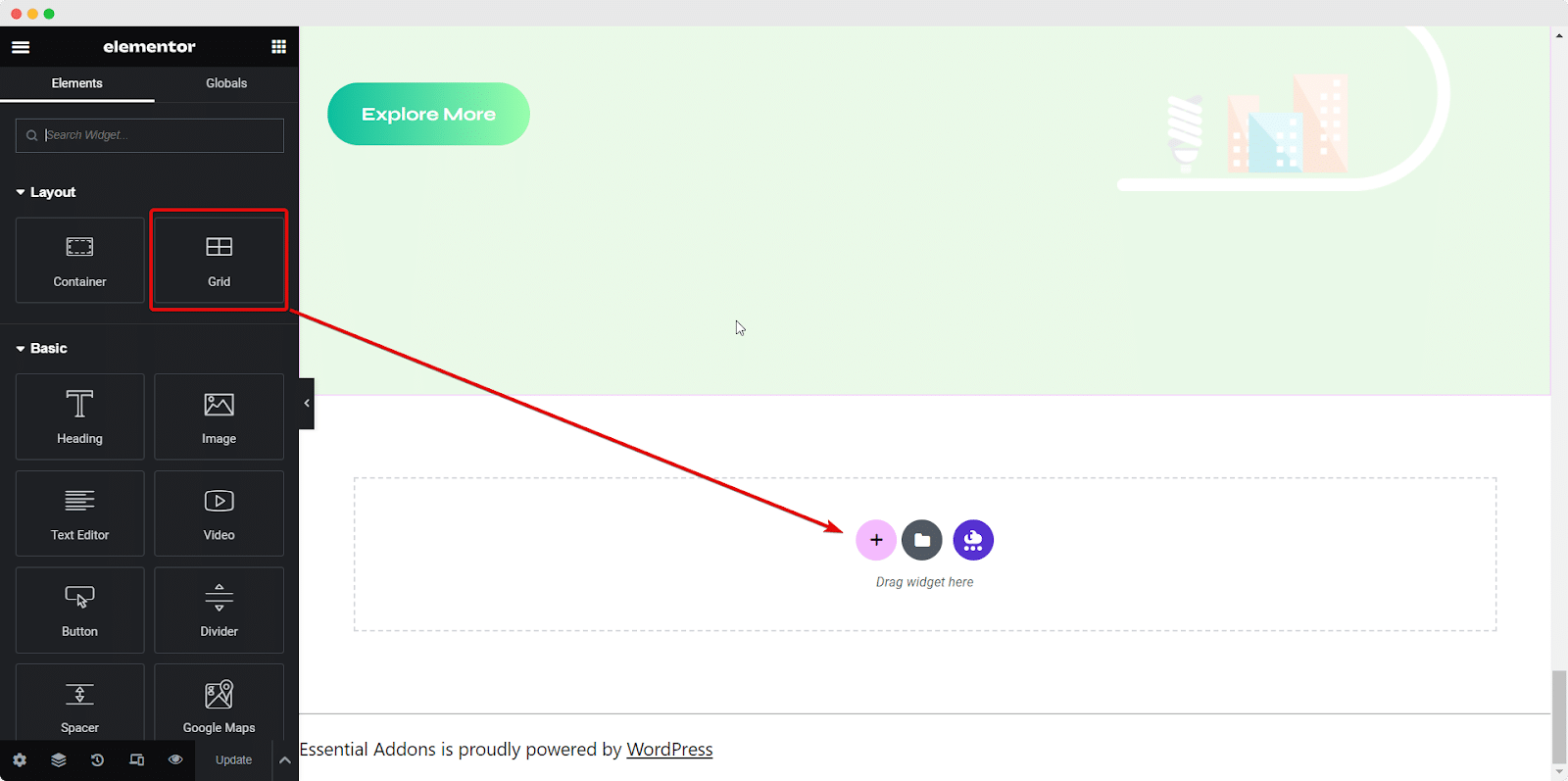
Another easy way to create a layout is by clicking the Plus icon. After this, you’ll get two options: Flexbox and Grid. Now, click on the Grid option to create a layout of Grid Containers.
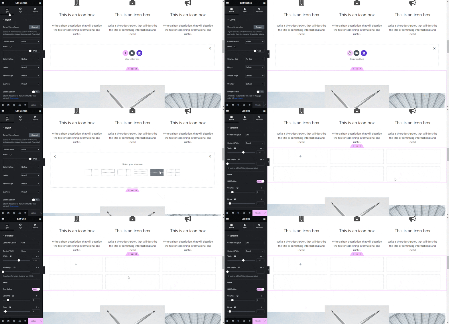
Step 3: Customize The Settings To Create Amazing Layouts
After adding the Grid Container by Elementor widget to the left-hand side (located in the Widget Panel), you’ll gain the ability to customize the appearance of this particular widget.
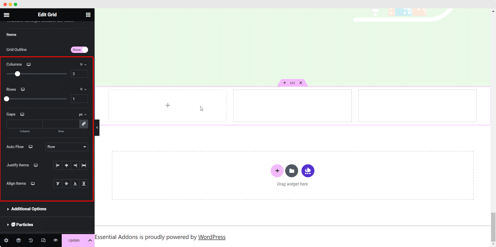
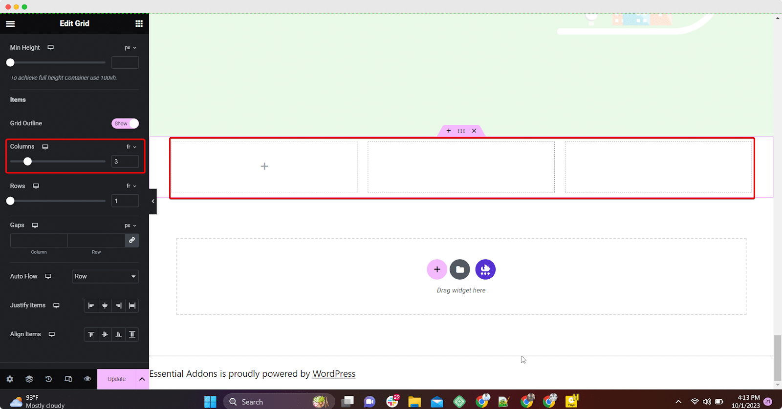
By modifying the Columns setting, you have the flexibility to determine the number of columns to be displayed in a single row. Within each column, you have the freedom to insert various widgets. In this scenario, we’ve created three columns, allowing for the placement of three image widgets, as an example.
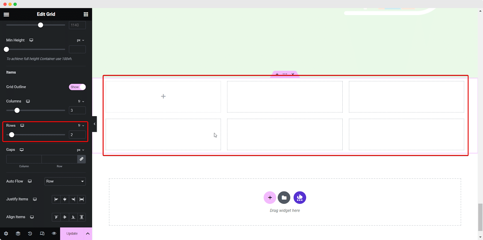
The same goes for the Rows. When you adjust the row value, you’re empowered to decide the number of rows containing columns across your page. In this specific instance, we’ve arranged two rows, each consisting of three columns. It’s as straightforward as that.
As mentioned earlier, you can effortlessly craft your desired layout by leveraging the Elementor Grid Containers.
Step 4: Add Multi-Elements In The Grid Container
Let’s create a multi-element design layout using the Grid Container by Elementor. See the example below. To create this multi-element design layout, you just need to drag and drop the required widgets from the Elementor panel to the Grid Container widget. Here, we’ve used only two additional widgets: Image & Text Editor widgets in the grid.
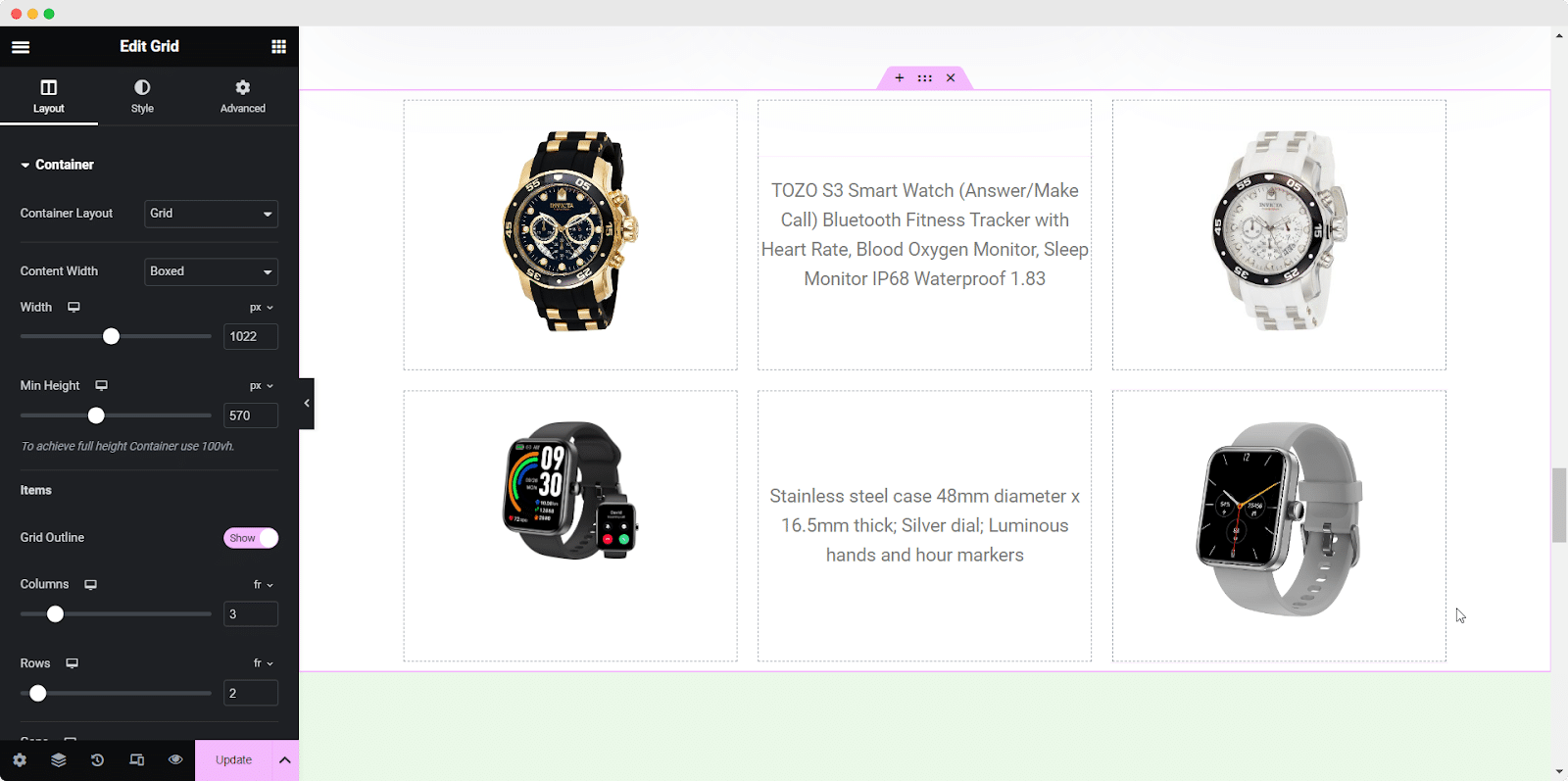
This is how you can easily create multi-element layouts and elevate your Elementor website design using Grid Container with flexibility. No coding is required; adjusting margin/padding is easier than ever. All you need to do is simply drag and drop, and your design will be ready in minutes.
Simplify The Process Of Creating Multi-Element Design Layouts With Grid Container
Undoubtedly, the Elementor Grid Containers widget streamlines the art of creative design. There is no need to use several containers or tweak the design management much. From design to alignment, Grid Container has everything in it. Using this widget, you can take your Elementor design experience to a whole other level.
Hope you find this blog helpful. If so, please subscribe to our blog and join our Facebook Community to get more Elementor news, tips, and tricks & stay ahead of the game.
