The last thing any web creator wants is a frustrated user leaving their website due to a cluttered layout that is difficult to navigate through. It is important to believe that most minor details in website design can significantly impact the bounce rates, conversion, and more. So, in this blog, we bring you the ultimate best practices to optimize website layouts using Elementor.
According to a web credibility research carried out by Stanford, as many as 75% of website users judge a site’s credibility depending on the visual designs. While another research shows that 38% of the users abandon a website if they find the layout unattractive.
Nobody likes surfing through slow websites with cluttered layouts, clashing color schemes, or a difficult-to-read and navigate design. Whenever a client comes across such websites, the most common response is to click away and find another website to visit in its place.
It is, therefore, essential to create web posts and pages for your site using optimal techniques. A stunning, optimized website layout created following the best practices can increase your site traffic, increase conversion rate, grow engagement and increase your site’s ranking. Stay tuned in to explain how you can achieve all these and effortlessly optimize website layouts using Elementor.
Optimize Website Layouts With Elementor To Enhance User Experience
Elementor is one of the most popular free WordPress website builders out there, and using this flexible page builder to create a web page is a breeze. It’s a fully customizable drag-and-drop page builder that allows you to create a website without coding in seconds.
Note: Use lightweight, fast loading and responsive themes such as ‘Hello’ or Flexia to help you optimize website layout with endless customizability.
You can easily create high-performing WordPress website layouts with Elementor following the best practices to optimize website layouts.
⭐ Improve The Header And Footer Sections Of A Web Page
Headers and Footers bind your content together and help to create a professional-looking website in no time. These are the two sections where you include the website logos, and links to the most notable web contents or pages and therefore are essential in presenting your brand to the world.
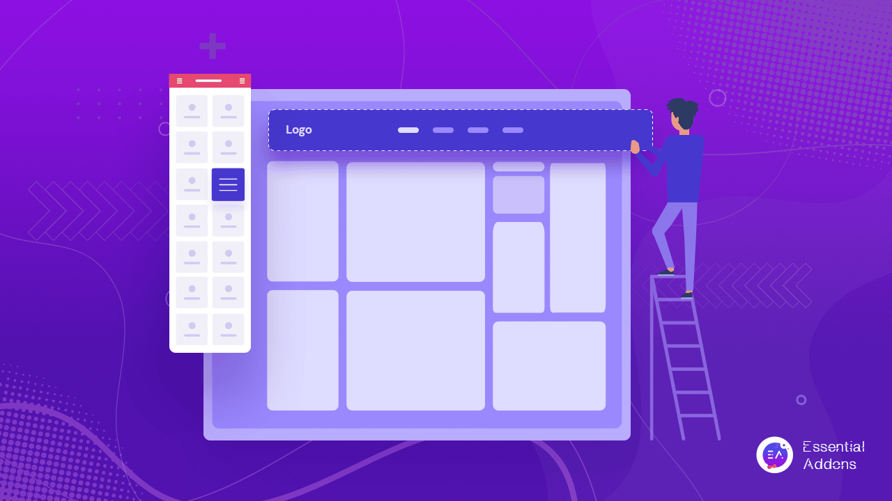
However, these sections may also be gravely responsible for reducing your site’s performance if they include too many columns, widgets, and logos.
🎯 Optimize The Header Section:
We recommend you use a minimal number of columns on your header section – a maximum of two for optimizing the layout.
Elementor brings you an exclusive site logo widget to create and style your website logos and personalize them according to your business aesthetics. Ensure to set the right image dimensions from Elementor editor’s ‘Style Tab’ when uploading the logo which will help to avoid a layout shift when the web page loads. Also, do not forget to add a relevant image title to and Alt tags to improve SEO rankings.
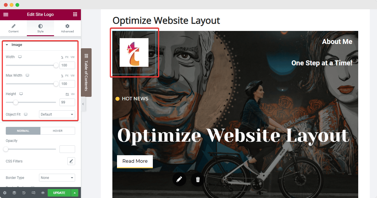
Next, we have the Nav Menu widget from Elementor which we can set onto the 2nd column. Here, you can add all the significant pages and posts by configuring the ‘Menu Screen’ on your website dashboard, and then modify the layout using Elementor’s ‘Content’ and ‘Style’ tabs. One best practice here is to set the pointer to ‘none’ to avoid a cluttered look.
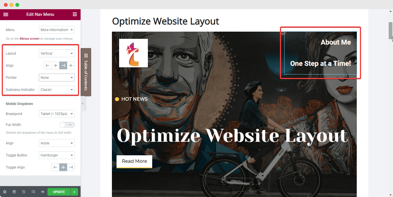
You can add any other required widgets to your header (example: Icon List widget) right underneath the Nav Menu within the same column.
Once you are satisfied with the header columns and widgets, set the elements in line with each other and also set the column’s positioning in line with the widgets. Follow the steps below to achieve this optimized layout:
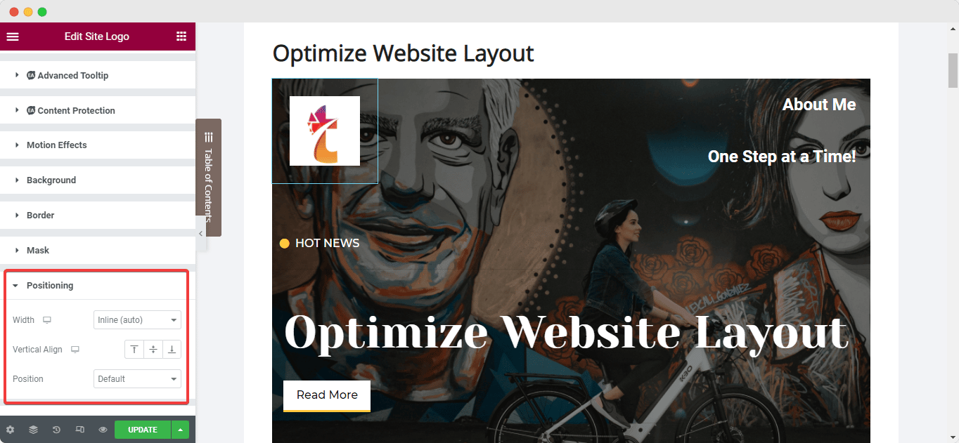
Select your widget and navigate to the ‘Advanced’ tab from the Elementor side panel and set the width of the widget to ‘Inline’ under the ‘Positioning’ option. This will place the widgets in line with each other instantly.
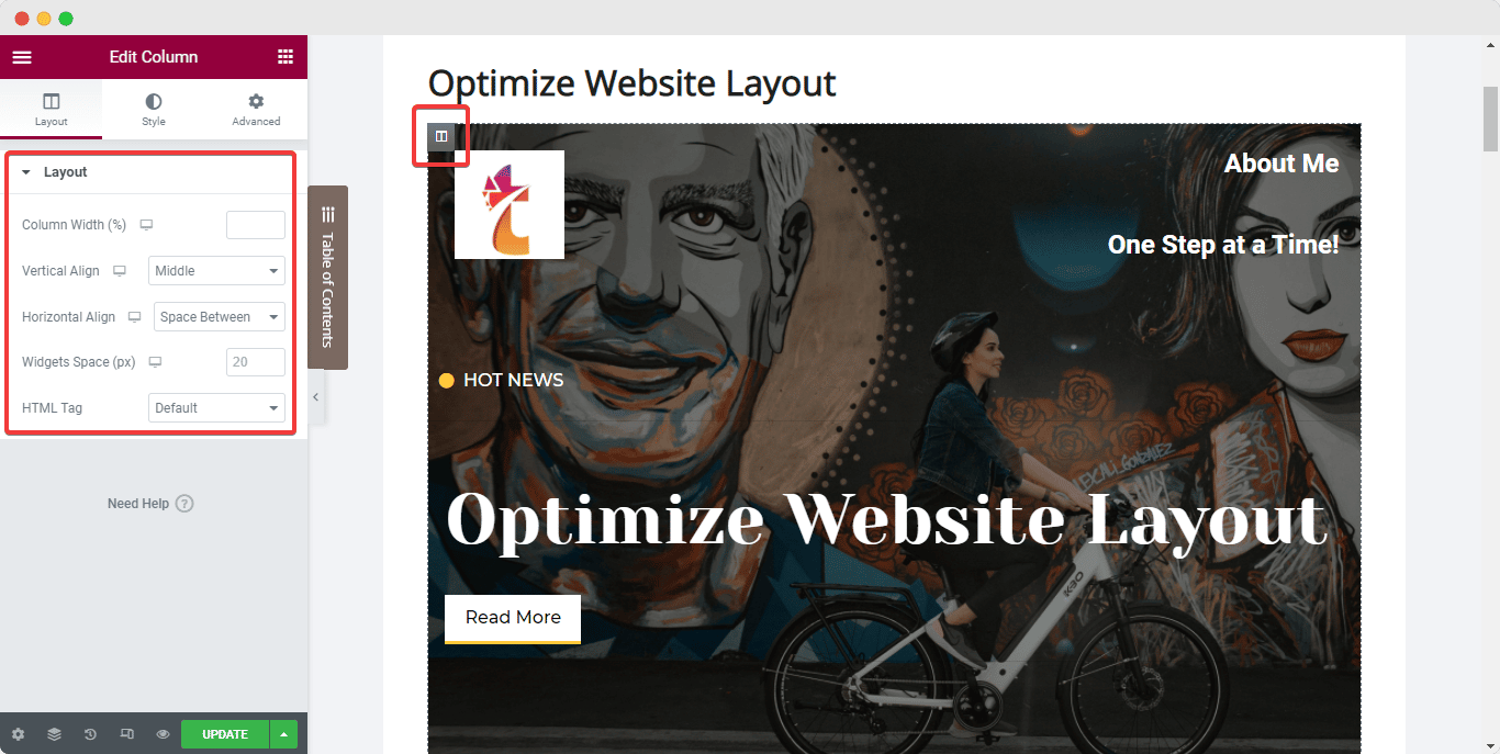
Next, to set the column inline with the widgets, select the column and navigate to its ‘Layout’ tab. Then, under ‘Vertical Align’, choose ‘Bottom’ while selecting the ‘Space Between’ option for ‘Horizontal Align’.
🎯 Optimize The Footer Section:
Similarly, website creators often make a common mistake of using multiple widgets in the Footer section to add descriptions, links, and copyright symbols. The best practice to optimize your website layout, in this case, will be to use widgets that offer multiple functionalities and reduce excessive use of sections in the Footer.
You can merge certain widgets into one section to keep the Footer clean and more attractive. You can now also create a Footer that will update itself continuously with the Dynamic tags from Elementor. Read this dedicated document to learn more.
⭐ Catch Eyes Instantly With An Attractive Hero Banner
Next up, we have the Hero Section or banner of your website page. The best practice to optimize this section layout is to use a banner with bold text that is clearly visible to the website users.
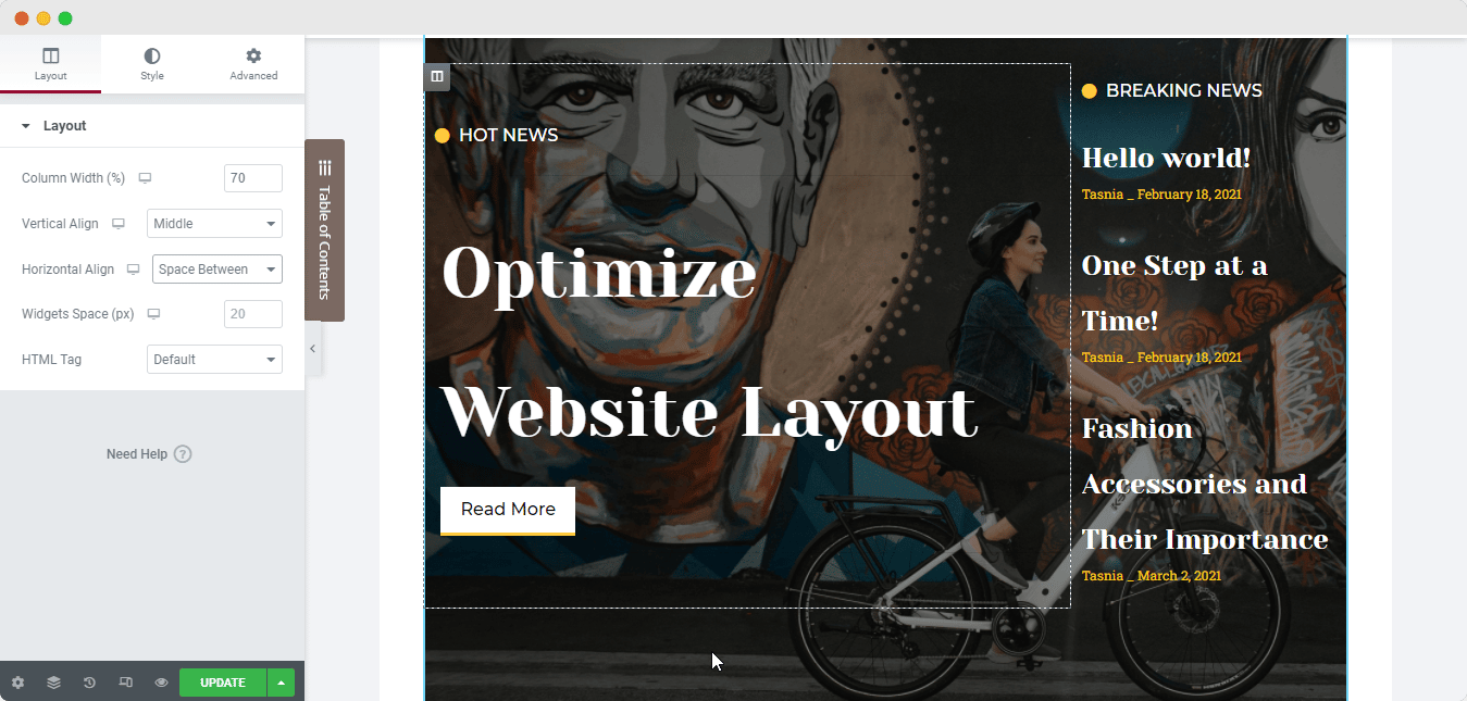
To make the texts clearly visible over any background or image in your Hero Banner, position text using the column alignment options. Again, select the column as you did for the header section and set the ‘Vertical Alignment’ to ‘Middle’ and then configure the paddings as needed to ensure the layout is optimized to the fullest.
⭐ Maintain A Consistent Look With Global Styling Options
To ensure a consistent outlook on your website, we recommend you follow the Global Styling standards. For the proper styling practices to optimize website layout with Elementor, check out the strategies listed below:
🎯 Use Global Fonts:
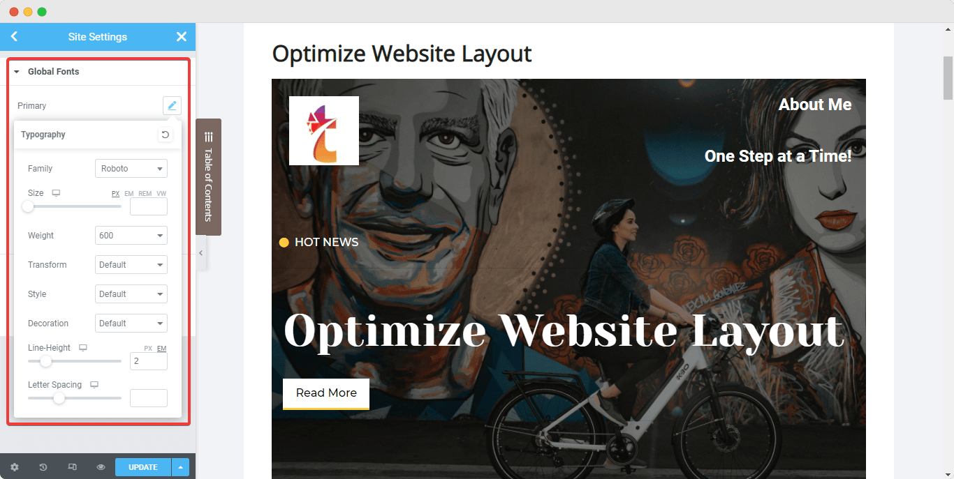
An excellent practice to optimize your site’s layout is to avoid using various text fonts, at least not more than two. Instead, we will recommend that you use Elementor’s Global Fonts to set a consistent font throughout your entire website.
Using Elementor’s Design System feature enables you to easily set up a color palette and a collection of font styles that you can apply to all widgets and web pages throughout your website from one place. This will not only help to keep uniformity through all web pages and posts with your company brand, but also reduce the loading speed of your website.
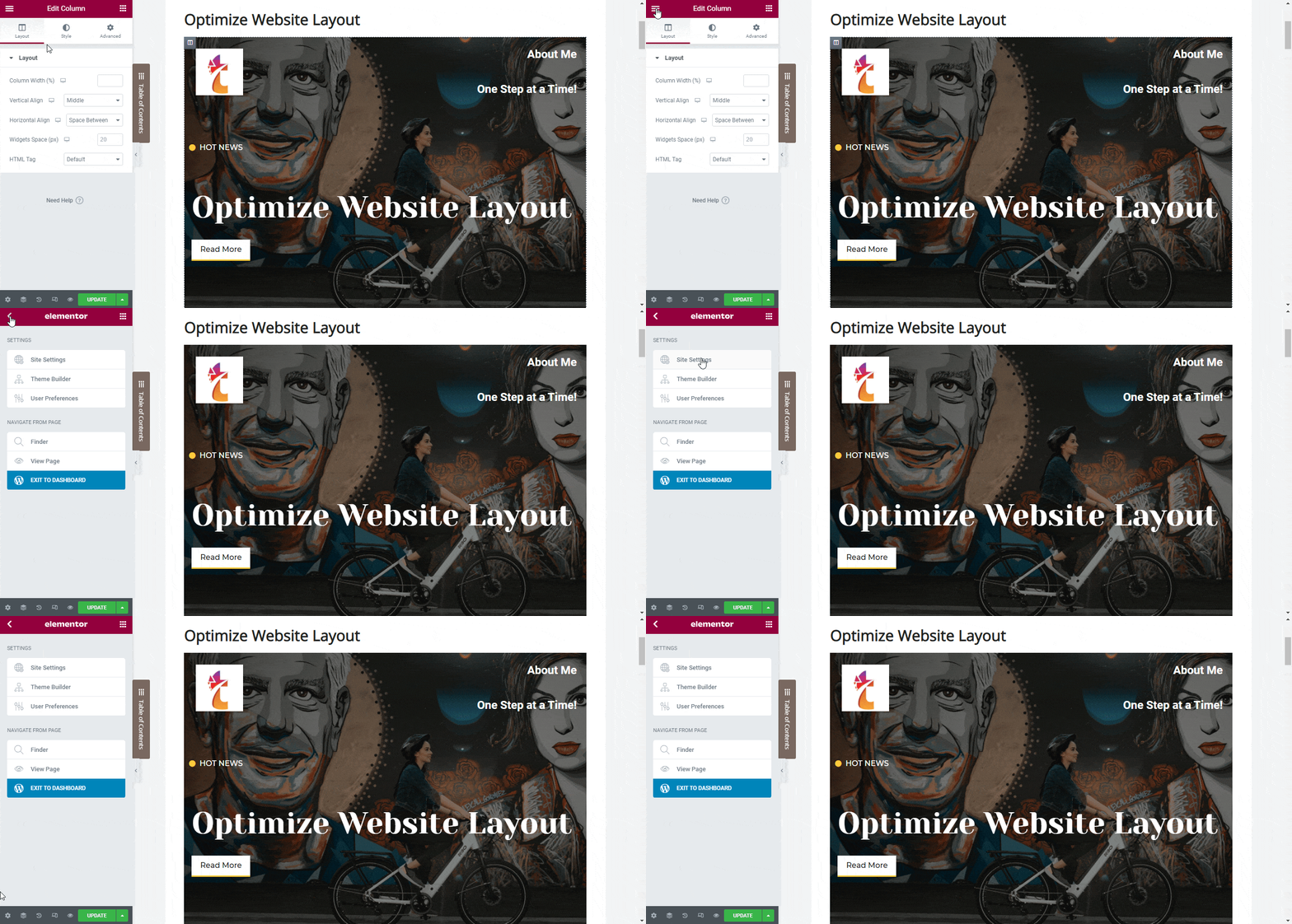
To set a stable ‘Global Fonts’, click on the hamburger menu on the top left corner of the Elementor side panel and navigate to the ‘Site Settings’ tab.
Click on the ‘Global Font’ option under the ‘Design System’ section and then configure the primary, secondary, text and accent fonts as you prefer, as shown below.
🎯 Set Global Colors:
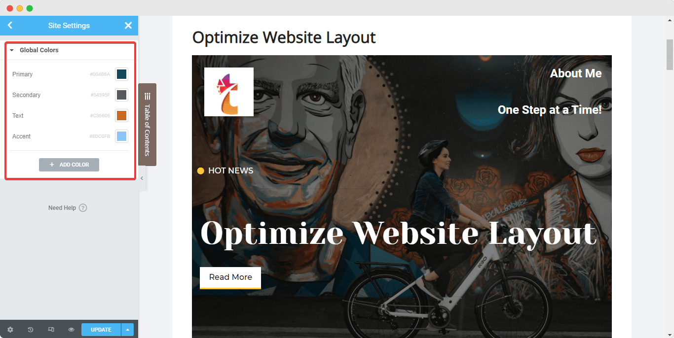
Similar to Global Fonts, Elementor also allows you to set some Global Colors for your website. Again, from the Elementor side panel on any web page navigate to the ‘Site Settings’ option.
This time, click on the ‘Global Color’ option, and you will come across 4 default, Elementor base colors – Primary, Secondary, Text, and Accent. These default colors can be changed and given different names and you can also add new colors. When you change these Global Colors, the changes can be seen live and will be applied throughout the site simultaneously.
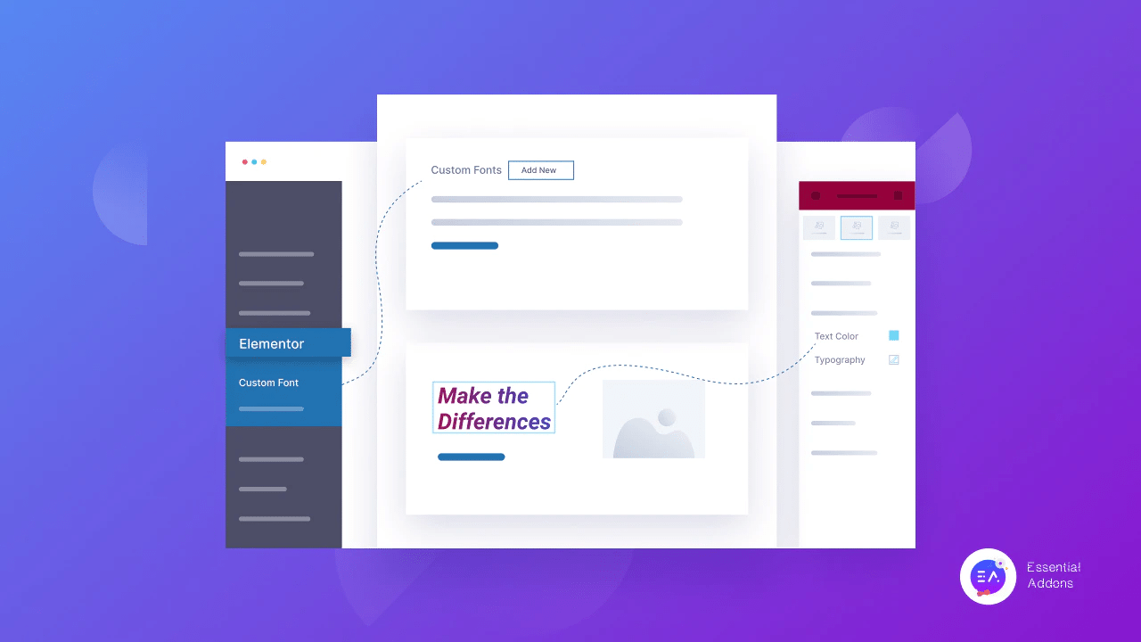
If you want to take your website designs a step further, take a look at our blog on how to use custom fonts, colors, and styles in Elementor.
⭐ Set A Good Contrast Between The Text & Background
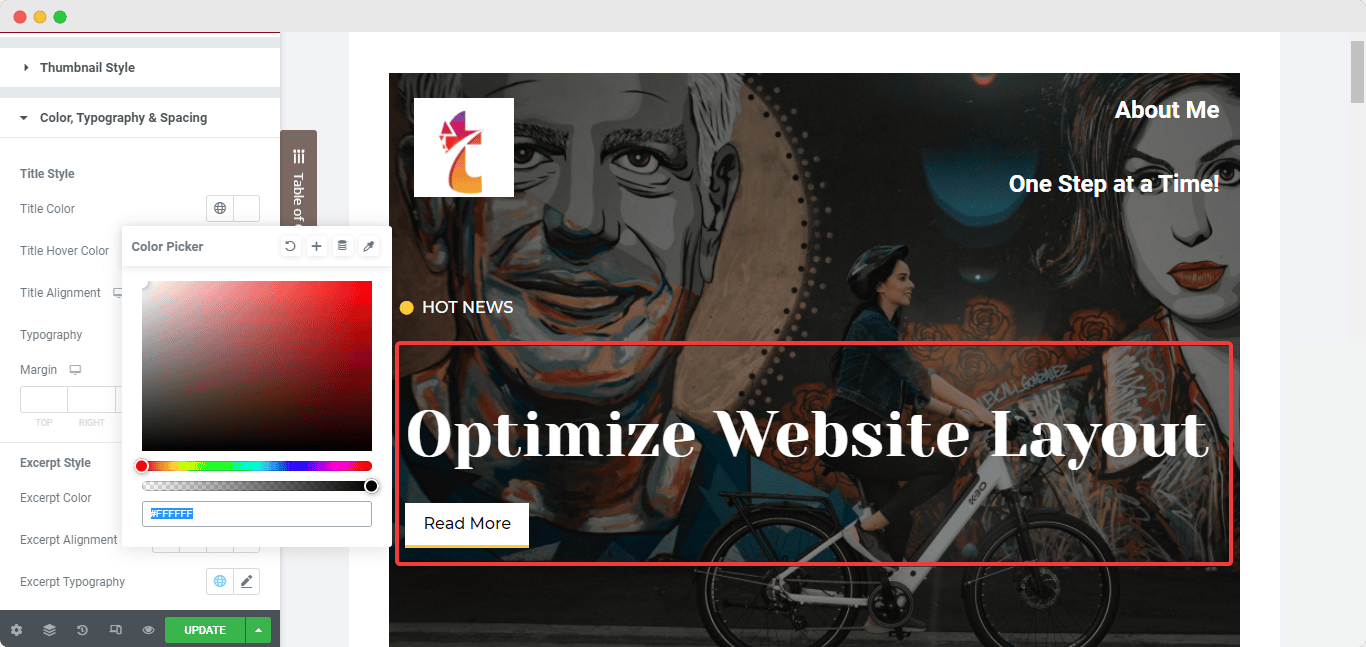
It’s important for every website to have a good contrast between the text and background. Non-readable information affects your website scores and can also drive visitors away. No matter what, the text must always be clearly readable.
Always make sure that the text on your website is clearly visible and easily readable by ensuring there is a striking contrast between the text and the background color or image it is placed on top of. And Elementor brings you the facilities to change the color of the texts on any of the widgets used with the help of the ‘Styling’ tab of the Elementor side panel.
⭐ Configure The Image Sizes On Your Site’s Pages
Images are a must if you want your blog posts to perform well among your audience. Images and GIFs help hold your users’ interest for a more extended period. For the best user experience and optimized website layout, you must use high-quality images on your website. And as mentioned above, you should use image ALT texts and attributes for all your images on the site to improve page accessibility.
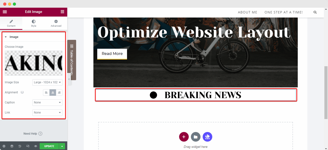
Setting image dimensions is another way to optimize your site performance. It ensures faster loading times while maintaining good quality. Using low compression rates can also result in better-quality images on your site. When you add an image to your web page using the ‘Image’ widget from Elementor, you can easily navigate to the widget’s ‘Content’ tab, and set your preferred ‘Image Size’ along with the image alignment.
From the ‘Style’ tab, you will be able to customize dimensions, CSS filters, opacity, borders, and so on, while the ‘Advanced’ tab will help you determine the image’s padding and positioning.
⭐ Use Lazy Load To Optimize Videos With Just A Click
When it comes to using the ‘Video’ widget from Elementor, the best practice to optimize website layout is to use lazy load whenever possible. This instantly improves your websites’ loading time and performance. To enable this exclusive and highly useful feature, select the widget, and navigate to its ‘Style’ tab and simply select ‘Lazy Load’.
⭐ Ensure Responsiveness Of The Web Page On All Devices
In this digital era, more often than not, users prefer to scroll through websites on their phones – mobile users have now surpassed computer users by a large number. Not updating or optimizing your WordPress website layout to be responsive on different devices will only result in missing major opportunities to boost sales.
To ensure an excellent user experience on mobile devices, you need to create simple and clean, optimized website layouts with maximum responsiveness for screens of all sizes. You can achieve this using the ‘Custom Width’ setting for Elementor widgets and elements. Using custom widths will not change the sections on your website; it will only modify the dimensions of the sections so that the entire content can be viewed from any device.
🏆 Other Strategies To Optimize Website Layout
There are many other strategies that you can use to optimize your site’s performance using its layout design. We want to give you some more options that you can explore through and see what suits your website the most – to find out more, let’s keep reading.
One of the first techniques you need to keep in mind while creating a website is negative spaces positively impact website layouts. Many sites have excessive graphics, information, Call-To-Action buttons, and backlinks to other pages. While having useful content on your site can engage users, for the majority of the time, cluttered websites tend to take away people’s attention. Try to keep your website design simple and make good use of whitespace.
Effective Website Design Principles For WordPress
While there are many valuable WordPress website layout tactics and principles out there, some are more effective than the rest. The website design principles mentioned below can help you set your site apart from the thousands that are available on the internet today.

Learn about the latest trends in website design principles, we recommend you go through our blog on the 10 most effective Website Design Principles. But to summarize, you will be the top 5 modern, optimized website layout design techniques used these days listed below:
🎯 Focus on accessibility and inclusivity for all
🎯 Use muted and pastel colors to soothe the eyes
🎯 Highlight essential content using Parallax effects
🎯 Implement elegant and easily readable fonts
🎯 Increase engagement with interactive photo galleries
Bonus: How To Test The Performance Of Your Website Pages
Now that we know all the best practices of optimizing website layouts, the next step would be to run a test of the performance of your optimized web page. Below are the steps to how to easily carry out the test.
Step 1: Open The Web Page In An Incognito Window
To carry out the test, you need to open the optimized web page of your choice from your WordPress website on a new window in the ‘Incognito Mode’. You can easily do so by copying the URL of the web page and pasting the link onto the incognito tabs’ search bar.
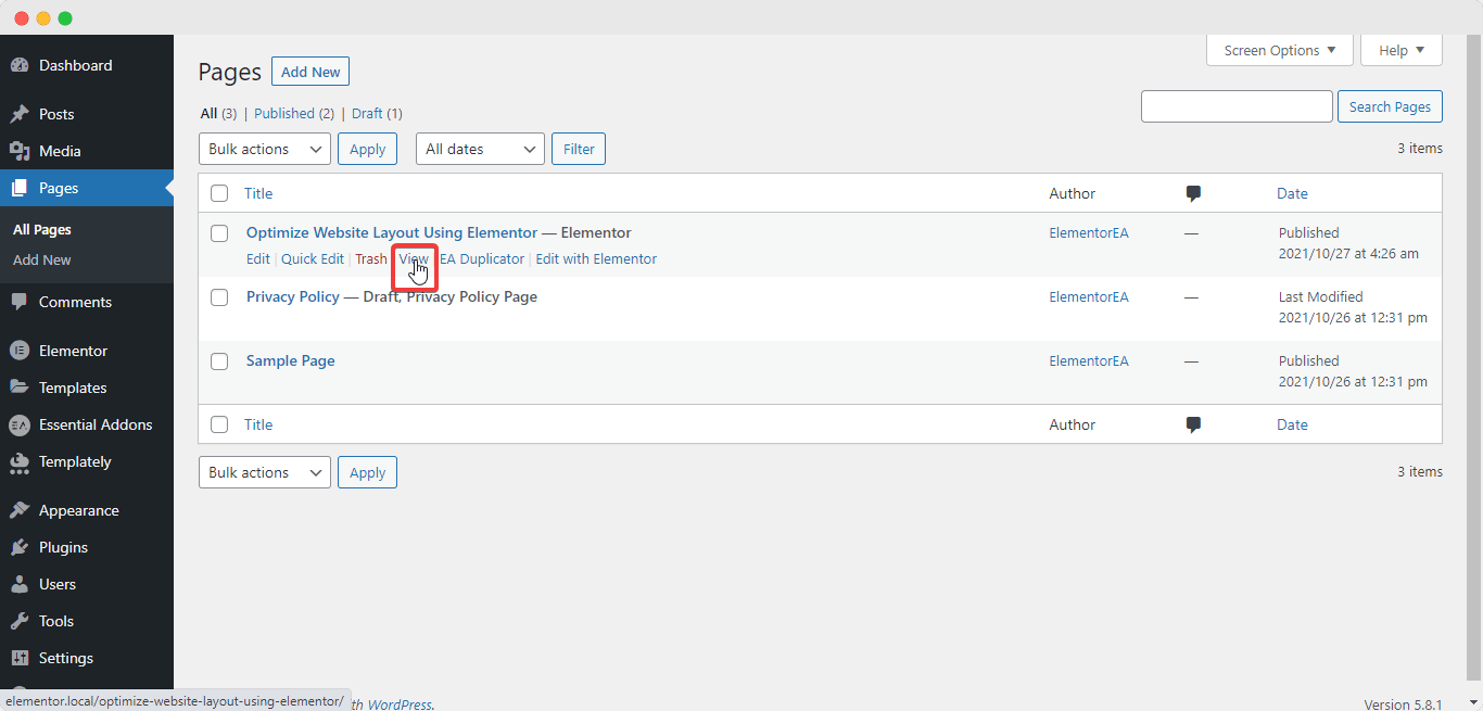
To copy the URL of the web page, navigate to ‘Pages’ from your WordPress dashboard. Then hover over the page you want to or have just optimized; options will appear underneath the title of the web page. Simply right-click on the ‘View’ option, and copy the link from the drop-down menu that appears, and then past the URL onto your incognito tab’s search bar.
Step 2: Inspect The HTML & CSS Content
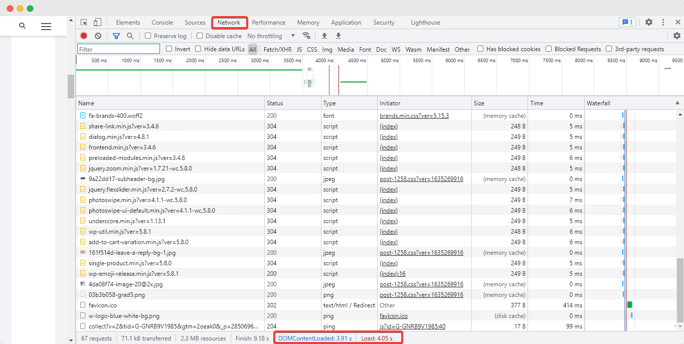
Then, you will have to inspect the HTML & CSS content of your page. To do so, right-click anywhere on your web page and hit the ‘Inspect’ option. A side screen will appear where you will be able to see several tabs featuring your HTML and CSS, find errors, get SEO results, and perform different types of tests.
Select the ‘Network Tab’ and hit ‘ctrl + R’ buttons – this will instantly load the backend database of your webpage including the load time and query optimization requests, as shown above.
Step 2: View The Performance Of Your Page
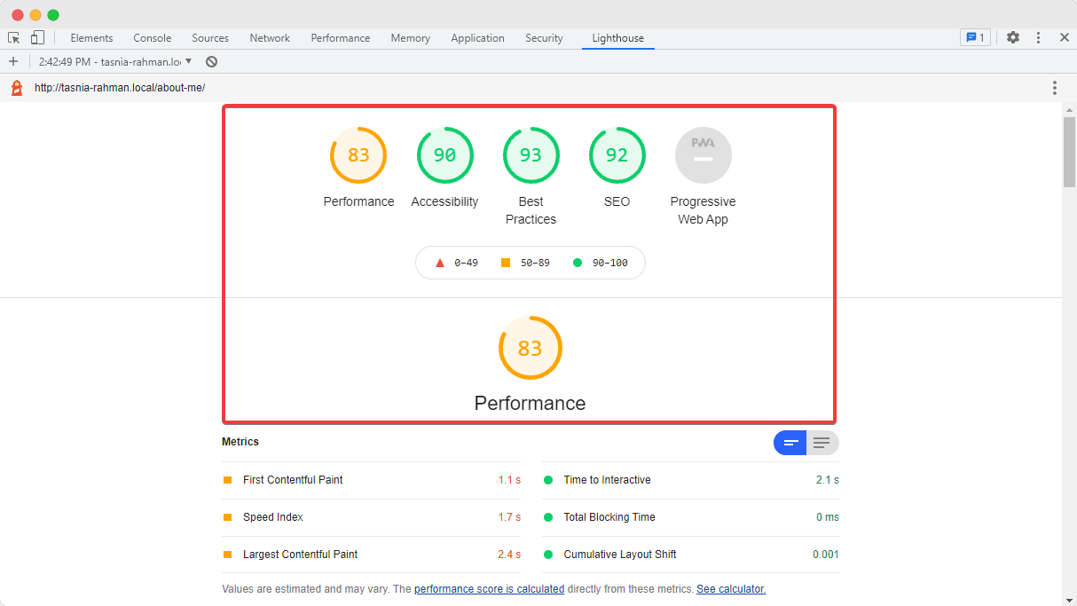
Next, switch over to the ‘Lighthouse Tab’, and click on the ‘Generate Report’ button on our page to view the current web page’s performance insights. As you can see from the screen above, the performance results will be showcased. You must always target to get a score above 90%.
And with that, we would like to conclude our ultimate guide on the best practices you can use to optimize website layout using Elementor with ease. If you found this blog helpful, let us know by commenting below; we would love to know.
To get more useful tips like these and learn about our latest updates, subscribe to our blog and join our friendly Facebook community.
