Whenever you build a website on any website builder you may see that some elements offer size choices, such as PX, EM, REM, percent, VW, or VH while margin or padding any content. Today in this design guide blog, we will talk about this phenomenon known as relative units and for PX only, absolute units.

Why Should You Focus On CSS Relative Units?
CSS units for specifying size, such as font size, width, height, border width, border radius, and so on, can be generally classified into four sorts.
- Absolute Measurements (px)
- Font-size Proportional units (rem, em)
- Related Parent Size Units ( % )
- Relative Viewport Units (vw, vh)
If you commonly use bootstrap, you will prefer the default base size in pixels(PX). You may use the percent(%) to specify the width and height of images, containers and divs, ems and rems for typography, and typography-related components such as margin, padding, and so on. You may also experiment with viewport units for flexible typography, which is quite fascinating.
Experiment with these font parameters a lot, and you’ll eventually find a design guide that’s perfect for you.
Design Guide: Basic Definitions Of PX, EM, REM, %, VW & VH
Now we will talk about these relative and absolute units in a very easy language and how they can help you to build your first design guide for future web building.
Pixels (PX): PX is an acronym for pixel, a measure of relative length and screen resolution. Pixel was widely used as the font size for everything from typography to width, padding, and height long before the invention of responsive design. Pixels, on the other hand, are fixed-size units that do not change with the size of the screen and are not customizable.
REM: REM units are classified as proportional to the HTML tag’s font-size value. Think it like this, if the HTML tag’s font size is 16px (the normal size for an HTML web page), then 1rem unit equals 16px. That results in. 5rem=80px, 2rem=32px, and so on. EMs are often used for typography such as headers, texts, paragraphs, and typographic features such as margins, padding, and so on.
EM: EM is a scalable unit that is transformed into image pixels by any browser. Say the usual font size in Google Chrome is set to 16 px, 1 em = 16 pixels. So mathematically the font-size of h2 is 48px (16 * 3), and 32px for the h3 (16 * 2). EMS in Elementor is often used for typography features such as headers, texts, articles, and typographic features such as margins, padding, as well as content border-radius too.
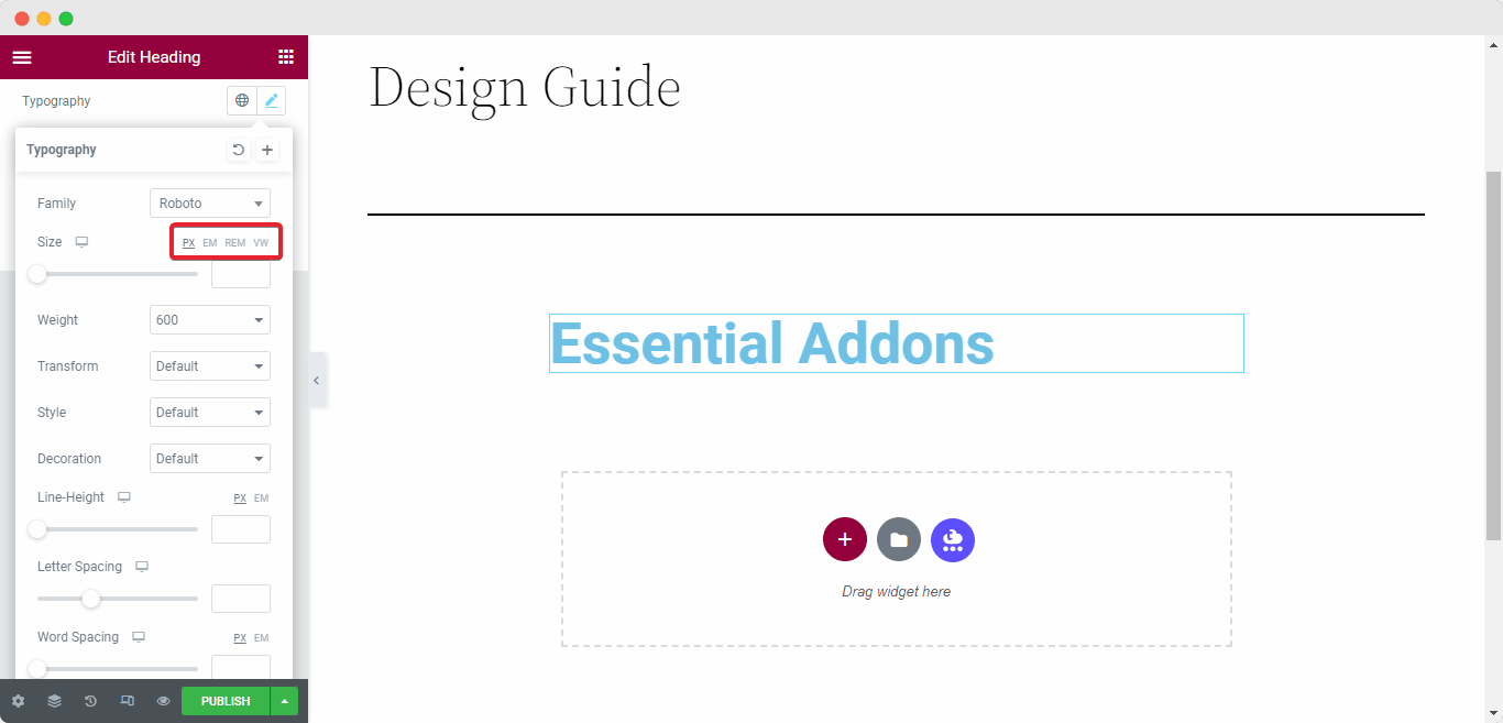
VW: Usually VH defines the area of your browser where your web content is shown – in short, your web browser without toolbars and buttons. VW is handy for constructing full-screen elements (100%) with a refresh rate that covers the complete area of the window. You can use any predefined value to calculate your proper screen width. Like 50% for the half-width means your content will take the area of the upper half of the monitor.
VH: The VH units are related to the user’s field of view or FOV. Usually, 100vh is the entire height of the browser window, and 100vw is the full width of the browser window. VH units are pretty useful when we have an element whose location is typically determined by the complete screen size.
Now think of a Table Of Content box that can be made to have a “height: 100vh” and “position: varied”. This means it will always take up the full space of your monitor no matter the device and the table of content will work as a sticky block.
%(Percent): Percentage value is always related to any other value, whether it is the element’s parent (here parent means root value, and for any component, root value is always 1) value or another attribute of the element itself. Percentages are mostly used for cross-browser compatibility and full responsiveness on any device.
If you want to make a website based on social media interaction or community-based interaction then using Percent(%) value can be a big help because it is dynamic. If you want to make any structural change you don’t have to assign a value to every content, just change the parent value and all the necessary changes will apply the same.
So these are some basic definitions of these CSS units. It will help you construct a basic design guide if you want to make any website on WordPress.
Unit Comparison Between EM & REM
Both EM and REM are scalable units that are transformed into pixel values by the browser-based on the font size parameters in your design. If you use a value of 1em or 1rem, the browser can translate it as anything from 16px to 160px, and so on. In pen and paper, both of them are basically the same.
But things get interesting on how the browser detects the pixel value. If you use REM values then the browser will always check your parent or root value. Your browser font size will be multiplied by the value you have assigned on the REM unit. For example, your root value is 16px and you have assigned the REM value as 2, so it will be 16*2= 32px.
While using EM value, it acts a little bit differently than REM units. EM value calculates the font-size value. This means, your content typography, heading, title, etc is the main parameter here. EM will multiply with the font size parameters.

Say, your blog title value is 3px and the value of your H2 tags is 5px. So EM will calculate the values like 16*3=48px for title and 16*5=80px for H2 tags. In short, EM heavily relies on dynamic values.
Basic Difference Between VW & VH
You are creating your first website on WordPress and you want to create multiple knowledge bases for your product. You have entered 100% for full width and 100vh for height. You have fixed the height of 50vh to cover half of your screen. Why not use 50vw for the width, you may wonder? Because the VW style does not account for scroll bar width, it may cause side-scrolling issues on your site and will make the scrolling laggy.
In other words, you can change the VH value for your site screen any way you want because it is not dependent on the root value, but you can’t change the VW value as you wish because it works as a static value and it can disrupt the whole user experience if you do not follow a proper convention.
So if you keep these aspects in your mind then you can make your own design guide to make a perfect website.
Bonus: 10 Web Design Principles You Must Follow

Web design is an ever-changing field. To stay up with the newest technologies and tools, a web developer needs to continually learn and evolve with new possibilities. In the following points, we have discussed some essential steps which will work as your comprehensive design guide for web development.
👉Your website’s content is the rising tide of your business. Content gives value, engagement, and connection. That is why it is critical to think about the content in terms of its relationship with the rest of your site and how that relationship affects the user experience.
👉You should avoid writing that is overly wordy or imaginative. Your message will baffle your potential readers, and they will not understand what you are trying to express. You should make sure that your phrases are concise and easy to grasp.
👉Parallax effects, often known as motion effects, are a great method to make your website more engaging. However, keep in mind that too many motion effects might make your website appear unsettling to users.
To get more out of your website check this fantastic article about the design guide to making a beautiful website.
Follow Proper Design Guide For Your Website
If you want to start your career path in web development then this design guide on various CSS units can be helpful. These factors can be of huge difference if you use them carefully with proper procedure.
Liked this design guide blog? Share your feedback in the comment section. Subscribe to our blog and join our Facebook community for more exciting updates.


