Having a website that looks great on every device is a necessity nowadays. Because a non-responsive website is like a shop that ignores half its customers. Responsive design ensures your site adapts to all screen sizes, providing a smooth experience whether viewed on a desktop, tablet, or smartphone. It adjusts your website’s layout, images, and text to fit any device, making it easy to navigate. If your Elementor site is not adapting well, it could lead to frustration, higher bounce rates, and lost conversions.
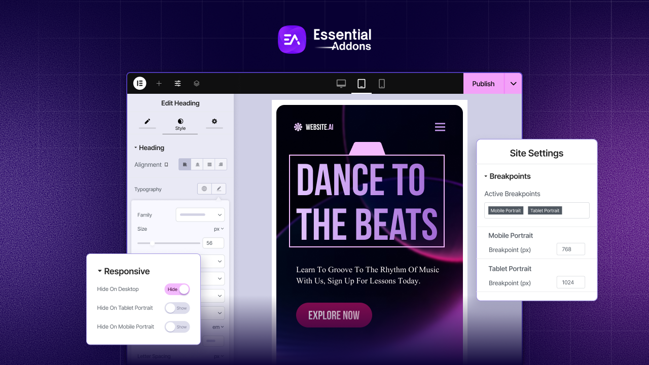
However, fixing responsive design issues has never been easier, thanks to Elementor. Our guide will help you fix Elementor responsive design issues and ensure your site is mobile-friendly. To get the most out of Elementor, you must understand breakpoints and be able to adjust the design to fit each screen size.
Key Reasons Behind Elementor Responsive Design Issues
Before diving into the Elementor responsive design issues, you need to understand an important thing: Breakpoints in Elementor.
The breakpoint in Elementor refers to a specific point at which your website’s layout adjusts to fit different screen sizes. Every device, such as a PC, tablet, or smartphone, has its breakpoint. For your site to be responsive, you need these breakpoints.
- PC (Desktop): Screen widths greater than 1024 pixels.
- Tablet: Screen widths between 1024px and 767px.
- Mobile: Screen widths of 767px or less.
In simple terms, a breakpoint is the transition point between two layouts in your design. By allowing you to customize each breakpoint individually, Elementor helps you address responsive design issues.
Why Do Elementor Responsive Design Issues Happen?
- Despite looking great on desktops, your site does not adjust well on mobile devices.
- The size of text, images, or buttons appears too large or too small on smaller screens.
- Smaller devices have columns that overlap or sections that do not stack properly.
- When viewed on a smaller screen, elements are not aligned correctly or are cut off.
These issues can hurt your site’s usability, leading to frustration for users and a drop in engagement.
Fix Elementor Responsive Design Issues: Multiple Ways for Mobile & Tablet
Elementor provides a set of intuitive tools to help you fix responsive design issues for each device. Below are the key steps to address these issues and ensure your site works well on all screen sizes.
1. View Your Site on Different Devices in Elementor
If you want to fix responsive design issues in Elementor, you must first see what your site looks like on different devices. With Elementor’s Responsive Mode, you can preview your site on desktops, tablets, and mobile devices.
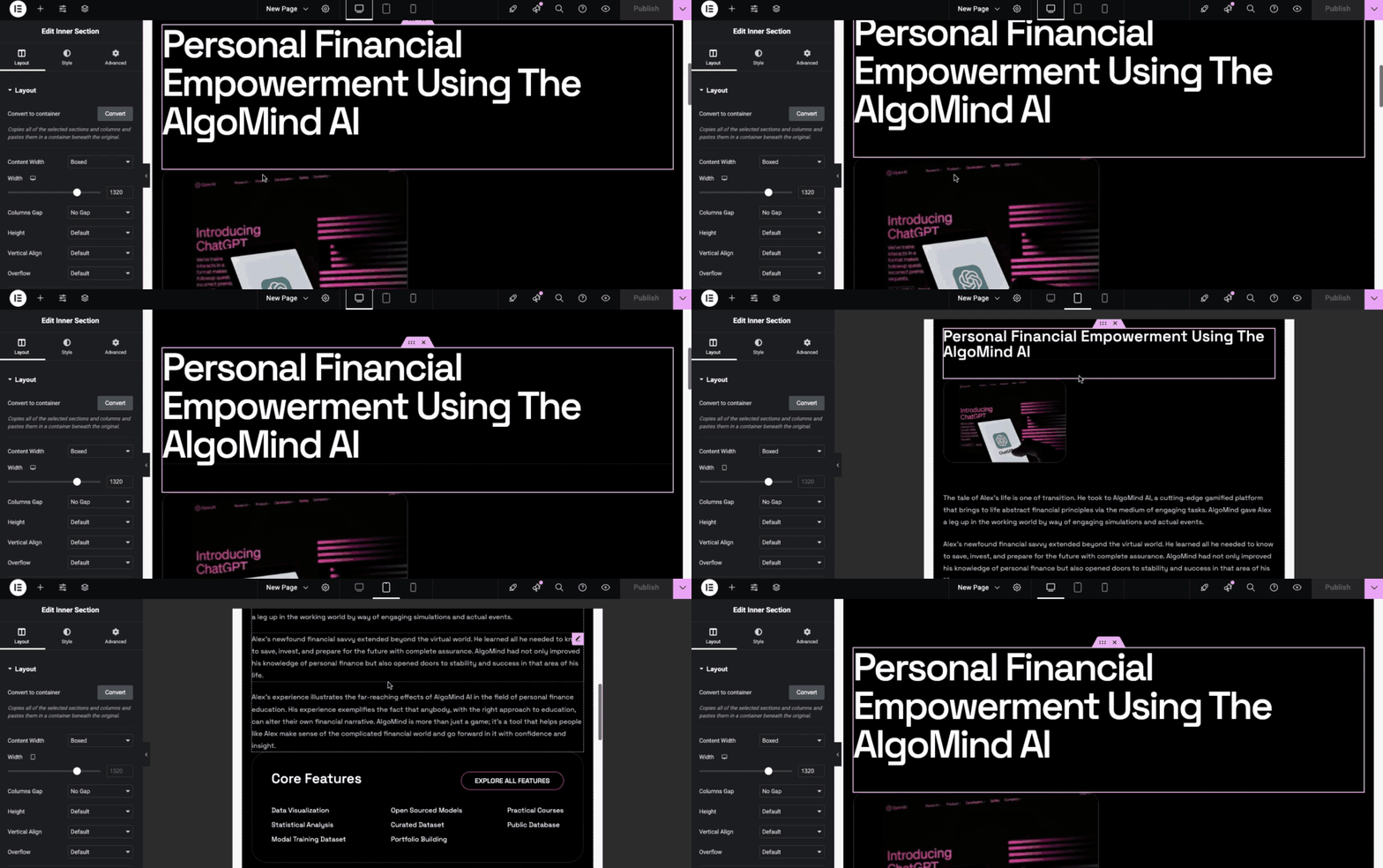
The following steps will help you preview your site on different devices:
- Open Your Page in Elementor: Choose the page or post you would like to edit.
- Responsive Mode: Click the Responsive Mode icon on Elementor’s top bar. In this way, you can select one of the three views: desktop, tablet, or mobile.
- Manually Adjust the Screen Width: To check your design at different screen sizes, you can drag the screen width handle.
By testing your design on various devices, you can identify and fix any Elementor responsive design issues before they affect your users.
2. Edit Elementor Settings for Specific Devices
Once you have previewed your site on different devices, the next step is to customize the settings for each device type to address any responsive design issues. To do this, start by selecting the device icon from the top bar in Elementor, choosing between Desktop, Tablet, or Mobile.
Then, adjust various settings to ensure your design looks and functions well on each device. For typography, modify the font size, line height, and letter spacing to ensure readability across all screen sizes.
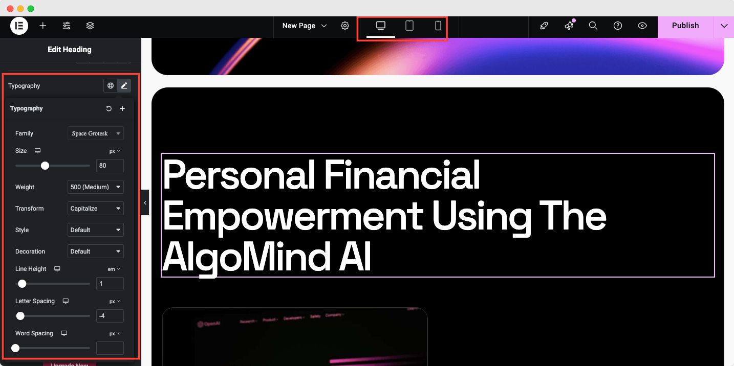
You may also need to adjust margins and padding, especially on smaller screens, to prevent overcrowding or misalignment. To do that, you need to go to the ‘Advanced’ tab.
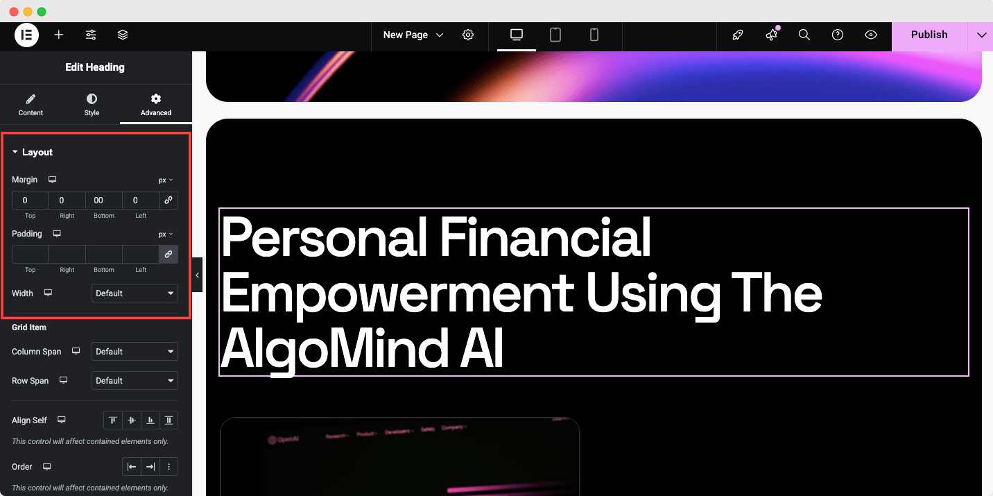
Additionally, you can control visibility, hiding or showing elements that may not work well on mobile or tablet views. Navigate to Advanced → Responsive to get all the options.
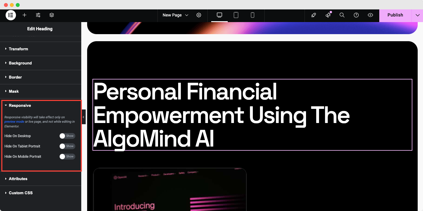
By fine-tuning these settings for each device, you can resolve Elementor responsive design issues and provide a smoother, more user-friendly experience for all visitors.
3. Adjust Typography for Smaller Screens
Typography that looks good on a desktop may not work well on mobile or tablet screens. Here is how to adjust typography settings for Elementor responsive design issues below.
- Select the Text Element: Choose a heading, paragraph, or other text elements.
- Go to the Style Tab: Under the Style tab, locate the Typography section.
- Adjust for Mobile: Click the mobile icon next to the font size setting to change the font size for mobile.
- Repeat for Other Devices: You can adjust typography for tablets and desktops by switching between the device views in the top bar.
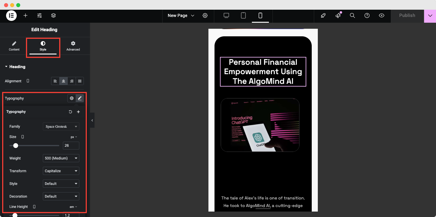
Adjusting typography for each device ensures readability and prevents text from becoming too large or too small.
4. Add And Customize Breakpoints for Specific Devices
While Elementor has default breakpoints for desktops, tablets, and mobiles, you may want to add custom breakpoints for certain devices or screen sizes. This can help you resolve Elementor responsive design issues that arise with unusual screen sizes. Now the question comes, how can you add and customize breakpoints?
- Access Site Settings: In the Elementor editor, click the gear icon (settings) in the bottom-left corner and select Site Settings.
- Go to Breakpoints: Scroll down to the Breakpoints section under Layout.
- Add a Breakpoint: Click the + icon to add a new breakpoint. Select from the available options, such as Tablet Landscape, Mobile Landscape, etc.
- Customize Breakpoint Width: Enter a new pixel value in the Breakpoint (px) field to create a custom breakpoint in Elementor for specific devices.
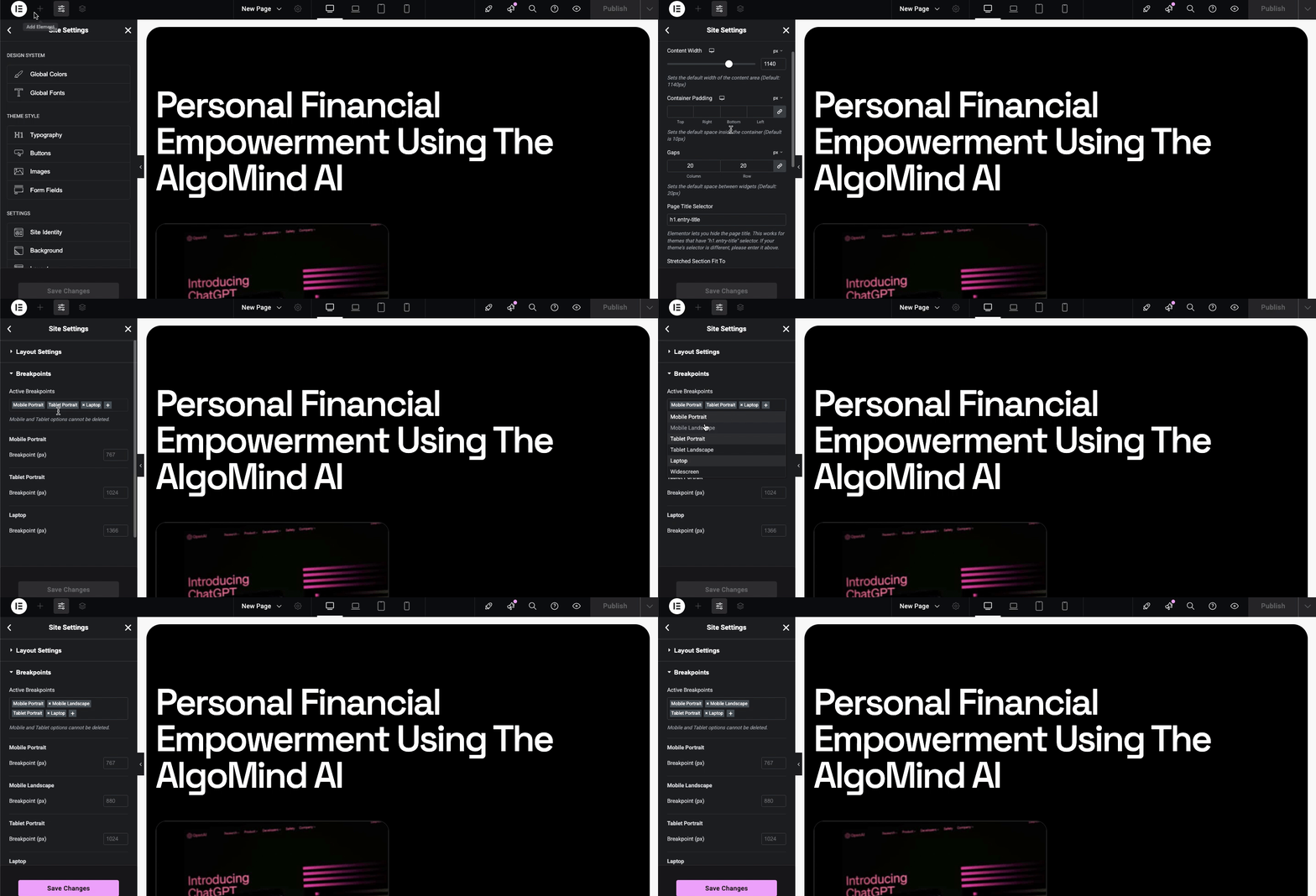
Customizing breakpoints allows you to fine-tune your responsive design and ensure your site looks great across all screen sizes.
5. Test Your Site on Real Devices
While Elementor’s preview tools are useful, testing your site on actual devices is essential to catch any remaining responsive design issues. Testing on real devices gives you a better idea of how the design performs in real-world scenarios.
Use tools like Google Chrome’s Developer Tools or BrowserStack to simulate different devices, or test your site on physical phones and tablets.
Best Practices to Avoid Elementor Responsive Design Issues
Fixing responsive design issues in Elementor involves tweaking layouts for mobile, tablet, and desktop views using its responsive tools. Always preview on various devices to confirm optimal display. These are the best practices for fixing Elementor’s responsive design issues.
1. Mobile-First Approach
Start with a mobile-friendly design and then expand. With mobile-first, your website is designed with the smallest screen in mind, improving the mobile experience and ensuring that the most important content is prioritized.
2. Use Flexible Layouts
Do not set elements’ widths to fixed values. If you want elements to resize fluidly across different devices, use percentage-based widths or the Auto setting.
3. Hide Unnecessary Elements on Smaller Devices
It may not be possible to use some elements on a mobile device or tablet. Using the Advanced tab in Elementor, you can hide elements on specific devices. By doing this, you can reduce clutter and speed up the loading process.
4. Optimize Media
Make sure that images and videos are optimized for use on mobile and tablet devices. Ensure that your images are responsive and that they scale properly across different screen sizes.
Mastering Elementor’s Responsive Design Issues for All Devices
A responsive design that is compatible with all devices is key to ensuring that your website performs well. Elementor provides tools for adjusting settings for mobile, tablet, and desktop views and adding custom breakpoints.
Follow the tips mentioned above to resolve common website problems and create a seamless, professional website. To ensure everything works correctly, always test on real devices. With these strategies in place, your site will be fully responsive and offer an excellent user experience.
Hope you’re all set with the Elementor responsive design issues. Do not forget to subscribe to our blog & join our Facebook Community for more Elementor guides.
