Have you ever thought there could be a theory behind colors that can make your normal design look very professional? Well, as an artist, designer, or even branding expert understanding color theory can help you to elevate your game. In this blog, we will explain the rules of color harmony to create iconic color combinations in your design. Without further ado, let’s dive in.
📖 A Brief On The Fundamentals Of Understanding Color Theory
Color theory is a combination of vast guidelines. To start with, you can find two types of colors that we mainly use in a design that are print color and digital color. If you want to understand color theory, you need to keep these two types of colors in mind before going any further.
While printing colors refer to the colors you see on printed papers, flyers, cards, or even in books, digital colors are what you see on screens. In addition to that, what works for printed colors may not look well on digital screens. This blog will help you understand how you can mix and match colors and make your design stand out.
💡 Understanding Hues, Tints, Tones, & Shades In Color Theory
When you are working with colors, you will hear about hues, tints, tones, and shades quite often. To understand color theory, these basics are important to study first. The tints, tones, and shades are the variation of hues. You can easily create variations of hues by adding lighter or darker colors.
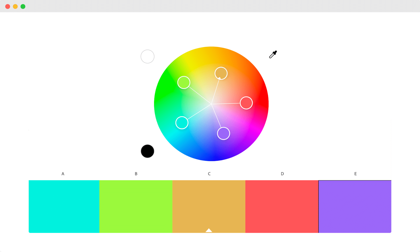
If you add white color to any other color, this will be called tint and when black is added it will be called shades. Mix and match these so you can easily create new colors. Black and white colors help to manipulate the tone of colors. When you change the tone of any color, the original hue will become dimmed.
✨ The Basics Of The Color Wheel: 6 Things You Should Know
How do you know which color works well together? Luckily we have a color wheel that can help us to determine which colors can be mixed with another color and looks good. On a color wheel, you can see the representation of primary, secondary, tertiary, and other colors bent into a circle. Now, let’s have a look at the different types of colors below.
🔵 Primary Colors
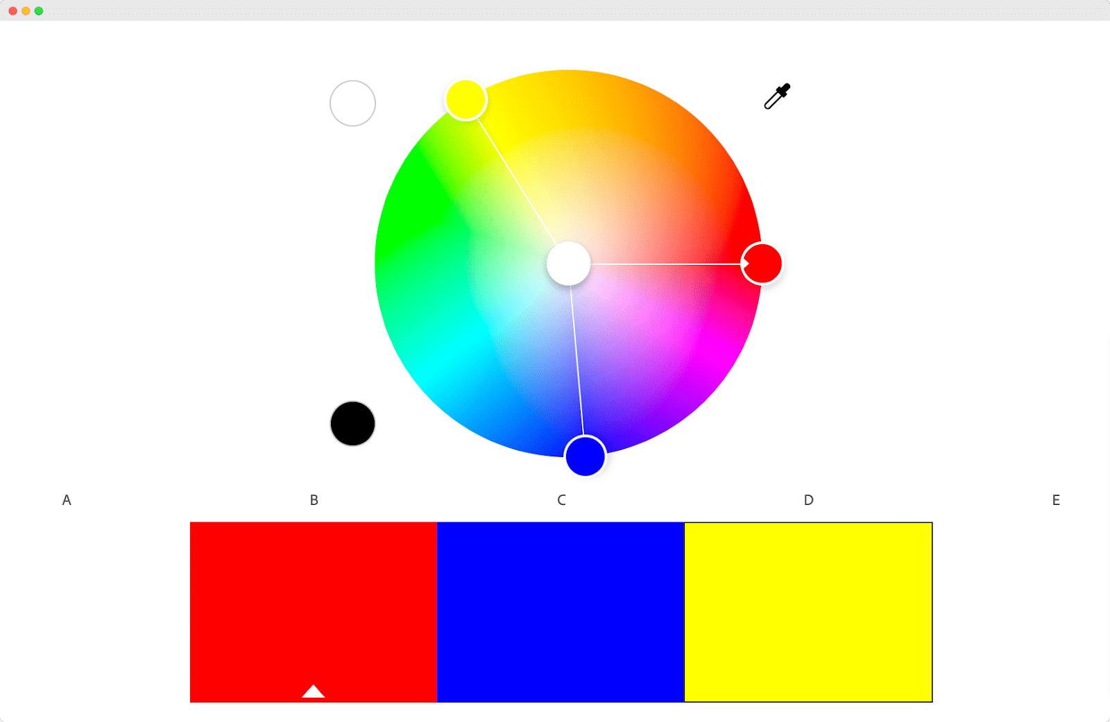
You may already know what the primary colors are. Red, blue, and yellow are the main colors that you can use to create any secondary colors. These colors are used to create all the other colors that you see around in your daily life.
🔵 Secondary Colors
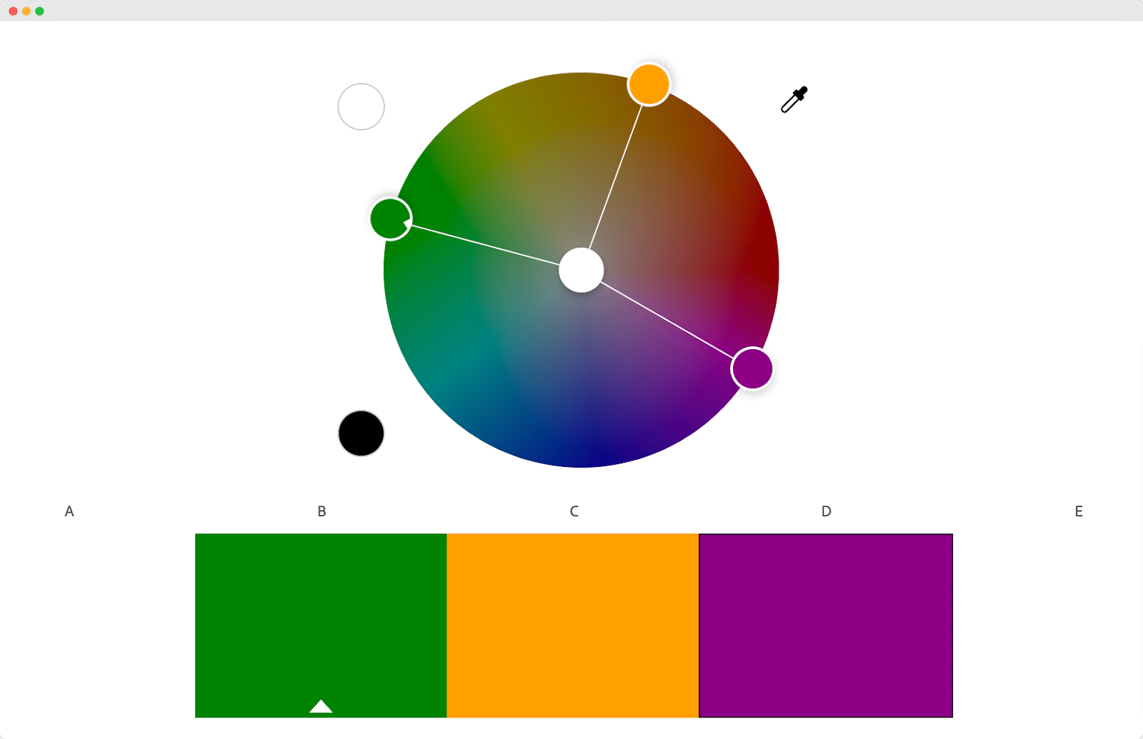
Orange, green, and purple are called the secondary colors. These colors are a mix of primary colors. When you mix the primary colors together, you will get these colors.
🔵 Intermediate Colors
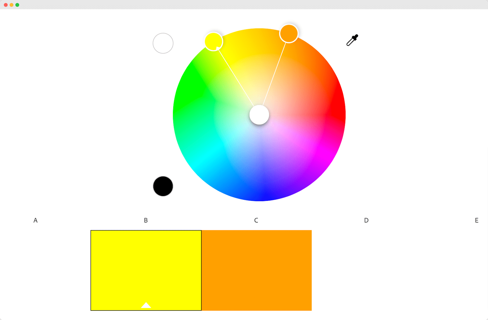
Intermediate colors are situated between your primary and secondary colors. For example, when you mix yellow with orange, it will create an intermediate color.
🔵 Monochromatic Colors
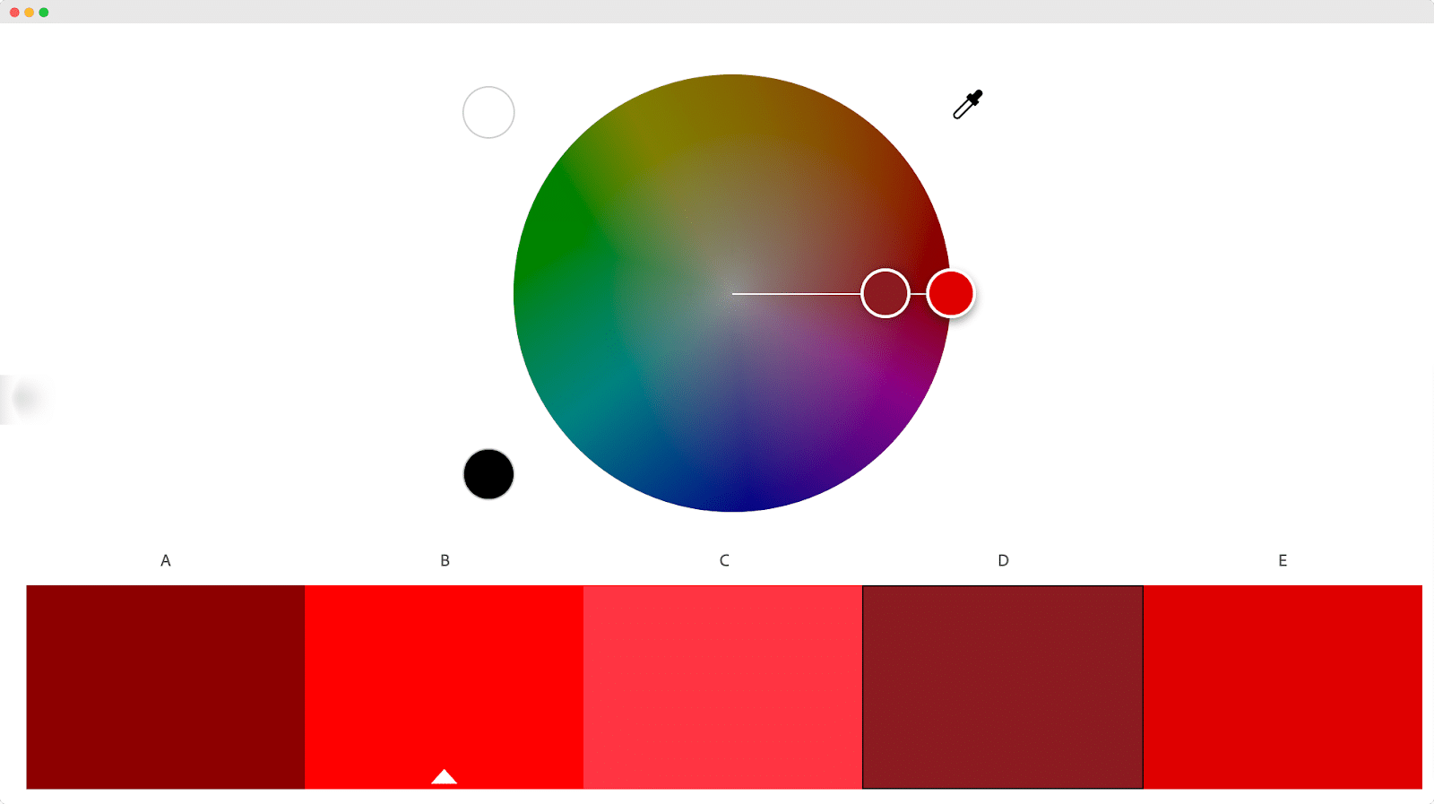
We have already briefed you about the tints, shades, and tones. Now, when you mix and match these elements with a color, it will create monochromatic colors.
🔵 Tertiary Colors
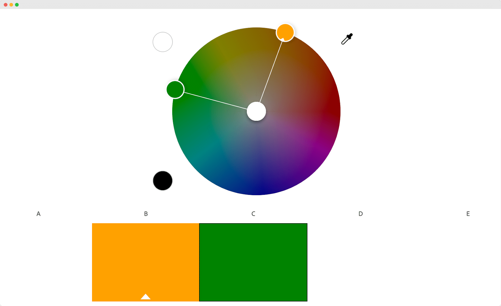
When you add a secondary color with another secondary color, you will find a tertiary color. These colors are usually darker than the intermediate colors.
🔵 Tetradic Colors
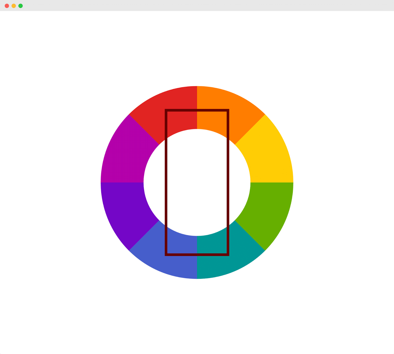
These types of colors are created by adding four complementary colors. When you form a rectangle on the color wheel and pick two sets of colors, it will create a triadic color scheme.
💡 What Is The Relationship Between Colors and Brand Awareness?
Color psychology is important for brands as it has the direct power of influencing people’s decisions. It can pass nonverbal messages to the customer and create an emotional connection with them. Therefore, while choosing your brand colors, you must understand color psychology to increase your brand awareness.
Color Schemes: How To Create Beautiful Color Combinations For Your Brand
So, what should you keep in your mind when choosing your brand colors? If you want to build an iconic color, you need to understand the color schemes. With color schemes, you can decode the color combination decision from any icon brand color. It can also help you to create new color combinations for your brand that can stand out.
🎨 Complementary Color Scheme
Complementary color schemes are the colors that you find on the opposite side of your selected colors in the color wheel. According to color theory, you need to pick one color that will be the focus of your design while the other one will create some contrast. However, you should pair a warm color with a cool one to keep the focus on your primary color which will create a complementary color scheme.

Take a look at how Heineken used complementary colors in its brand logo. Red and green made this logo the logo stand out creating the perfect contrast.
🎨 Analogous Color Scheme
This type of color scheme you will see quite often. It is the combination of three or four colors that resemble one another. There must be a dominant color that will complement the rest chosen from a different color trait.

The Slack logo is a good example of using an Analogous color scheme. This logo is not only pleasing to the eye but also draws attention.
🎨 Triadic Color Scheme
Triadic color schemes can help you to create bright and vibrant colors. These colors are chosen by creating a triangle on the color wheel. These colors are usually highly contrasting and attract people very easily.

While talking about Triadic color schemes, Fanta used them brilliantly with modern, vibrant, and engaging colors. The Fanta brand logo portrays excitement which is exactly what a soft drinks company needs.
✨ How To Use Color Techniques To Create Color Combinations?
Color combinations are extremely crucial to understanding if you want to pick the right colors for your design. You can pick any color from the color wheel, however, you need to be careful when choosing another color for combining it into your design. You need to understand the light contrast and light to create the perfect combination.
💡 Color Psychology: Why Specific Colors Matters In Branding?
When you are choosing a brand color, you need to be aware of the colors that you are choosing. Because specific colors can portray specific means, when you choose the perfect brand color for your brand, it will help you to visually communicate and send your brand message with ease.
While green means natural and organic, red and yellow portray positivity and passion. Similarly, every color portrays a specific message which is why you need to be aware while choosing your brand color.
📣 Choose The Ideal Color For Your Brand & Increase Brand Awareness
As the colors can speak for your brand, you need to have knowledge of colors. Understanding color theory can help you to make conscious decisions while picking colors for your brand. We hope this blog helped you to enhance your knowledge of color theories.
So, don’t forget to subscribe to our blog for similar blogs, guides, and tutorials. Also, feel free to join our Facebook community to share your thoughts.


![[New Extension] How to Show Vertical Text on Elementor Websites?](https://essential-addons.com/wp-content/uploads/2025/11/Essential-Addons-New-Extension-Vertical-Text-Orientation-1024x576.jpg)


