Designing your own website with Elementor is fun when you have clear ideas about sections, columns, margin, and padding from the right Elementor tutorials. In this blog, we will show you a complete guideline to create Elementor sections, columns, margins, & paddings from the beginning. Sit tight and start reading. Hopefully, at the end of this tutorial, you will have all the basic ideas to customize your website with Elementor swiftly.
Why Beginners Should Create Websites With Elementor Website Builder?
When you start designing you will need to do coding, UI sketch, keep in mind UX, prototyping, etc. Without being an experienced developer, it’s kind of impossible to do everything all by yourself. And when designing websites in Elementor, you don’t need to do coding or designing. You will get every functionality as a widget with stunning designs. All you have to do is drag and drop the widgets on your website and edit the content. That’s why Elementor is getting more popular day by day for beginners.
Why is Elementor Website Builder Widely Suggested For Beginners?
Assuming you are an Elementor website builder user and its popularity brings you here to know in detail about Elementor columns, sections, margin, padding, and all. Have you ever wondered why Elementor website builder has gained so much popularity despite not being the first drag and drop page builder? Here, we are sharing the top reasons with you.
⭐ Elementor Website builder will give you codeless experience in creating your WordPress website. You won’t need to have knowledge about HTML, CSS, or PHP. Just following any Simple Elementor tutorial, you can complete creating the WordPress website.
⭐You will get a wide range of customization options. You can customize the appearance of almost everything, from widgets to your pages, Elementor columns to sections, and more without coding. Another major reason why Elementor website builder is so popular.
⭐ Another stunning feature of the Elementor website builder is, you can design your website in a live preview. So, at a glance, you can visualize the changes you are making are suitable for your web page or not. Also, you can get a sense of how your site looks on other devices, such as a smartphone, tablet, etc.
 ⭐ You can easily undo or redo your revision history with the Elementor Website builder. The plugin will store your changes. Therefore, anytime you want you can undo the changes and roll back to the previous version. Moreover, its codes are so optimized that they won’t affect your website loading speed and more.
Elementor Padding, Margin, Sections & Columns Explained: What Do They Stand For
With Elementor website building you can’t only add widgets and customize them, you can design the entire WordPress website’s Elementor columns, paddings, sections, margins, and more. Before taking a deep dive into the Elementor tutorial for beginners, let’s go through what Elementor sections, columns, paddings mean and where to find them.
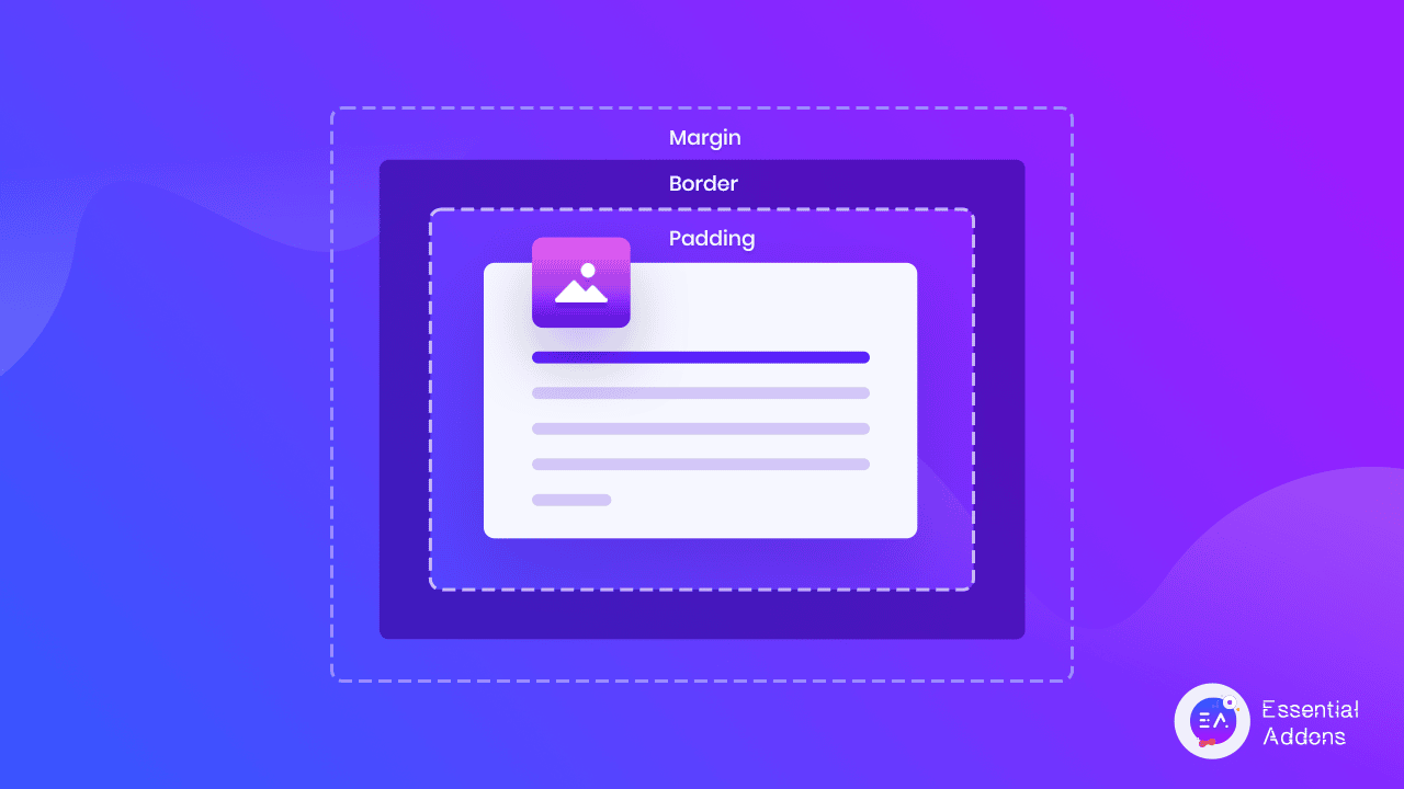
Source:w3school.com
Sections, margins, paddings, and columns are all part of the CSS box model, which is essentially a box that wraps around each and every HTML element. Here is what they mean:
- Content or section – In this part, the text and images will appear on your website.
- Columns – When you add contents side by side that will be called columns.
- Padding – It is an area around the content. For every content, padding is always transparent.
- Border – A border is kept around the padding and content
- Margin – When you keep an area outside the border. The margin is also kept transparent.
When you are working in Elementor website builder, you will find all these similar attributes there to design your website. Moreover, Elementor provides an entire panel to adjust Elementor margin and padding of your sections and columns.
Beginners Tutorial For Elementor Columns: How To Design & Manage
You can create multiple columns under one section of Elementor. Whenever you try to add a new section to your page, you will find the pre-built layout for Elementor columns. You can select Elementor columns layouts easily from there.
In Elementor website builder, you can create columns after creating a single section also. To do this add a section first. Now right click on the section and select Add Column. For each new click, a column will be added.
You can customize the Elementor column length, alignment, HTML tags, and many more. Just by clicking on the column section, you can customize your content’s appearance. Have a look at how it has turned out.
Elementor Tutorial On Padding: How To Use & Customize
From the basic introduction of this Elementor tutorial, hopefully, now you know what Elementor padding is. Like the Elementor margin, every element has its own padding in the Elementor page builder. It’s time to see how to customize adding in this Elementor tutorial.
Select the element you want to customize its padding from Elementor website builder. Now go to the Advanced panel and you will find the Padding section there. You can change the padding of four sizes together or change padding separately. Check out the changes.
Elementor Tutorial: How To Design & Customize Elementor Sections
Elementor sections serve the same purpose as HTML sections, holding the content. In this Elementor tutorial, we will explore what various things you can do in sections. First, open a web page and create a new Elementor section by clicking the Add icon. Under one section, you can add multiple columns, inner-section, and so on.
After adding elements in Elementor sections, you can customize them easily. Go to Advanced tab. There you will find the options to add padding, and margin for a total section as well as individual elements.
Add Customized Sticky Layouts That Stay in Column
With the Elementor Pro 3.2 update, website visitors can create a sticky layout that begins when the previous one ends, providing a consistent and transparent experience on the site. You can utilize the Inner Section Widget if, for example, you want to display a timeline on your website with changing dates and images that appear as the user scrolls.
Elementor Tutorial On Margin: How To Use & Customize
Let’s focus on the Element margin. Margin is a mandatory part for every element of Elementor page builder. To explore Elementor margin and customization, follow the below Elementor tutorial.
First, add elements to your page. It can be a text section, image, FAQ, etc. then navigate to the Advanced panel and there you will find the Margin control section. In Elementor page builder, initially, all elements margins are set to zero. But you can customize them. Add values in the field. You can add the same value for the top, bottom, right, and left margin, or put different values for different sections.
You can use Elementor margin to adjust your element into the section or bring a new appearance. Check out how the element position changes when you change its Elementor margin.
Common Elementor Sections, Column, Magrin, & Padding Mistakes, & Solutions
When you start to learn something new, it’s pretty obvious that there will be a lot of mistakes. The same thing is true while creating a website with Elementor columns, sections, margins, and paddings. To stay advanced, we have listed some common mistakes that are made when working with Elementor website builders.
Elementor Columns & Space Widgets for Positioning Elements
People often make the mistake of adding unnecessary Elementor columns under sections, when it is necessary to align elements when creating websites with Elementor. You may think it helps you to keep the element in the right position, but it is detrimental to your page. By adding an Elementor column to your page, you are adding markup to your HTML, which acts as a skeleton for your page.
As a result, all that extra markup adds up, making systems work harder, eventually tipping the balance on how long your page will take to load. Further, using empty ‘content’ elements to arrange your layout gives the wrong impression to search engines, which results in your ranking being lowered.
Solution: Use Elementor Padding & Margin
In the Elementor website builder, every element and widget has margin, padding, and Z-index parameters. In the Style and Widget content tabs of many gadgets, you will find additional alignment and positioning options. Utilizing these options, Elementor website builder ensures you use only the minimum amount of data for your code. Also, keeping this data in CSS instead of markup code prevents the need to add additional code to the markup. The spacing can also be copied & pasted using Paste Style.
Use Of Inner-Section Widget Incorrectly
When you want to keep multiple types of elements in the same Elementor column, users use inner-sections mistakenly. They add elements under a single inner section which makes the design clutter and you can’t style separately that elements with Elementor padding, or margins.
Solution: Go For Regular Elementor Columns
The best way to set up an Elementor section is to click the Add New Section button, then select the number of columns you want. The advantages of this are that it keeps everything uniform in your section while allowing some things to be independent, like animated backgrounds and foregrounds, while maintaining a light markup pattern. When you only want to add an Elementor column to a section, right-click the column handle and select Add New Column.
How To Design Mobile Responsive Elementor Columns, Sections, Magrin, & Padding
You may encounter numerous issues with mobile responsiveness when you first begin building websites with Elementor website builder. The most common issues users face are breaking of text size, Elementor margin, padding, etc. Here are some cool tips and tricks to design mobile responsive Elementor columns, sections, margin, & padding.
How To Fix Text Size Of The Elementor Section
Open a page from your WordPress dashboard which you want to make mobile responsive. Now select a text Elementor section and navigate to ‘Style’ option. There in the Typography section, change the icon to ‘Mobile’. Now adjust the text size of that Elementor section.
How To Show Or Hide A Elementor Section For Mobile
To do this, select the Elementor section from your page you want to customize or hide in mobile preview. Navigate to Advanced → Responsive section. From there you can control to show or hide that specific Elementor section.
How To Customize Elementor Columns For Mobile Responsive
To make your website adjust to your mobile screen, you can easily reverse Elementor column orderings. To use Elementor Columns ordering, go to Elementor Section Setting → Advanced → Responsive → Reverse Columns and set it to Yes. That’s it.
Bonus: Get Ready Elementor Templates With Elementor Margin, Columns, Sections & Padding
Elementor website builder will support you with an unlimited ready template library, like Templately, Envato, Elementor templates, and many more. By using these templates you can easily create stunning websites without any coding and design knowledge. Let’s explore 4 stunning templates where Elementor columns, margins, and paddings are maintained perfectly.
MarketerPro – Personal Marketer Website Template
This ready Elementor template is suitable for creating portfolios for marketers, marketing consultants, marketing advisors, business consultants, business coaches, business advisors, digital marketing, anyone offering similar services. With MarketerPro freelance marketers create their portfolio or freelancer websites.

In this Elementor template pack, margins and padding for every section are nicely maintained. Moreover, MarketerPro is 100% responsive and has cross-browser compatibility. So the designs won’t break into different devices.
Delibox Courier Service Website Template
Another nice example of Elementor sections, columns, padding, and margin is Delibox template from Templately. If you are planning to create a delivery website with Elementor, then this template is right for you. Also, you can use this ready Elementor template for delivery companies, courier companies, transportation, or logistics companies.

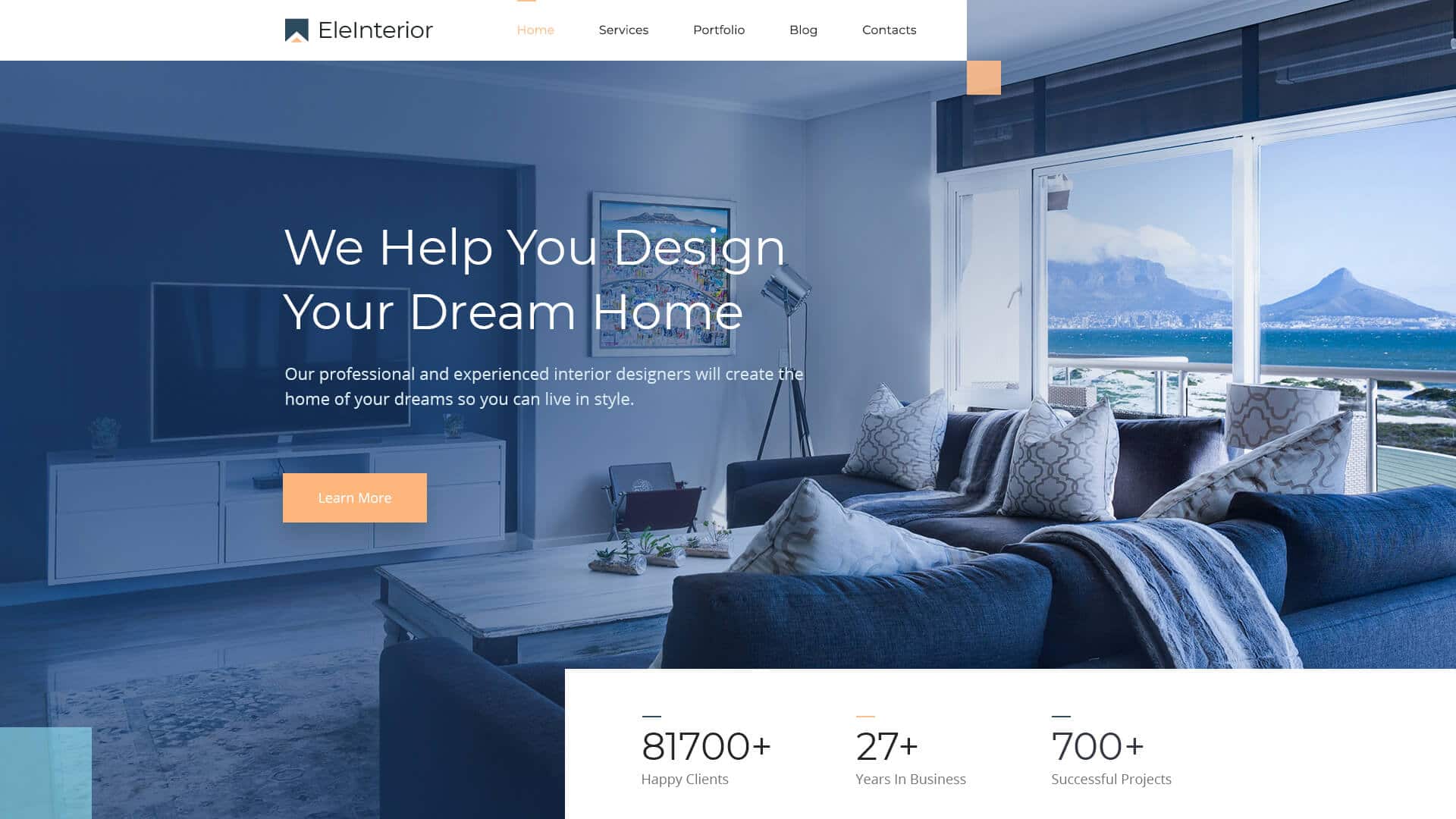
EleInterior WordPress Template For Interior Design
When you are planning to create for your interior design company, you may need to create a website with Elementor’s perfect margins and paddings. EleInterior ready Elementor template can help you to create an eye-soothing website. You won’t have to worry about the Elementor column, padding, or margin of your website. Moreover, you can use this template for an interior design studio, interior decorating, home design, office design, architecture, architects, home decor, or other similar services.
If you are reading these sections, that means you have got a detailed and in-depth idea of how to use Elementor sections, columns, margin, and padding from the Elementor tutorial. So start designing your website following this Elementor tutorial today.
If you have enjoyed this Elementor tutorial, then don’t forget to express your thoughts via comments or by joining our Facebook community. Also, subscribe to our blog to stay up to date with the latest Elementor tutorials, insights, and more.
