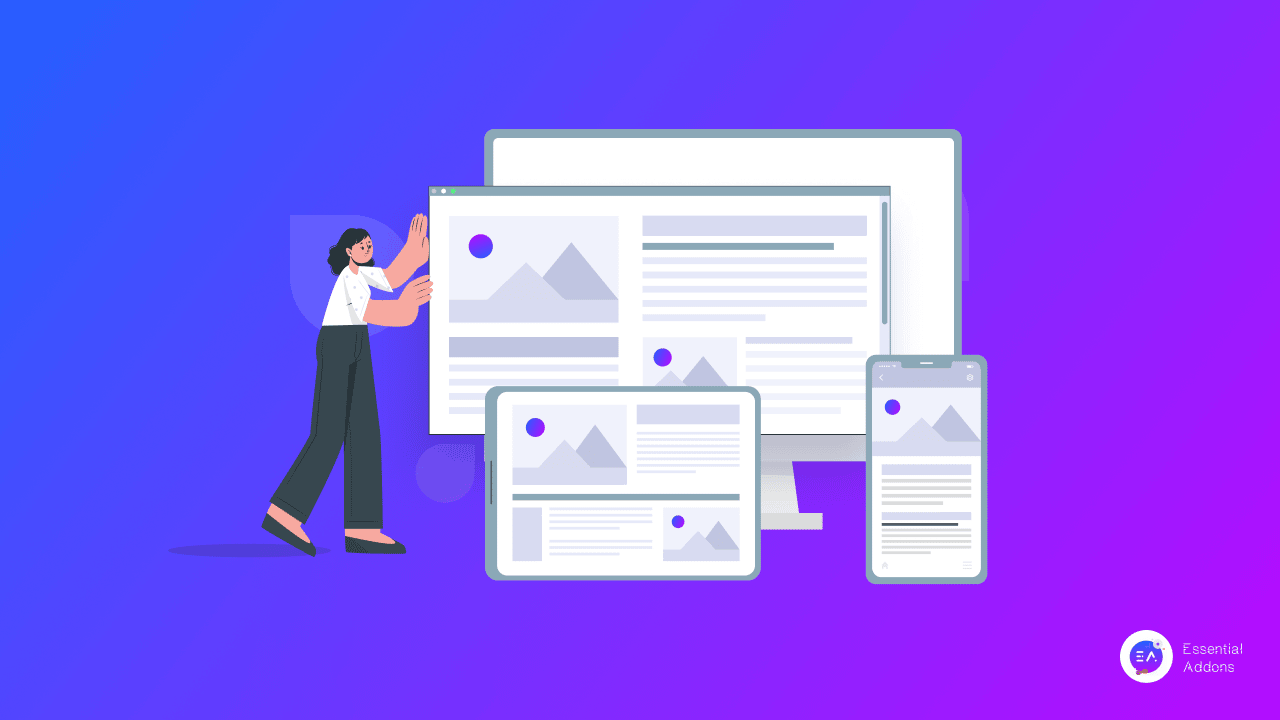
Responsive web design is one of the essentials that you must have to ensure while planning or developing a website. That’s because the whole user experience is depending on your website responsiveness. It helps to make your website pages look the same on all device types.
It could be a computer, laptop, mobile device, or any small to large environment. The design of your website will be unbreakable and constant for your site visitors to ensure the excellence of the user interface and the whole experience. Want to know more details about it and the key elements of responsive web design, then let’s dig deep into this blog below:
What Is Responsive Web Design?
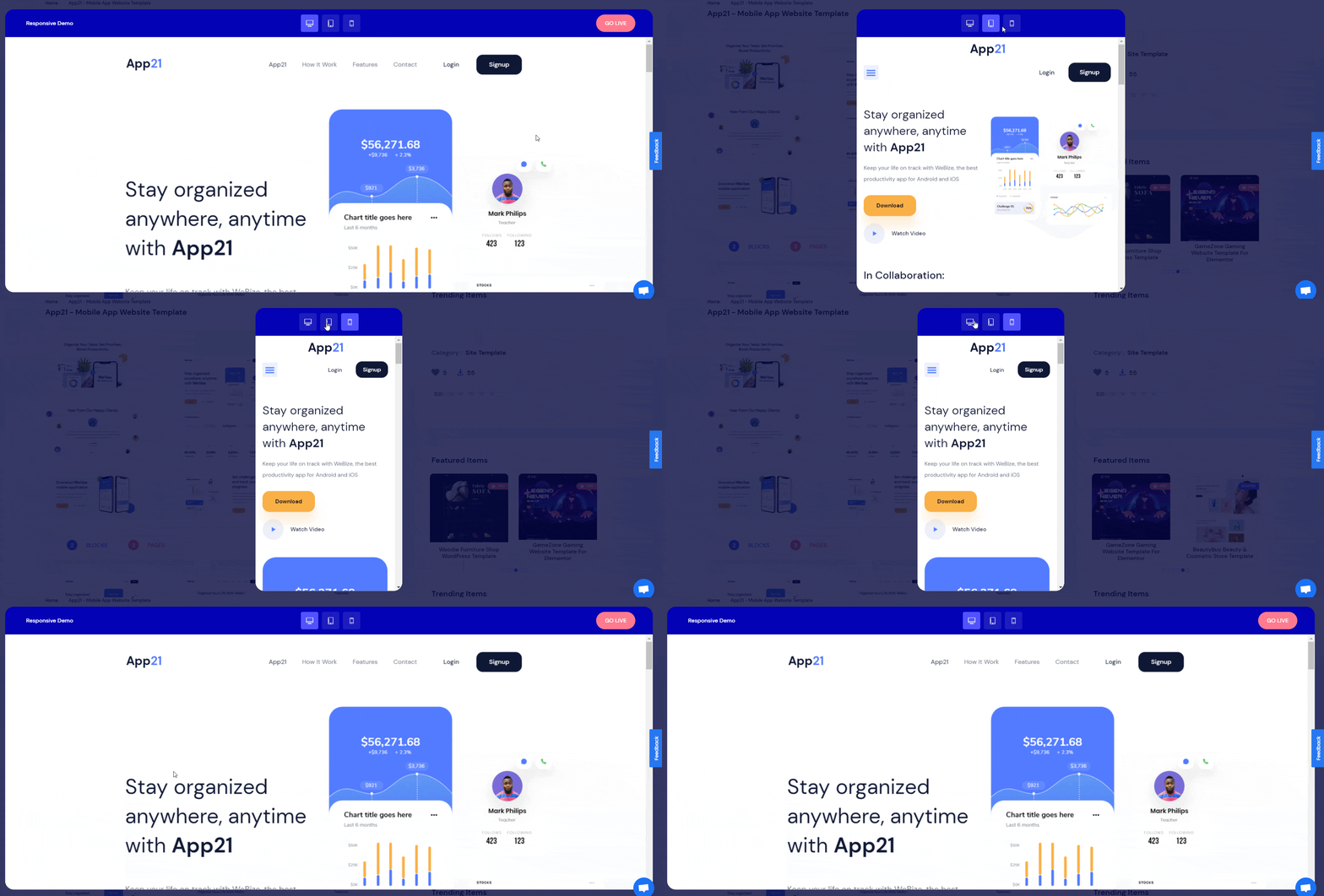
Responsive web design is one of the web development processes which provides dynamism to the outlook of your website. This can be dependent on your device screen size, orientation, and overall structure. It depends on your website each grid that will rearrange your content and whole design components.
If you want to define responsive web design, it can easily be described by the user experience of visualizing your website from any type of device will remain the same. That means the outlook, content, and overall structure of your site will not break whatever device your user may use. So if your website design is responsive, then your website layout on a computer screen, mobile, laptop, tab, or any device size is fixed and unbroken. According to the GobalStats survey, 54.25% are mobile users, 42.9% are desktop users, and 2.85% are Tablet users, and so on.
Difference Between Responsive & Adaptive Web Design
When you are designing your website you must have to know about these two types of patterns. One is adaptive design and another one is responsive web design. Take a look below to know each of the types of real functions below:
Adaptive Web Design
Adaptive web design is defined when you are working on the design part of your website, the structure of your site will be different and maintain a unique style for each of the devices. The outlook of your website will not be the same but unique is called adaptive design. The formation of adaptive design is totally in contrast to responsive design patterns.
Responsive Web Design
Responsive web design is the one where your website outlook will fit any device type according to screen size, orientation and structure will remain the same and unbreakable. So when you are making your website responsive, it will then fit with separate browsers, resolutions, different screen types.
Top 3 Benefits of Responsive Web Design
As you have already known in detail about responsive web design, here in this section we are going to highlight three top benefits of responsive web design. This section will help you to know why it carries that much importance nowadays. Check out in-depth below:
1. Better User Experience
When you are ensuring responsive web design, you don’t have to worry about your user experience anymore. Because desktop, mobile, tablet all types of customers can view your website and make your online business and presence successful.
2. Easily Rank Site on SEO
If your website is responsive, it will then automatically be helpful for your search engine score. Google or other search engines will easily pull your website on crawling and make it on the top of your custom search with ease.
3. Cost-Effective Than Before
Earlier a single website had two types of design, one for desktop users, another one is for mobile users. As time passes, right now if you make your website responsive, it will be every type of device user just by configuring once. It saves time and costs both at the same time.
How To Consider Your Responsive Web Design Is Good To Go?
Several things that you must have to ensure to make your web design responsive is fully functional that will work great and follow all the latest design trends are mentioned here in this section. Find out in detail:
1. Take A Look At Your Typography
You have to ensure that you have maintained your entire site typography like font type, size, color, line lengths, and others. It defines your brand’s online presence, user experience, and interactive appearance of the website for your valuable customers or visitors. Check out this detailed Elementor web typography guide and get it clear.
2. Reduce Your Page Load Time
Whether your website is built with WordPress or other mediums, page load time is one of the major issues that you have to get an update on and solve immediately. It helps you provide your customers a great user experience and improve your website’s performance in search engines. So when your website is fully responsive, it will surely reduce your website page load time.
3. Selective About Your Media Files
You have to be selective about your website media files. It has to be compressed without breaking the quality and can reduce your page load time and make your website faster. So you have to be careful about your media file selection.
4. Make Your Website Accessible For All
Design your website in a way that your customers browsing experience will remain the same for all types of browsers. It will make it accessible for all users, types like techy, non-techy, or belonging to any profession can easily view and browse your website from anywhere without any hassles.
5. Clear Navigation Experience For Users
When you are making your website responsive, you have to make your website navigation easily understood and ensure friendliness for customers. For a better user experience, the navigation of your website should be easily understandable and functional for your user base.
Complete Guide: 5 Key Elements Of Responsive Web Design That You Must Have To Know
There are some key factors that you have to consider when making responsive web design. Here you will get a list and a detailed description of each of the key elements of responsive web design is given below:
- CSS & HTML
- Flexible Grid
- Responsive Images
- Media Queries
- Ensure Speed
Proper Utilization of HTML & CSS Codes
HTML stands for Hyper Text Markup Language and CSS stands for Cascading Style Sheets are two major elements that you have to use in a continuous process to make your web design responsive. The whole layout, style of your website, even color, alignment, spacing with lots of other essentials has been fixed implementing CSS & HTML codes.
For instance, HTML helps to control the structure, elements, content of your entire website and create a responsive web design. So if you have to add an image with your required size, you can do it easily by using these codes below:
<img src=”image.gif” alt=”image” class=”full-width-img”>
If you want you can now fit all of your HTML images on your website with more perfection that will help you make your website image content responsive following the below CSS style sheets:
img {
width: 100%;
}
Even if you want, you can make this happen only for your preferred image by calling this style sheets code below:
.full-width-img {
width: 100%;
}
Make Your Website Design Responsive With Flexible Grid
Organizing each component of your website that helps to manage the entire visual structure like typography, images, margin, padding, any individual elements, or others are included in a website grid design. You have to ensure each placement, orientation to make your website’s different grid layout flexible, and responsive.
As you know, different websites have their own design pattern maintaining the basic web design structure and making the design responsive. This is why a flexible grid layout has to ensure it is one of the key elements of responsive web design.
Insert Responsive Images & Make Your Website Content Responsive
When you are designing your website and the aim is to do responsive web design, you must have to make your images responsive that will fit your website environment and provide your visitors a great user experience. You have to scale your images with HTML codes that we have mentioned above to manage the width of the image.
This is also true for image height, weight, position, pixel, and others. If you make this happen on your responsive web design, it will then also ensure your site speed and lesser content load time and make your website faster.
Build Multiple Responsive Layouts Configuring Your Media Queries
Media Queries is one of those key elements of responsive web design that web developers, designers must have to ensure. It basically helps you to create multiple layouts on your HTML document with your CSS stylesheets. This will scale the look of your website’s exclusive features, browser size, windows size with other parameters. It could be landscape portrait design, defining the entire screen resolution, color, orientation, and more.
If you once implement the media queries fully functional on your website design, your website can visualize with the right way in all screen types, not only the mobile or tablet screen.
The below example of media queries is only to make you clear about the concept of maintaining it and that is depended on the device width:
<link rel=”stylesheet” media=”(max-device-width: 320px)” href=”mobile.css” />
<link rel=”stylesheet” media=”(min-width: 1600px)” href=”widescreen.css” />
Ensure Speed of Your Website With Responsive Web Design
Making a responsive web design is not an easy task, with all the other four key elements, you have to make sure the speed of your website. To do this you have to ensure flexible layouts with grids, images, contents, solve the caching issues and others will make it happen. Besides, optimize your images, use lightweight, advanced codes, stylesheets, and more. And all this is true for any website design including a WordPress site.
Facing Difficulties To Make Your WordPress Site Responsive?
If you want to make your WordPress website responsive you need to use a responsive theme layout that will control your entire site design. To do so you can use the default Twenty Twenty theme or can use Flexia the versatile, powerful theme for your WordPress website.
This is not yet, if you are using Elementor the popular page builder of WordPress, you can then use ready, responsive templates to make your website stunning, lightweight, and faster with Templately the ultimate templates cloud for WordPress with 1000+ ready, in-built responsive theme layouts collection.
Hope you find this helpful and feel free to share your thoughts with us by commenting below. If you want to read more exciting blogs, visit our blog page, and join our Facebook community to get along with all WordPress experts.
