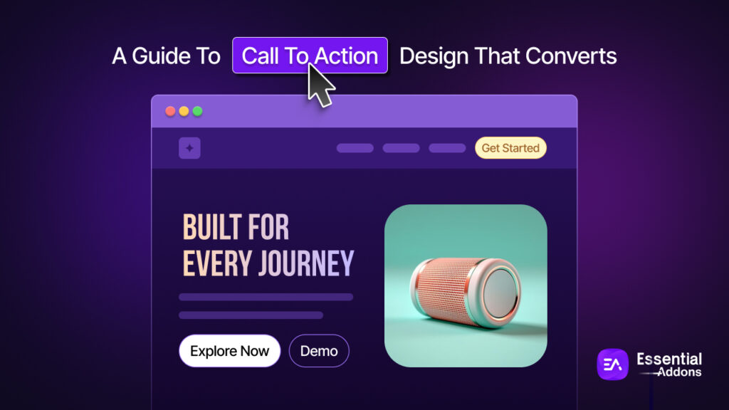
Every page on your website has one job: to move a visitor closer to becoming a customer, subscriber or lead. And right at the center of that job sits your Call to Action (CTA): a button, a link or a prompt that says, “Here’s what to do next.”
But here is the uncomfortable truth: most call to action designs are forgettable. They appear in the wrong place with the wrong color, or written with words so vague that visitors simply scroll past them. A weak CTA means a leaking funnel, and a leaking funnel means lost revenue, no matter how good your traffic or your product is.

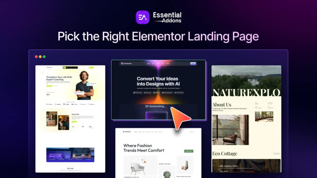
This guide covers everything you need to design CTAs that genuinely convert, from the psychology of color and copy to placement strategies, mobile optimization, A/B testing, and how tools like Essential Addons for Elementor make the entire process easier for WordPress users.
TL;DR: High-Converting CTA Design at a Glance
Designing a CTA that converts comes down to five core principles: the right words, the right look, the right placement, the right psychology, and continuous testing. Here is everything you need to know with a quick-reference table.
| Principle | What It Means | Quick Win |
| Copy | Use first-person, benefit-focused language | Change “Start Your Trial” → “Start My Free Trial” |
| Color & Contrast | CTA must visually stand out from the page | Pick a color that appears nowhere else on the page |
| Button Size | Large enough to notice, proportional to the page | Minimum 44×44px on mobile — bigger for primary CTAs |
| Placement | Put the CTA where intent is highest | Above the fold for simple offers; post-benefits for complex ones |
| Copy Length | Short wins | Keep button text to 2–5 words maximum |
| Urgency | Tap into loss aversion — but only honestly | Use real deadlines, genuine stock limits, or actual countdowns |
| Social Proof | Reduce click hesitation near the CTA | Add a star rating, customer count, or one-line testimonial beside the button |
| Mobile Optimization | Mobile is the primary use case in 2026 | Use full-width buttons and sticky footer CTAs on small screens |
| Single Focus | One page, one goal | Remove competing CTAs — a single CTA can lift conversions by 266% |
| A/B Testing | Assumptions are not data | Test one variable at a time: copy, color, placement, or size |
What Is a Call to Action And Why Does It Matter?
A Call to Action is any element on a webpage that prompts a visitor to take a specific, desired step. It could be a button (“Buy Now”), an inline text link (“Download the free guide”), a form submission prompt, or even a phone number styled to stand out.
CTAs are the bridge between visitor interest and business results. A visitor browsing your site is curious and your CTA converts that curiosity into commitment.
The stakes are high. According to research, using a specific and clear CTA can increase conversion rates by 161%. Personalized CTAs perform 202% better than basic ones. And adding urgency to CTAs, such as a limited-time offer can increase conversions by as much as 332%.
In short, your CTA is not just a design element. It is one of the most strategically important pieces of content on your entire website.
The Anatomy of a High-Converting CTA
Before diving into specific tactics, it helps to understand the core components every strong CTA must have:
A Clear Action
The visitor should know exactly what will happen when they click. “Get My Free eBook” is clear. “Submit” is not. “Learn More” is vague. “See How It Works” is specific.
A Value Proposition
The best CTAs tell visitors not just what to do, but what they get. “Start Your Free Trial” communicates both the action and the benefit. “Sign Up” does not.
Visual Prominence
Your CTA needs to stand out from the rest of the page. This comes down to button color, size, white space and contrast: all of which we will cover in detail below.
Strategic Placement
Even the best-written CTA will fail if it is buried somewhere visitors rarely look. Placement is just as important as design.
Low Friction
The CTA should make action feel easy, not risky. Reducing perceived risk through free trials, money-back guarantees, or social proof nearby dramatically improves click rates.
CTA Copywriting: Words That Drive Action

The words on your CTA button are small in size but enormous in impact. Here is what the research and real-world testing reveal about writing CTA copy that works:
Use First-Person Language
Changing button copy from “Start Your Free Trial” to “Start My Free Trial” can significantly lift clicks. First-person language makes the action feel personal and self-initiated, not pushed.
Be Specific And Benefit-Focused
Generic CTAs like “Click Here” or “Learn More” tell visitors nothing about the value they will receive. Specific CTAs like “Get Instant Access,” “Download the Free Checklist,” or “See My Dashboard” communicate a clear benefit and reduce hesitation.
Keep It Short
Research recommends keeping CTA copy to 2 to 5 words wherever possible. Longer button text creates cognitive load. If you need to explain more, do it in the supporting copy around the button not on the button itself.
Use Power Words
Certain words trigger action and emotion. Words like “Free,” “Instant,” “Exclusive,” “Now,” “Proven,” “Guaranteed,” and “Limited” have been shown to improve CTA performance consistently. Use them intentionally — not as filler.
Create Urgency without Manipulation
Phrases like “Offer ends tonight,” “Only 3 spots left,” or “Join 10,000+ users” create urgency and social proof. However, manufactured urgency — fake countdown timers or false scarcity — destroys trust when visitors notice it. Use urgency only when it is genuine.
CTA Design: Color, Size, Shape And Contrast
The visual design of your CTA button is one of the most studied areas of conversion optimization. Here is what the data tells us:
Color Psychology in CTA Buttons

Color is one of the most debated topics in CTA design and for good reason: it matters enormously. Research shows that red and orange buttons generate 32–40% higher click rates compared to other colors in many contexts.
But the reality is more nuanced than “use red.” Here is a breakdown of the most common CTA colors and what they communicate:
Red: Creates urgency and draws immediate attention. Ideal for time-sensitive offers like “Buy Now” or “Limited Offer.” Brands like Netflix and Target use red to command attention. A famous A/B test by HubSpot (originally Performable) found that changing a CTA button from green to red increased conversions by 21%.
- Orange: Combines red’s urgency with yellow’s optimism. It radiates energy and enthusiasm without feeling aggressive. Orange is one of the most popular colors for high-converting CTA buttons and works especially well for non-corporate, friendly brands.
- Green: Signals trust, growth and a “go” response. Works well for CTAs like “Sign Up,” “Learn More,” or “Get Started.” Particularly effective for eco-focused brands and SaaS products.
- Blue: The most trusted color in digital marketing. Works well for CTAs on service-based websites, B2B platforms and anywhere trust is paramount. Brands like Facebook, LinkedIn and PayPal rely on blue to build reliability.
- Yellow: Grabs attention and evokes optimism. Best used sparingly, as yellow on white can be difficult to read. Works well on dark backgrounds.
The most important rule of CTA color is not which color you choose, but contrast. A CTA button must stand out from the surrounding page. A blue button on a blue background is invisible, regardless of how well blue converts in other contexts. Your CTA color should be the most visually distinct element on the page.
Button Size And Shape
Size matters, but proportionality matters more. A button that is too small gets overlooked. A button that is too large feels aggressive and clutters the design. The ideal CTA button is large enough to be impossible to miss, but proportional to the surrounding content.
On mobile, the minimum recommended tap target size is 44×44 pixels. Smaller than that, and users frequently mistype and bounce in frustration.
Button shape also influences perception. Rounded corners tend to feel friendlier and more approachable, while sharp-cornered rectangles can feel more formal and corporate. A slight shadow or gradient can make a button look “clickable” by giving it a three-dimensional appearance.
White Space
White space is a powerful tool that is frequently underused. Surrounding your CTA with adequate empty space draws the eye to it and prevents it from getting lost in visual noise. Do not crowd your CTA button with competing design elements.
CTA Placement: Where You Put It Is As Important As What It Says
You could have the most compelling CTA copy and a visually stunning button, but if it is placed where no one looks, it will not convert. Placement strategy is one of the most impactful and often overlooked dimensions of CTA optimization.

Above the Fold
Placing a CTA above the fold (visible without any scrolling) is the most widely recommended starting point. Above the fold CTAs capture visitors who are ready to act immediately, which is particularly effective for simple, low-friction offers like “Start Free Trial” or “Get a Demo.”
Below the Fold And Mid-Page
For complex products or services, asking for commitment before the visitor has understood the value can backfire. In these cases, placing the CTA mid-page (after a benefits section or social proof) or below the fold (after full explanation) gives visitors the context they need to say yes.
Repeating CTAs on Longer Pages
For long-form pages, detailed product pages, long-form blog posts, or comprehensive landing pages, repeat your CTA at key intervals. A practical structure is to place the first CTA in the hero section, a second after the benefits or features section, and a third at the end of the page. All repeated CTAs should lead to the same goal to avoid decision paralysis.
Sticky CTAs
A sticky CTA stays fixed on the screen as the visitor scrolls. This is particularly effective on mobile, where visitors may scroll through significant content before feeling ready to act. A sticky “Get Started” button at the bottom of the screen ensures the action is always one tap away.
Inline CTAs in Blog Posts
For blogs and content pages, inline CTAs embedded within the article text significantly outperform sidebar CTAs. According to research, inline link CTAs perform 121% better than standard sidebar CTAs. Placing a relevant CTA naturally within the content — when the reader is most engaged — is one of the highest-leverage moves for content-driven websites.
Mobile CTA Optimization: Non-Negotiable in 2026
With over 63% of web traffic now coming from mobile devices, designing CTAs for mobile is not optional; it is the primary use case. Yet many websites still treat mobile as an afterthought, leading to tiny buttons, cramped tap targets, and CTAs buried below the fold on small screens.

Here is what mobile CTA optimization requires:
- Thumb-Friendly Button Sizes: CTA buttons need to be large enough to tap comfortably with a thumb. The 44×44 pixel minimum is a floor, not a target. For primary CTAs on mobile, bigger is better.
- Mobile-First Placement: Your primary CTA should be visible on the first screen load without scrolling, even on a small phone display. Test your pages on actual devices, not just desktop browsers.
- Full-Width Buttons: On mobile, full-width CTA buttons are easier to tap and create a strong visual anchor. They also naturally align with the mobile reading pattern, which is a narrow vertical scan.
- Sticky Mobile Footers: A floating CTA button in the lower portion of the screen keeps the action accessible without interrupting the reading experience.
Optimizing CTAs for mobile can improve conversion rates by 32.5%, according to research, a significant lift from a relatively straightforward set of adjustments.
How to Build CTAs in WordPress with Essential Addons for Elementor
For WordPress users building pages with Elementor, Essential Addons for Elementor offers one of the most flexible and powerful ways to design, style and deploy CTAs without writing a single line of code.
The EA Call to Action Widget
The EA Call to Action widget is a dedicated CTA element that gives you complete control over every aspect of your CTA’s design and content directly inside the Elementor editor.
With the EA Call to Action widget, you can:
- Add a headline, subtitle and supporting content to give your CTA context and communicate value.
- Choose between two content types such as “Content” for custom text or “Saved Template” for using pre-built Elementor template designs.
- Add a primary CTA button with custom text and a destination URL, directing visitors to any page, product, or landing page on your site.
- Add a secondary button for situations where you want to offer two options — for example, “Start Free Trial” and “See How It Works.”
- Style everything visually using the Style tab: set max width, padding, margins, borders and box shadows for the container; modify the color and typography of the title and body text; and customize the CTA button’s color, border and shadow.
This makes it easy to apply all the best practices covered in this guide, from color contrast and button sizing to copy and layout without needing a developer.
👉 Learn More: How to Configure & Style EA Call to Action
Combining EA Widgets for Maximum CTA Impact
Essential Addons goes far beyond a single CTA widget. By combining multiple EA elements, you can build CTA sections with significantly higher conversion potential:
- EA Countdown: Add a countdown clock directly above or below your CTA to create genuine time-based urgency for limited offers, sale deadlines, or event registrations.
- EA Testimonial: Place social proof immediately adjacent to your CTA. Visitors who see a credible testimonial right before the button are significantly more likely to click.
3,000+ Pre-Built Elementor Templates via Templately
One of the most time-saving features of Essential Addons is its integration with Templately, a template library offering over 3,000 pre-built Elementor templates. Each of these templates includes professionally designed CTA buttons that already follow conversion best practices: high contrast, strategic placement, compelling copy structures and mobile-responsive layouts.
Using Urgency And Social Proof to Amplify CTA Performance
Two of the most powerful psychological drivers of CTA clicks are urgency and social proof. Used correctly, they dramatically amplify the impact of even a well-designed CTA.
To create urgency and social proof, try NotificationX. It is one of the most effective social proof marketing tools trusted by 40,000+ businesses worldwide.
Creating Genuine Urgency
Urgency works because of a well-documented psychological principle: loss aversion. People are more motivated by the fear of missing out than by the prospect of gaining something. CTAs that communicate a real deadline or limited availability tap directly into this instinct.
Effective urgency tactics include:
- Countdown timers for limited-time offers, flash sales, or enrollment deadlines.
- Limited stock/seat messaging — “Only 4 spots left” or “Less than 10 items in stock.”
- Time-bound language — “Today only,” “Offer ends Friday,” “Register by midnight.”
The critical caveat: urgency must be real. Fake countdown timers that reset on every page load are quickly noticed by returning visitors and destroy trust. Real urgency — a genuine sale, a genuine deadline, a genuine capacity limit — drives action without damaging your brand.
Using Social Proof Near CTAs
Social proof placed near your CTA reduces the perceived risk of clicking. It answers the subconscious question every visitor has before taking action: “Can I trust this?”
Effective social proof elements near CTAs include:
- Customer counts: “Trusted by 500,000+ users” is placed just below the button.
- Star ratings: A 4.8/5 rating badge next to a “Download Now” button adds immediate credibility.
- Short testimonials: A one-line quote from a real customer positioned adjacent to the CTA.
- Logo bars: Recognizable brand logos (“As featured in Forbes, TechCrunch, Wired”) elevate the perceived authority of the offer.
Research from Optimonk found that pop-ups featuring strong social proof elements had a combined average conversion rate of 42.3%, and nearly half of all visitors who saw them completed the desired action.
A/B Testing Your CTAs: How to Know What Actually Works
Every audience is different. What works for one website may not work for another. A/B testing is the only reliable way to discover what genuinely drives conversions for your specific visitors.
A/B testing means creating two versions of a CTA (changing one variable at a time) and splitting traffic between them to measure which performs better. The key is to change only one thing per test: button color, button text, placement, size, or surrounding copy. Changing multiple elements at once makes it impossible to know what drove the difference.
Variables worth testing include:
- Button copy: “Get Started” vs. “Start My Free Trial” vs. “Try It Free.”
- Button color: Red vs. orange vs. green, against your specific page background.
- Button placement: Above the fold vs. below vs. after the testimonials section.
- Button size: Standard vs. oversized.
- Surrounding context: With social proof vs. without, with urgency messaging vs. neutral.
- CTA type: Button vs. inline text link vs. form.
Common CTA Mistakes to Avoid
Even experienced marketers make these mistakes. Knowing them helps you avoid them:
- Too many CTAs on one page: Every additional CTA you add creates decision paralysis. Research shows that reducing the number of CTAs to a single primary action can increase conversion rates by 266%. One page, one goal.
- Vague button text: “Submit,” “Click Here,” and “Learn More” communicate nothing. Be specific about what the visitor gets.
- Poor contrast: A CTA button that blends into the page background is invisible. Contrast is the single most important visual principle in CTA design.
- No mobile testing: Designing on desktop and not testing on actual mobile devices leads to tiny tap targets, off-screen buttons and CTAs buried below the fold on phones.
- Ignoring the surrounding context: A CTA does not exist in isolation. What is the headline above it? Is there social proof nearby? Is there a competing visual element drawing attention away? The context around your CTA is as important as the CTA itself.
- Fake urgency: Countdown timers that reset, “only 2 left” messages that never change — visitors notice, and they stop trusting you. Only use urgency when it is genuine.
Build High-Converting CTAs for Your WordPress Website
Designing a CTA that converts is not about finding a magic button color or a single power word. It is about understanding your audience, communicating clear value, removing friction and systematically testing what works.
The best CTAs are the result of thoughtful copy, deliberate visual design, strategic placement and ongoing optimization. Each element reinforces the others and getting all of them right is what separates high-converting websites from mediocre ones.
For WordPress users, Essential Addons for Elementor provides the tools to implement everything in this guide visually and without code, from the EA Call to Action widget and Countdown Timer to Testimonial elements and pre-built templates from Templately. It removes the technical barriers between your CTA strategy and your live website.
If you found this blog helpful, join our community to stay updated with the latest articles, product reviews and WordPress solutions. You can also subscribe to our blog for in-depth tutorials and tips.
FAQs (Frequently Asked Questions)
What is a Call to Action (CTA) and why does it matter?
A Call to Action is any element on a webpage — a button, link, or prompt — that directs a visitor to take a specific next step. It matters because it is the direct bridge between visitor interest and business results. A clear, well-designed CTA can increase conversion rates by up to 161%, while a vague or poorly placed one silently drains your funnel.
What makes a CTA button high-converting?
Five elements work together to make a CTA convert: benefit-focused copy (telling visitors what they get, not just what to do), strong visual contrast so the button stands out, strategic placement where intent is highest, low friction through social proof or guarantees nearby, and a single focused goal per page. Getting all five right is what separates high-performing CTAs from forgettable ones.
Which CTA button color converts best?
There is no universally “best” color — contrast is what matters most. Your CTA button should be the most visually distinct element on the page. That said, red and orange buttons consistently generate 32–40% higher click rates in testing across many contexts. Red works well for urgency-driven offers, orange for friendly and energetic brands, green for trust-based actions, and blue for B2B and service platforms. Always test against your specific page background.
Where should I place my CTA on a page?
It depends on your offer’s complexity. For simple, low-friction offers like a free trial or demo, place the CTA above the fold so visitors who arrive ready to act can convert immediately. For complex products or services, place it mid-page after your benefits section or below the fold after full explanation. On long pages, repeat the CTA at key intervals — hero section, after benefits, and at the end — all pointing to the same goal.
How do I optimize my CTA for mobile?
Mobile optimization starts with button size — the minimum tap target is 44×44px, but bigger is better for primary CTAs. Use full-width buttons on small screens for easy tapping, ensure the CTA is visible on the first screen load without scrolling, and consider a sticky footer button that stays accessible as the visitor scrolls. With over 63% of web traffic coming from mobile, testing on actual devices (not just desktop browsers) is non-negotiable.
How does the Essential Addons Call to Action widget help with CTA design?
The EA Call to Action widget gives WordPress and Elementor users complete visual control over every CTA element — headline, description, primary and secondary buttons, colors, typography, spacing, and hover states — without writing a single line of code. It also integrates with the EA Countdown widget for genuine urgency and the EA Testimonial widget for social proof placement. Combined with Templately’s 3,000+ pre-built Elementor templates, it removes every technical barrier between your CTA strategy and a live, optimized page.