Most visitors do not read your website. They land on the site, glance at the top, scroll a little, maybe hesitate. Where do they click next? Can they find what they need quickly? Does the site feel trustworthy? And decide within seconds whether to stay or leave. In those quiet, almost invisible moments, the website headers and footers are doing the heavy lifting. They guide where users go next, what they notice, and how confident they feel navigating your site.

On many Elementor websites, these small sections work like silent guides shaping the entire browsing experience. The website header sets the tone, directs attention, and helps visitors take the first step, while the footer reinforces trust, answers key questions, and offers a clear path forward. Together, Elementor header and footer, influence how people navigate your site, what they remember, and whether they stay or leave. And because these sections appear across every page, even small improvements like cleaner menus, better spacing, and smoother mobile behavior can dramatically improve UX without requiring a full redesign.
TL;DR
Too long? Didn’t read? Here is the quick summary of what you will get in this blog post.
| What you will find | Quick takeaway |
| Why headers and footers matter | They influence navigation, trust, consistency and usability across the full site |
| What makes a strong Elementor header | Clear hierarchy, concise menus, visible CTA, mobile-friendly structure |
| What makes a strong Elementor footer | Provide useful secondary links, trust signals, contact info, and low-friction discovery |
| Which is the best UX strategies that work | Simplify choices, keep layouts responsive, use spacing well and stay consistent |
| Where Essential Addons helps | Adds flexibility for navigation and layout enhancements in Elementor |
Why Headers And Footers Matter in Elementor Website
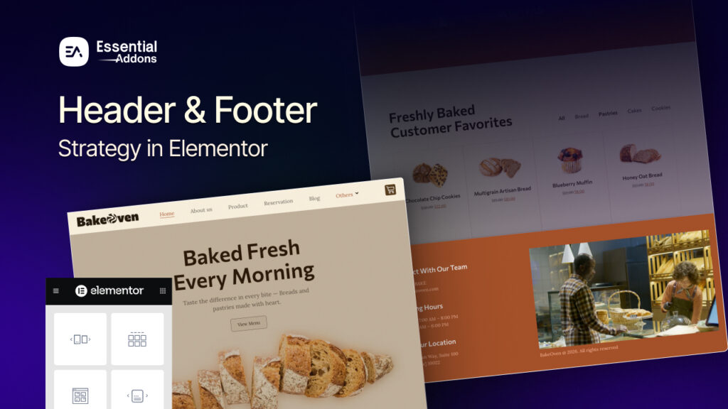
In Elementor, the website header and footer are not just decorative site parts. They are repeated experience layers that help visitors orient themselves, find the next action and understand your brand faster. Elementor makes it easier to manage headers and footers consistently across your website. At the same time, good UX design focuses on simple navigation, responsive layouts, and readable typography. That is exactly why a thoughtful Elementor header and footer setup often improves the whole site more than a flashy one-off page section.
Shape First Impressions
The website header of a website is usually the first structured area a visitor sees. It introduces the logo, navigation and often the primary action. If that area feels cluttered, unclear, or visually heavy, users start working before they start browsing.
A clean header gives users confidence. They know where they are, what the brand is and where to click next.
Reduce Friction
Navigation is a UX task, not just a design choice. The website header carries primary pathways, while the footer supports secondary exploration. In practical Elementor workflows, menus, hover states, icon visibility, and layout alignment all contribute to whether users move smoothly or hesitate.
Create Consistency
One of the biggest strengths of the website header and footer in Elementor is that they can be managed as reusable site parts. That means your branding, structure and visual language can stay aligned across landing pages, blog posts, archives and more. Consistency lowers cognitive load because users do not need to re-learn the interface on each page.
Support Accessibility
Headers and footers are also semantic and usability layers. Elementor has emphasized assigning meaningful theme-part tags such as <header> and <footer>, which can support accessibility and on-page structure. Add readable typography, contrast-aware styling, and sensible spacing, and these sections become easier for both users and machines to understand.

Practical Elementor UX Strategies for Headers And Footers
A strong header and footer strategy is rarely about adding more. It is usually about choosing what deserves to stay visible on every page and making those choices easier to scan.
Focused Header Section
A header should guide, not overwhelm. Use the checklist below to keep your navigation focused and effective, which can be the best practice for a header menu on an Elementor website.
Best practice checklist:
- Keep the main menu short
- Limit competing CTAs
- Make the logo visible but not dominant
- Reserve utility links for the footer if they are not critical
- Use hover states to clarify interactivity

The more decisions you force into the website header, the weaker the experience becomes. A good Elementor header strategy is often built on subtraction.
Use Spacing to Create Clarity
White space is one of the simplest ways to improve UX. It helps important elements breathe and gives the eye a clear path between logo, navigation, and action areas. Creative use of white or negative space is a best practice when designing headers and footers in Elementor.
Where spacing helps most:
- Around the logo
- Between menu items
- Between social icons
- Above footer link groups
- Around search or CTA elements

Design Mobile-First Strategy
If the desktop version is doing too much, mobile will expose it. Responsive previewing and custom mobile header thinking are both emphasized in header/footer best practices for Elementor. That matters because navigation that feels manageable on a desktop can turn into friction on smaller screens.
Here is how header and footer elements should adapt across devices:
| Element | Desktop approach | Mobile approach |
| Navigation | Full primary menu | Condensed or simplified menu |
| Logo | Standard width | Smaller relative width |
| Icons | Supportive | Only keep high-value icons |
| CTA | Visible | Keep one clear action |
| Footer links | Multi-column | Stack for easy scanning |
Utilize Every Section of the Footer
A lot of websites treat the footer like leftovers. That is a missed opportunity. A strong Elementor footer strategy turns it into a destination for users who need reassurance, support, or one more path before converting.
Useful footer content includes:
- Contact information
- Secondary navigation
- Legal pages
- Social links
- Location or map
- Newsletter sign-up
- Short brand description

Keep Styling Consistent
Elementor’s broader editing direction has focused on making site parts easier to manage from one workflow, which reinforces a bigger UX principle: users should feel one coherent brand across the whole experience. Shared colors, typography, spacing rules and interaction styles make headers and footers feel intentional instead of detached.
A practical rule is simple: if the header of your website feels premium but the footer feels generic, the overall site experience drops.
Use a Layout Structure
A strong header or footer should not only look good in the initial stage of a website. It should also stay organized as you add more pages, links, campaigns and content over time. That is why layout structure matters so much. When these sections are built with a clear framework, they are easier to scan, easier to update and far less likely to feel crowded later.
A scalable layout should:
- keep important items visually separated
- prevent menus and utility links from competing for attention
- make future updates easier without redesigning the whole section
- adapt smoothly across desktop, tablet and mobile views
- preserve alignment, spacing and hierarchy as content changes
Style Links And Icons
Links and icons in the website header and footer should never feel like filler. They are small interface elements, but they play a big role in guiding attention and helping visitors move confidently through the site. When styled well, they make navigation feel smoother, actions feel more obvious and the overall design feels more polished.
To make links and icons work better for UX:
- Use clear contrast so links are easy to notice
- Add hover or active states to show interactivity
- Keep icon styles consistent across the section
- Give links and icons enough spacing to avoid accidental clicks
- Make sure tap targets are comfortable on mobile devices
- Limit decorative icons and keep only those that serve a purpose
How Essential Addons Can Strengthen Your Website’s Header And Footer UX
If your goal is to improve the website header and footer on the Elementor website without rebuilding everything from scratch, Essential Addons can add useful flexibility. Its own guidance around headers and footers emphasizes responsiveness, consistency, readable design and more creative layout possibilities through an extended widget library.Here are some of the widgets that will improve the UX of your Elementor website.
Advanced Menu for Flexible Navigation
The Advanced Menu widget by Essential Addons lets you display your navigation menu in different places on the site and is built to make navigation more user-friendly. That can be valuable when the default menu setup feels too rigid for your layout goals.

Why it helps:
- gives more control over menu placement
- supports more tailored header layouts
- can improve clarity in both header and footer navigation zones
One Page Navigation
For landing pages or single-page websites, One Page Navigation is especially relevant. Essential Addons describes it as a way to improve navigation and user experience for one-page sites, where jumping between anchored sections quickly matters.
This is useful when the website header needs to guide users through a narrative page without sending them elsewhere.

Ready Website Templates
Essential Addons offers 3,000+ ready Elementor templates through Templately. These templates include well-structured headers and footers designed with UX best practices in mind. These templates are designed in such a way that it follows the perfect strategy of UX to build and launch your website instantly. They also ensure a more seamless browsing experience, making it easier for visitors to navigate and engage with your site.
Common Mistakes to Avoid While Adding Header And Footer on Elementor Website
Even a well-designed Elementor website can lose UX value when the header and footer are treated as an afterthought. These sections appear across the entire site, so even small mistakes can affect navigation, readability and trust at scale. The goal is not to add more elements, but to make sure every item has a clear purpose and supports the user journey. Avoiding a few common issues can make your header and footer feel cleaner, more useful, and easier to maintain over time.
- Adding too many menu items in the header and making navigation feel crowded
- Using different styles for headers and footers across pages without a clear reason
- Ignoring mobile responsiveness and assuming the desktop layout will work everywhere
- Making logos, icons, or CTA buttons too large so they compete for attention
- Hiding important contact, policy, or support links deep in the footer
- Using poor contrast for links, icons, and text, which hurts readability
- Treating the footer like a dumping ground for random links and widgets
- Forgetting hover, active, and focus states for links and clickable elements
- Overloading the header with social icons, banners, and secondary actions
- Making updates without checking spacing, alignment, and overall visual balance
Make the Perfect Header And Footer Website Today
Headers and footers may be small compared with hero sections, landing page blocks, or product grids, but they influence almost every session on your website. They guide movement, support consistency, and shape how effortless the site feels from page to page. In that sense, improving the website header and footer in Elementor is not a minor design task. It is a UX upgrade with site-wide impact.
The best results usually come from a simple mindset: keep the website header focused, make the footer useful, design for mobile early, and maintain a consistent visual system across both. Do that well, and your Elementor website will feel clearer, faster, and more trustworthy without needing a complete redesign.Was this blog helpful? Do not forget to subscribe to our blog posts for more Elementor updates. You can also join our Facebook Community to stay updated with the latest articles.

