You launched your store, added a handful of products, and everything felt smooth. The pages looked great, the cart worked, and Elementor made the whole thing fun to build. Then your catalog grew. More products, more traffic, more pages, and suddenly things slow down. The shop page takes a few seconds too long. Editing one product means touching ten others. Your once-snappy site starts to feel heavy.
If that sounds familiar, you are doing everything in the right way. Scaling WooCommerce websites in Elementor is a different game from building them. Most store owners design for the version of their store they have today, not the one they will have in a year. And the gap between those two versions is where stores quietly start to leak speed, time and sales.
This guide walks through what actually changes as your store grows, the easy-to-miss mistakes, and the Elementor-specific habits that keep a big store fast and easy to manage. And one of those habits matters more than the rest: for most stores, the phone is now the main storefront, not the backup, so we will keep coming back to how each choice holds up on mobile.
Why WooCommerce Stores Break When They Scale in Elementor
A small store hides its weak spots. With 30 products, almost any setup will feel fine. The trouble starts when those same choices get repeated hundreds of times.
WooCommerce on its own is built to grow, but how you build on top of it matters a lot. As the official WooCommerce developer guidance on performance at scale points out, your store’s speed depends on many moving parts at once: the plugins you run, your hosting, the size of your catalog, and the custom work layered on top. Elementor sits right in the middle of that stack, so the way you use it shapes how well your store holds up.
The Hidden Cost of Building Product Pages One by One
Here is the most common trap. A store owner opens Elementor, designs a beautiful product page, and is happy. So they do it again for the next product. And the next. It feels productive because you can see progress with every page.
But this approach hides a cost that only shows up later. Every page you build by hand is a page you have to maintain by hand. The work does not happen once at launch. It comes back every single time something needs to change.
Say you decide your “Add to Cart” button should be bigger and a different color. On one page, that is a two-minute edit. Across fifty product pages, it is an afternoon. Want to add a trust badge under the price, a new payment-methods icon, or a short returns note? Same story: a small idea turns into a repetitive slog, so most owners quietly skip the improvement instead.
That is the real damage. It is not only the hours you spend, but it is also the changes you never make because they feel too big. Your store stops evolving because evolving has become expensive.
There is a second, sneakier cost too: drift. When you build each page by hand, tiny differences creep in without you noticing. A little more spacing here, a slightly different heading size there, a button that is not quite the same blue. Shoppers cannot always name it, but an inconsistent store feels less trustworthy, and trust is what moves a cart to checkout.
The math is what makes this dangerous. The effort of a hand-built store grows in a straight line with your catalog. A thousand products means a thousand pages to touch. That is exactly the wrong direction for something you want to grow. The fix is not to build faster. It is to stop building page by page at all, which is where templates come in shortly.
When Widgets Quietly Become Bottlenecks
Widgets are the heart of Elementor, and they are wonderful. But it helps to understand what a widget actually asks your store to do, because that is where the slowdown hides.
Every widget carries two kinds of cost. The first is back-end work: a widget like a product grid has to run a database query to fetch products, pull their images, prices, ratings, and stock status, then assemble it all into HTML before the page can load. The second is front-end weight: many widgets load their own CSS and JavaScript, so a page packed with sliders, carousels, counters, and tabs is also downloading and running a pile of scripts in the shopper’s browser.
On a small store, none of these registers. Thirty products and a trickle of traffic mean your server has plenty of room to spare, so even a busy page feels instant.
The picture changes under real conditions. Picture a homepage with a product grid pulling 60 items, three carousels, a few animated counters, and a heavy slider. Each of those runs its own work on every uncached page load. Now add fifty shoppers hitting that page at once during a sale. Suddenly, your server is doing all of that work fifty times over, at the same time, and the load time starts to climb for everyone.
The front end feels it too. More widget types usually mean more separate stylesheets and scripts to download, and some of them hold up the page until they finish. That is why a visually rich page can score well on your own fast connection and still feel sluggish on a mid-range phone.
The lesson is not “use fewer widgets and build a boring store.” It is to be deliberate. Ask each heavy widget to do less, show 12 products per page instead of 60, and lean on a small, consistent set of well-built widgets rather than piling on one of everything. A single maintained toolkit like Essential Addons’ Woo widgets makes that easier, since the pieces are built to work together instead of fighting each other.
As Your Database Grows, Performance Challenges Change
Everything so far has been about the parts of your store shoppers can see. But a lot of the slowdown on a large store happens somewhere they never will: the database underneath it.
WordPress keeps most of your content in two big tables, and every product, variation, and custom field you add lands there. A single product with a few attributes and a handful of variations can create dozens of rows on its own. Multiply that across a thousand products and you are running a genuinely large database, even when the storefront looks neat and tidy.
Here is why that reaches your shoppers. When someone filters by size, sorts by price, or searches your catalog, WooCommerce has to dig through all that product data to answer. On a small catalog, the answer comes back instantly. On a large one, those same queries have far more rows to scan, so filtering lags, search feels heavy, and busy category pages take longer to build.
Orders quietly pile on. For years, WooCommerce stored every order in the same core table as your pages and products, so a store making steady sales stacks thousands of orders onto an already crowded table. This one is worth fixing directly: WooCommerce’s High-Performance Order Storage moves orders into their own dedicated tables built for exactly this job. Newer stores often have it switched on already; older ones can turn it on in WooCommerce’s settings.
From there, light routine maintenance keeps things clean. Old post revisions, expired temporary data, and spam build up in the background, and a trusted cleanup tool can clear them on a schedule. It is also worth trimming “autoloaded” data, since some plugins load their settings on every page whether they are needed or not. On high-traffic stores, object caching with a tool like Redis lets the database remember the answers to common queries instead of recalculating them for every visitor, which takes real pressure off the back end.
The takeaway ties the section together. A fast store is not only about how your Elementor pages look and load. It is about keeping the engine underneath them clean, so the database can keep pace as your catalog and order history grow.
Build Once, Scale Everywhere: The Template-First Mindset
If there is one shift that separates stores that scale well from stores that struggle, this is it. Stop building pages. Start building templates.
How Do Templates Actually Save You Time at Scale?
Elementor’s WooCommerce Builder lets you design a single product template that every product then uses automatically. Instead of laying out each product by hand, you use dynamic widgets like Product Title, Product Image, and Product Price. Elementor fills in the right details for each product on its own.
So you design the layout once. Add a thousand products, and all a thousand follow the same clean design without any extra effort from you. Want to change something later? Edit the one template, and the change rolls out everywhere at once. That single habit turns hours of repeat work into minutes.
The same idea applies to your shop and category pages. With a WooCommerce archive template in Elementor, you control how every product listing looks from one place. New categories you add later just inherit the design. No rebuilding, no copy-paste.
Reusable Blocks Beat Page-by-Page Editing
Full templates handle your product and archive pages. But most stores also repeat smaller pieces everywhere: a “Why shop with us” strip, a shipping-promise bar, a returns note, a related-products row. Rebuilding those by hand on every page is the same trap as before, just smaller. Elementor gives you more than one way to reuse them, and the difference between them matters more than most owners realize.
The first is a saved template. You right-click a section or container, save it to your library, and drop it onto any page in seconds. This is a real time-saver for getting new pages up fast. But there is a catch worth knowing: a saved template is inserted as an independent copy. If you later change the wording in the library version, the copies you already placed do not change with it. Perfect for reuse, not for one-click global updates.
The second is a genuinely linked element. In Elementor Pro, a Global Widget stays connected to every place you use it, so editing it once updates every instance at the same time. The same is true of theme parts built in the Theme Builder, where your header, footer, single-product template, and shop archive are each controlled from one place. This is what you want for anything that must stay identical site-wide, like a promotion bar or a policy notice.
The rule of thumb is simple. If a block is just a convenient starting point you will tweak per page, a saved template is ideal. If it is something that must stay identical everywhere and change everywhere at once, reach for a global element or a theme template instead. Picking the right one up front is the difference between updating a promo in a single click and hunting it down across forty pages.
That is the quiet superpower of building at scale: your store grows in size, but your maintenance work stays small. Elementor’s own guide to customizing WooCommerce product pages leans on this same template-driven approach because it is simply the only way to keep a large store sane.
Performance Is a Scaling Problem, Not a Launch-Day Task
Speed is not something you fix once and forget. The faster your store grows, the more often speed needs your attention.
Cache Smart, But Protect Dynamic Pages
Caching is your best friend for speed. It serves a saved copy of a page instead of building it fresh every time, which makes things load much faster.
But here is the catch many store owners miss: some pages should never be fully cached. Your cart, checkout, and account pages change for every shopper. If you cache them like a normal page, customers can see the wrong cart or broken totals. Good tools handle this for you. Elementor’s advanced caching for WooCommerce automatically leaves the cart, checkout, and account pages out of full caching, so your store stays fast where it can and accurate where it must.
Manage Images And Query-Heavy Widgets
Images are usually the heaviest thing on a store page, and product sites are full of them. Turn on lazy loading so images only load as a shopper scrolls down. Optimize your images before you upload, or use a tool that does it for you. This one step alone can cut a lot of weight off your pages.

Then watch your query-heavy widgets. A product grid set to show 100 items in one go is asking your site to do a lot at once. Show fewer products per page, add pagination, and let shoppers load more only when they want it. Your pages stay light, and browsing stays smooth.
Watch for Plugin Bloat And Overlapping Tools
As stores grow, plugins pile up. One for sliders, one for filters, one for popups, one for grids. Many of them overlap, and each adds its own scripts and styles to every page load.
A cleaner path is to use one well-built toolkit that covers many needs at once, instead of ten single-purpose plugins fighting each other. Fewer moving parts means fewer conflicts, less weight, and an easier store to manage. If you want a deeper checklist, Elementor’s page speed optimization guide is a solid companion read.
The Storefront Experience That Holds Up at 1,000+ Products
A big catalog is only an asset if shoppers can move through it easily. When you have ten products, browsing is simple. When you have a thousand, the way you show and sort products decides whether people buy or bounce. This is where your WooCommerce widgets stop being decoration and start doing real work.
Product Grids, Carousels And Filtering That Stay Fast
Big catalogs need structure, and three WooCommerce widgets do most of that structural work: a clean product grid for browsing, a carousel for spotlighting bestsellers, and a strong filter so shoppers can narrow the field fast. The goal is to let people reach the right product in as few clicks as possible.
The product grid is your main browsing surface, so it has to stay light even when it is displaying dozens of items. Give it sensible column counts, pagination instead of one endless page, and image sizes that suit the layout rather than the full-resolution originals. A carousel earns its place differently: it puts a handful of hand-picked products, like bestsellers or new arrivals, front and center without loading your entire catalog into one heavy block.
Filtering matters most of all as you scale. A shopper who cannot narrow a thousand products by size, color, or price will give up long before they find the one they wanted. Good filtering is the difference between a large catalog that feels effortless and one that feels overwhelming. If you are weighing your options, this comparison of WooCommerce product filter plugins breaks down what good filtering looks like and what to avoid.
The practical win at scale is using these pieces as one consistent set rather than three mismatched plugins. A toolkit like the Essential Addons Woo widgets gives you the grid, the carousel, and filtering built to work together, which keeps both your design and your page weight under control as the catalog grows.
Quick View And a Smoother Checkout to Fight Drop-Off
The more steps you put between “I like this” and “I bought this,” the more people you lose along the way. Two moments deserve real attention here, because this is where a busy store quietly wins or bleeds sales: the browse-to-cart moment, and the cart-to-paid moment.
Start with a quick view. It lets a shopper peek at a product’s key details in a popup without leaving the page they are on, so they keep their place in the grid instead of bouncing back and forth between listing and product page. On a big catalog, that saved page load repeated dozens of times per session is real momentum preserved.
For a quick view to actually help, it needs to carry the details that drive a decision and nothing more. Show the image gallery, the price, the variation options like size and color, stock status, and an add-to-cart button right inside the popup, so a shopper can add and keep browsing in one motion. Keep it fast, keep it a preview, and let the full product page handle the deep detail. It matters most on mobile and on category pages, where the cost of a full page reload is highest.
Then comes checkout, where the real money is won or lost. A long or confusing checkout is one of the biggest reasons full carts get abandoned, and the fixes are concrete, not vague.
Cut every field you do not truly need. Second address lines, company names, and phone numbers you will never use each add friction, and friction on mobile is deadly. Offer guest checkout instead of forcing account creation up front, since making people register before they can pay is one of the most reliable ways to lose a sale. Show the full cost, including shipping, early rather than springing it at the final step, because a surprise total is a classic abandonment trigger.
Make the mobile experience effortless. Use large tap targets, trigger the right keyboard for each field, support autofill and address autocomplete, and offer express options like wallet or one-tap payments so returning shoppers can pay without typing card details. Place a small trust signal, a security note or a return-policy line, near the pay button where hesitation peaks.
This is exactly the moment to design deliberately rather than accept the default. A WooCommerce checkout widget like EA Woo Checkout lets you build a clean, modern checkout right inside Elementor, so you can trim friction at the precise spot where shoppers decide to buy. Small wins here, a tighter layout, fewer fields, a faster mobile flow, add up fast across a busy store.
The Quiet Differences Between Scaling And Just Getting Bigger: What Most Store Owners Miss
Everything above helps, but a few things slip past even experienced store owners. These are the small habits that separate a store that truly scales from one that simply grows heavier as it adds products.
Mobile Is the Main Store, Not the Backup
Most owners design on a big desktop screen and check mobile last. But the majority of store traffic is mobile, and mobile is where carts get abandoned most. Flip your habit. Check the mobile view first for your shop page, product page, and checkout. Use Elementor’s responsive controls to set proper spacing, font sizes, and column counts for small screens. A store that feels great on a phone will almost always outperform one that only shines on desktop.
Design Consistency Is a Scaling Tool
When you build page by page, small differences creep in. Slightly different button colors, mismatched spacing, headings that do not line up. Shoppers may not name it, but they feel it, and it chips away at trust. Templates and global styles fix this for free. One design system, applied everywhere, makes even a huge store feel polished and intentional.
Measure Before You Optimize
It is easy to “optimize” based on a hunch. Resist that. Test your real pages, see what is actually slow, and fix the biggest problems first. Maybe it is one heavy plugin. Maybe it is uncompressed images. Maybe it is a single page trying to load too much. Find the real bottleneck instead of guessing, and your effort goes much further. If you are starting from scratch on the basics, this complete Elementor WooCommerce guide is a good place to ground yourself.
Essential Addons Woo Widgets That Make Scaling Easier
This is where having the right toolkit pays off. Essential Addons for Elementor ships a full set of WooCommerce widgets built to handle exactly the growing-store problems above, all from one plugin instead of a dozen.
A few that earn their place on a scaling store:
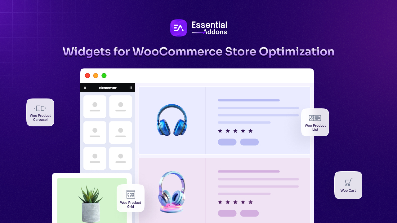
Woo Product Grid: Show your catalog in clean grid, list, or masonry layouts with up to six columns, built-in filtering by category, tag, or attribute, and quick view baked in. It is the workhorse for big browsing pages.
Woo Product Carousel: Spotlight bestsellers, new arrivals, or seasonal picks in a rotating carousel on your homepage or category pages, without cramming everything into one static block.
Woo Product List and Woo Product Gallery: Flexible ways to present products and product images so different page types stay interesting instead of repetitive.
EA Woo Checkout: Design a clear, modern checkout page right inside Elementor, so you can trim friction at the exact spot where shoppers decide to buy.
You can see the full lineup in this roundup of Elementor widgets for WooCommerce store optimization. The point is not to use every widget, but to lean on a single, well-maintained set so your store stays light and consistent as it grows.
If you would rather start from a polished base, Templately offers 3,000+ ready-made Elementor templates, including eCommerce designs, that you can import and adjust in minutes. It is an easy shortcut when you want a professional layout without building every section from zero. You can also browse these eCommerce website templates for Elementor for inspiration.
Build High-Performing WooCommerce Websites in Elementor
Scaling a WooCommerce store in Elementor is less about working harder and more about building smarter. The owners who struggle keep designing one page at a time, adding plugins as they go, and checking speed only when something breaks. The owners who win build templates once, keep performance in view as they grow, and design for the phone first.
Do those three things and your store can double or triple in size without doubling your workload or your load time. Pick the template-first habit, keep your pages light, and use a single solid widget toolkit instead of a messy pile. That is the quiet recipe most store owners miss. If you want a faster start, the Essential Addons WooCommerce widgets give you the building blocks to scale cleanly from your very next product.
Frequently Asked Questions
Why does my Elementor WooCommerce store slow down as I add more products?
Usually, it is a mix of small things stacking up: pages built one by one, query-heavy widgets loading too many products at once, large uncompressed images, and overlapping plugins. None of them hurt much on a small WooCommerce store, but together they drag down a large one. Switching to templates, turning on lazy loading, and trimming extra plugins fixes most of it.
Do I need Elementor Pro to scale a WooCommerce store?
The dynamic WooCommerce Builder, which lets you design single product and archive templates, lives in Elementor Pro, and it is the biggest time-saver for large stores. The free version still works for many pages, and toolkits like Essential Addons add powerful WooCommerce widgets on top. For a store that is growing fast, the template features make a real difference.
What is the best way to show a large product catalog in Elementor?
Use a clean product grid with pagination instead of loading hundreds of items at once, add strong filtering so shoppers can narrow choices quickly, and feature key products in carousels. Keep the number of products per page reasonable so the page stays fast, and always check how it all feels on mobile first.
How do I keep my checkout fast and reliable on a busy web store?
Never fully cache your cart, checkout, and account pages, since they are different for every shopper. Use caching that automatically skips those pages, keep your checkout form short and mobile-friendly, and remove any extra scripts you do not need. A short, fast checkout is one of the simplest ways to recover sales you would otherwise lose.