Every visitor arrives with one question: where do I click? Most menus make them guess.
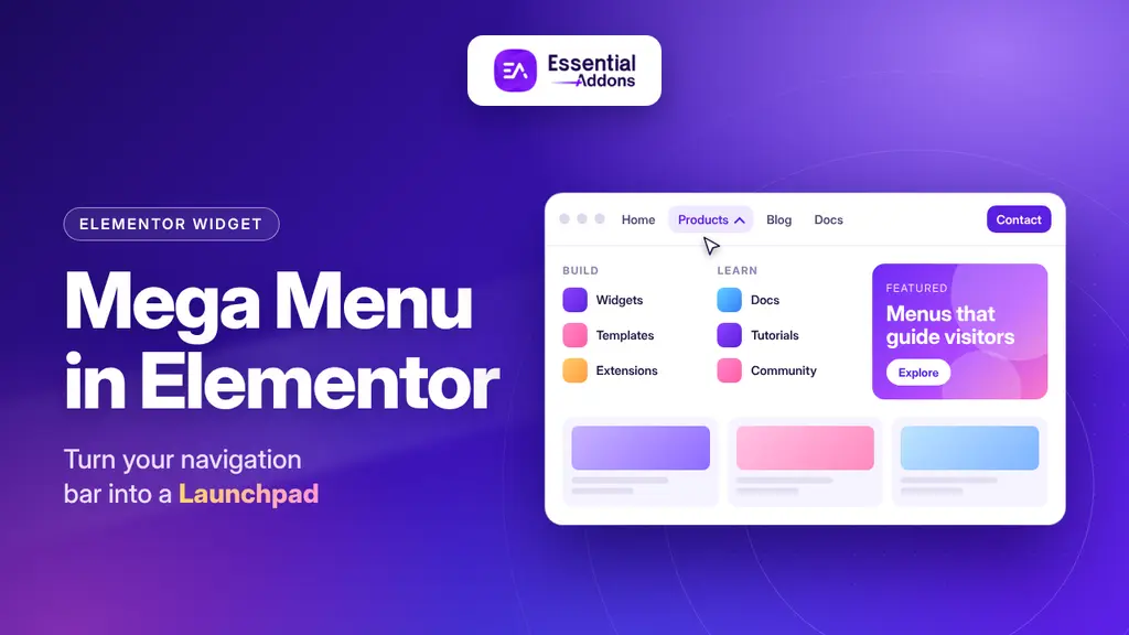
A mega menu answers before the first click, with links, images, and offers all in one dropdown. The Essential Addons Mega Menu widget builds one inside Elementor with no code. You can get it in the Essential Addons plugin on WordPress.org.

Why a Simple Menu Stops Working as a Site Grows
A five-page portfolio can live happily with a simple menu. Growth changes that. A store adds categories, brands, and seasonal collections. A publisher builds a library of guides. A software company needs room for products, solutions, pricing, resources, and support.
At that point, a single-column dropdown becomes a bottleneck. Visitors must open one submenu, scan it, close it, and try the next. Every extra step is a chance to leave.
Good navigation does three jobs. It reveals how the site is organized. It shortens the distance between a question and its answer. And it quietly advertises what matters most right now, whether that is a sale, a new feature, or a popular doc. A standard dropdown handles the first job. A mega menu handles all of these.
That is why we built the Mega Menu widget for stores and content-heavy sites. It puts categories, promotions, and docs links in one glanceable navigation bar.
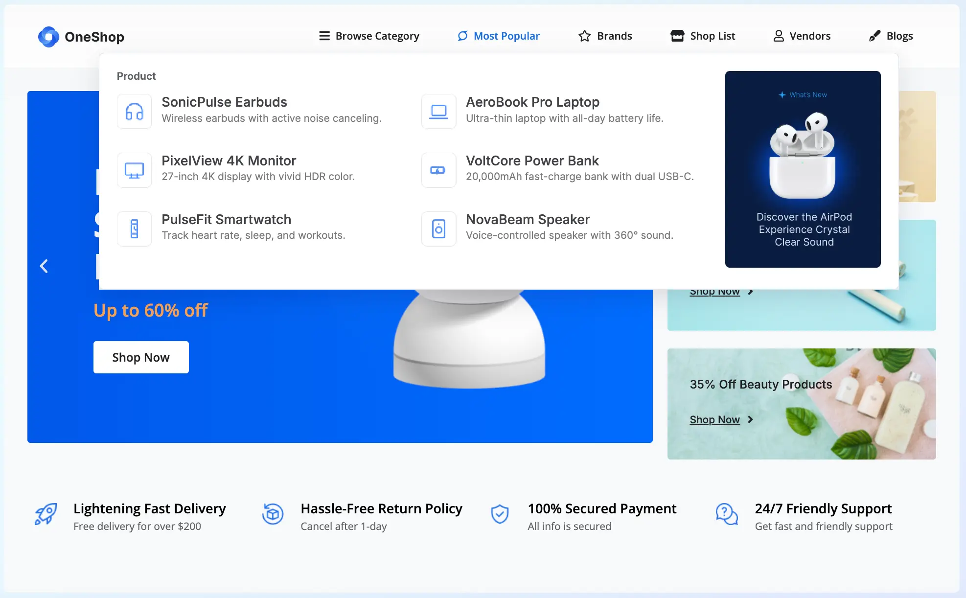
Meet the Essential Addons Mega Menu
Essential Addons for Elementor is a popular WordPress plugin with 120+ Elementor widgets and extensions, used by millions of website creators. Mega Menu is a Content element, sits next to its navigation relatives: Simple Menu, Offcanvas, and Advanced Menu. If you only need a minimalist menu, Simple Menu remains available. When you need a menu that carries real content, Mega Menu is the tool.
Here is the idea: stack columns, drop in images, or pull in a saved template, and build dropdown menus that guide visitors instead of just linking them somewhere. Few thoughts sit behind it.
First, flexibility in how you build. You can design each dropdown right inside its menu item, or plug in a saved Elementor template, and you choose per item.
Second, control over behavior. You decide how submenus open, how long they stay open, and how they animate.
Third, a mobile experience designed on purpose rather than squeezed in at the end. The menu collapses into a clean accordion with its own toggle icon, overlay option, and scrollable dropdown.
Everything happens in the Elementor editor, which matters if you build sites for clients or for yourself. There is no separate menu plugin to learn, no code to maintain, and no handoff between tools.
Four Ways to Fill a Dropdown
Every top-level item in the menu has a Menu Item Type. This single setting is the heart of the widget, because it lets one menu mix simple links and elaborate panels.
Each item also carries a label, a link, an optional icon, and fields for a CSS ID and CSS classes, so you can target it with custom styling when a design calls for it.
Link Only
This option gives you a plain clickable link with no dropdown. Home, Pricing, and Contact usually belong here. Not every item needs a panel, and the best menus know when to stay quiet.
Build Inline
Choose this type and you design a custom dropdown layout directly within the item. It is the fastest route when a panel belongs to one item only. You build it on the spot, see it in context, and avoid managing a separate template.
Saved Template
Here the dropdown pulls in an existing saved Elementor template. This is where agencies and busy teams save hours. Design a promotional block or a category grid once, save it, and reuse it wherever it fits. Because the panel lives in a template, one edit can update every place that uses it. If your toolkit already includes Elementor templates, this type puts them to work in your navigation.
Section CSS ID
The fourth type links the dropdown to a specific section elsewhere on the page, using that section’s CSS ID. It is the least obvious option and a clever one when the content you want to show already exists on the page. If you are new to the idea, read this documentation that explains how to get an Elementor section ID.
Together, these four types cover most navigation scenarios. A single menu could use a plain link for Home, a built-in panel for Products, a saved template for a seasonal sale, and a section link for a long landing page.
Decide How the Menu Behaves
A menu is a small piece of software, and behavior shapes how it feels. The Settings section gives you precise control.
Open Submenu On lets you choose Hover or Click. Hover feels quick on the desktop. Click suits menus with large panels, where an accidental hover could open something the visitor never wanted. Touch devices always use tap, whichever option you pick.
Close Delay sets, in milliseconds, how long a submenu stays open after the cursor leaves. A short delay forgives the wobble of a real mouse movement. Close On Outside Click closes the submenu when a visitor clicks elsewhere, which keeps panels from lingering.

Animation and Animation Duration control the open and close transition, so the motion can match the personality of the site, brisk for a tech brand and gentler for a boutique.
Layout options matter too. Stretch To Full Width fills the parent container, while turning it off lets the menu bar shrink to fit its items. Align Menu offers left, center, space-between, and full justification. The Submenu Indicator setting lets you pick the arrow icon that appears beside items with a dropdown.
None of these choices is dramatic alone. Together they decide whether a menu feels sharp or sluggish.
Mobile Menus That Do Not Feel Like an Afterthought
More and more visitors will see your navigation on a phone, and a wide mega panel cannot simply shrink. The Responsive section handles that.
Set a Breakpoint, the screen width below which the menu collapses behind a toggle button. Below that width, submenus stack as an accordion, which keeps long lists readable.
Customize the Toggle Text, which supports Write with AI, and choose a Toggle Icon and Close Icon to match your brand. Then decide whether to enable Overlay Dropdown. When it is on, the collapsed menu floats over the page instead of pushing content down, a popular pattern on phones.

In the Style tab, the Mobile Dropdown section lets you shape the collapsed menu with background type, border type, border radius, padding, box shadow, and a maximum height. That last control keeps tall menus scrollable inside a tidy box.
The result is one menu that behaves well in two very different environments, with no second menu to maintain.
Style Every Layer without Touching Code
The Style tab follows the structure of the menu from the outside in.
The Menu Bar
Start with the container. Choose a solid color or gradient background, set the border type and radius, add padding, and use Gap Between Items to control the spacing of the whole row. A transparent bar over a hero image feels very different from a solid bar with rounded corners, and both are a few clicks away.
Menu Items
Next, style each link. Adjust typography, padding, and border radius. Then set text color, background color, and border type separately for Normal, Hover, and Active states. Those three states tell visitors where the cursor is and which page they are on. A Divider control adds a separator between items, with its own style, thickness, and color.
Icons and the Submenu Indicator
Icons attached to menu items have their own controls for position, size, spacing, and color states. The submenu indicator, the little arrow, can be resized and spaced, and Rotate When Open flips it when the submenu expands. It is a tiny detail that makes the menu feel alive.
Because every layer is visual, you can match navigation to a brand in minutes. That is why Mega Menu has deep styling controls, and design decisions stay in the designer’s hands.
Start Faster with Presets
Blank canvases are exciting until the deadline arrives. Mega Menu presets give you ready-made layouts to start from, so you edit a finished menu instead of building every panel from scratch. There are few presets for different business websites in the Mega Menu widget: SaaS Menu, Product Suite, Fashion Store, Agency Services, and custom field so that you can create according to your desire.

Pick a preset, apply it, then swap in your own links, images, and text. The result looks designed from the first minute, and you only spend time on the parts that make the menu yours. There are layouts for different kinds of sites, including a SaaS style with a Resources column of helpful links. For a client project, that saves real layout time.
One practical tip: applying a preset replaces a block, so apply it deliberately, ideally before you invest time in custom edits.
Examples for Layouts You Can Build
The Mega Menu page shows the widget across several scenes. Treat them as inspiration for your own website design.
An Online Store
An online store’s menu can combine product cards, promotional banners with discounts, and a row of reassurances such as delivery, returns, secure payment, and support. For a store, the navigation itself becomes a showcase. A shopper sees offers and trust signals before reaching a single product page.
A Software or SaaS Site
A Software or SaaS site can use a category list on one side and linked columns on the other, with cards for Blog, About Us, Contact, and Documentation beneath. Software sites often need to explain several products and audiences at once, and this structure keeps the explanation scannable.
A Fashion or Lifestyle Brand
The FashionFit website menu can pair link columns for new arrivals and styles with popular categories, best-selling products with prices, and a call to action. The menu behaves like a mini storefront.
These are just a few examples. You can explore more on the Mega Menu page and see how the widget fits among the other Essential Addons demos.
Step-by-Step Guide: Set It Up in a Few Clicks
You need Elementor and Essential Addons for Elementor installed and activated. Then follow the path from the Mega Menu documentation:
Step 1: Enable the Mega Menu Widget
Go to Essential Addons → Elements in your WordPress dashboard, search for Mega Menu, toggle it on, and save.

Step 2: Drag And Drop the Mega Menu Widget
Open a page in the Elementor editor, search for Mega Menu in the widget panel, and drag it onto the canvas.

Step 3: Add Your Menu Items
Under the Content tab, open Menu Items and add an item for each navigation entry, such as Home, Products, Blog, Docs, Support, and Contact. Then choose a Menu Item Type for each one: Link Only, Build Inline, Saved Template, or Section CSS ID.

Step 4: Configure the Menu Settings
Open the Settings section to choose hover or click, timing, animation, width, and alignment.

Step 5: Set up Responsive Behavior
Open the Responsive section to set your breakpoint, toggle text, icons, and overlay behavior.

Step 6: Style the Menu Bar
In the Style tab, set the background, border, padding, and the gap between items.

Step 7: Style the Menu Items
Still in the Style tab, style the items, then their icons, the submenu indicator, and the mobile dropdown. Publish when you are happy.

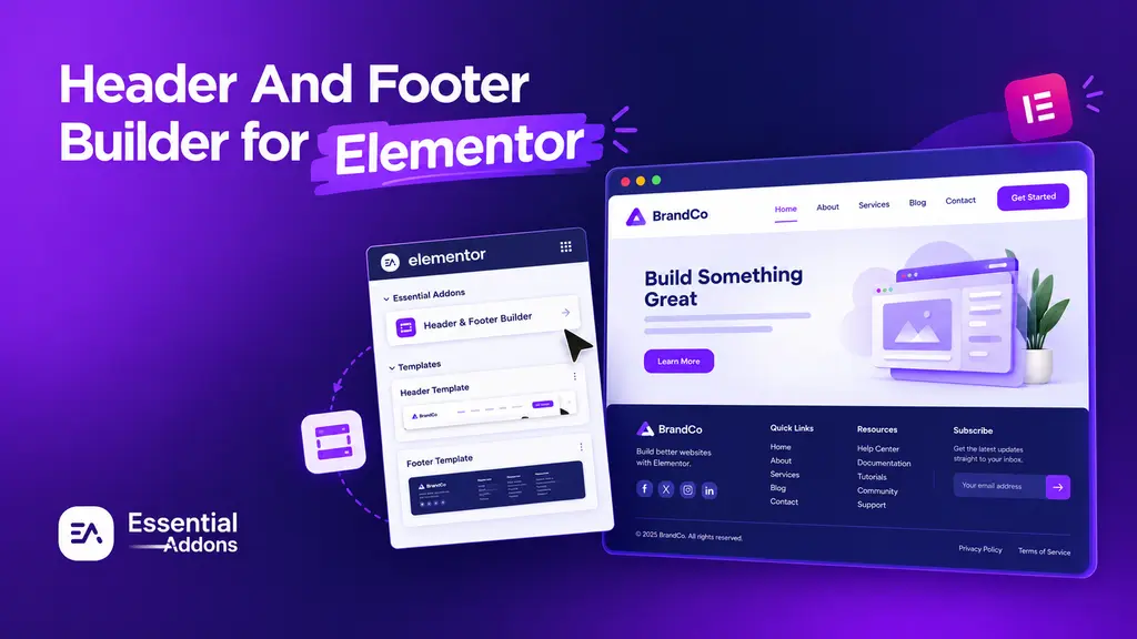
A site-wide menu usually lives in a header. Have a look at the Header & Footer Builder, a free Theme Builder for building custom Elementor headers and footers from presets. Treat them as natural companions when you design a full navigation experience.
Keep Your Navigation Light
A rich menu should not come with a heavy page. Essential Addons gives you the Elements Control panel, where you can enable or disable individual elements so only the widgets you use are loaded. Turn on Mega Menu, turn off what your site does not need, and keep the rest of the plugin quiet. For best results, pair any menu with good hosting, caching, and optimized images.
Give Your Visitors a Better Front Door
Navigation is the first conversation your site has with a visitor. A thin list of links says, “Good luck.” A thoughtful mega menu says, “Here is everything you came for, and a few things you may not have known you needed.”
The Essential Addons Mega Menu brings that second conversation into Elementor without code, extra plugins, or a steep learning curve. Build inline for speed, reuse saved templates for consistency, start from a preset when time is short, and fine-tune every state until the menu feels like part of your brand.
Ready to try it? Read the Mega Menu documentation, grab the plugin and turn your next navigation bar into a helpful guide. If you like this, then subscribe to our blog for more articles. Also, join us on our Facebook community to interact with other Elementor users.
Frequently Asked Questions
Do I Need Elementor Pro to Use the Mega Menu?
No. Essential Addons works with both free Elementor and Elementor Pro, but Elementor itself must be installed and active.
Is the Mega Menu Free?
Yes. Mega Menu is part of the free Essential Addons plugin on WordPress.org. Pro adds further premium widgets and extensions.
Will It Work on Phones and Tablets?
Yes. You set a breakpoint, and below it, the menu collapses behind a toggle with an accordion-style dropdown, with optional overlay behavior and a scrollable panel.
Can I Use Different Dropdown Types in the Same Menu?
Yes. You choose the Menu Item Type for each item. One menu can hold a plain link for Home, an inline panel for Products, a saved template for a sale, and a section link for a long page.
Will the Mega Menu Slow Down My Website?
It should not. Essential Addons’ Elements Control panel lets you turn off the elements you do not use, so only the widgets you need are loaded. Recent updates also lowered memory use on pages with many revisions. For the best speed, pair your menu with good hosting, caching, and optimized images.