
Essential Addons for Elementor’s Mega Menu widget lets you build fully customizable navigation menus, from simple link-based menus to rich, multi-column mega menus with saved templates or section-based dropdowns, directly inside Elementor, without touching code. It is built for stores and content-heavy sites that need to surface categories, promotions, or docs links in one glanceable navigation bar.
Note: Make sure Essential Addons for Elementor is installed and activated on your WordPress Website.
Step 1: Enable the Mega Menu Widget #
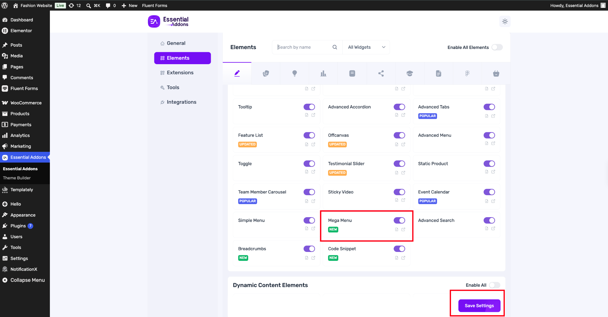
Go to wp-admin → Essential Addons → Elements, search for ‘Mega Menu’, and toggle it on. Click ‘Save Settings’ to confirm.
Step 2: Drag and Drop the Mega Menu Widget #
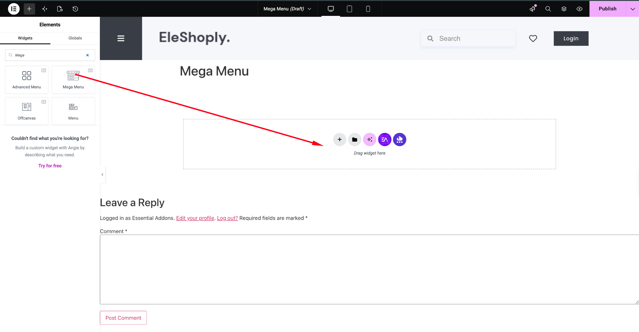
Open the page where you want the navigation menu in Elementor’s editor, search for ‘Mega Menu’ in the widget panel, and drag it onto the canvas.
Step 3: Add Your Menu Items #
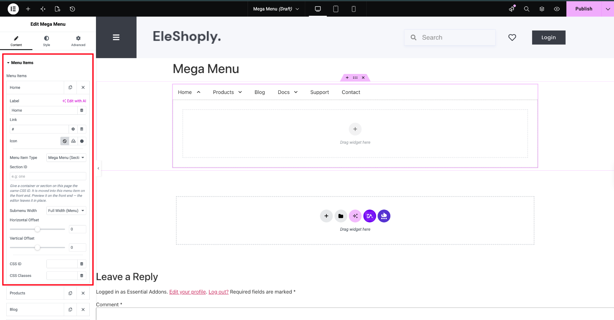
Under the Content tab, expand ‘Menu Items’ and click ‘Add Menu Item’ to create each navigation entry (e.g., Home, Products, Blog, Docs, Support, Contact). For each item, configure:
- Label: the text shown in the menu bar
- Link: the destination URL
- Icon: an optional icon shown alongside the label
- CSS ID / CSS Classes: for custom styling or targeting
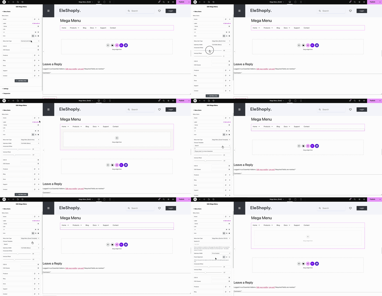
Here, in the menu items you can also choose specific layouts to add more elements and items right inside your menu bar.
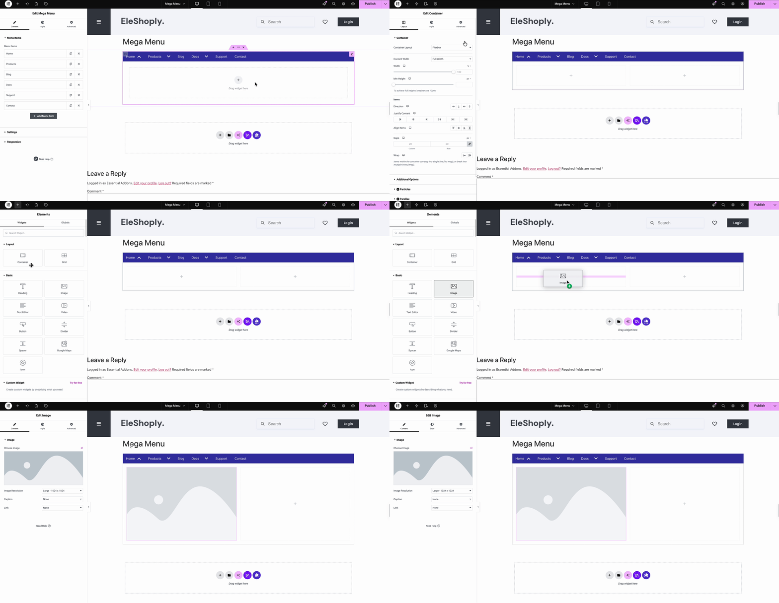
Step 3.1: Choose a Menu Item Type #
For each menu item, set the ‘Menu Item Type’ to control how it behaves:
- Link Only: a simple clickable link with no dropdown
- Build Inline: build a custom dropdown layout directly within this item
- Saved Template: pull in an existing saved Elementor template as the dropdown content
- Section CSS ID: link the dropdown to a specific section elsewhere on the page using its CSS ID.
Step 4: Configure Menu Settings #
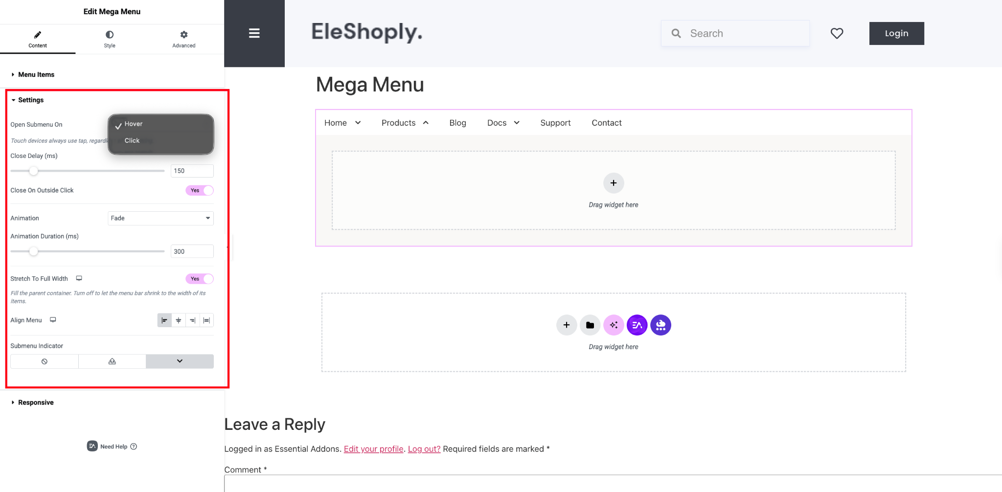
Expand the ‘Settings’ section to control how the menu behaves:
- Open Submenu On: choose Hover or Click (touch devices always use tap regardless of this setting)
- Close Delay (ms): how long a submenu stays open after the cursor leaves
- Close On Outside Click: automatically closes the submenu when clicking elsewhere
- Animation and Animation Duration (ms): controls the submenu’s open/close transition
- Stretch To Full Width: fills the parent container; turn off to let the menu bar shrink to fit its items
- Align Menu: left, center, space-between, or full justify
- Submenu Indicator: choose the dropdown arrow icon shown next to items with a submenu
Step 5: Set Up Responsive Behavior #
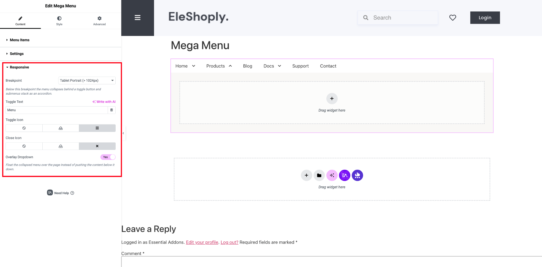
Expand the ‘Responsive’ section to control how the menu collapses on smaller screens:
- Breakpoint: the screen width below which the menu collapses behind a toggle button and submenus stack as an accordion (e.g., Tablet Portrait)
- Toggle Text: label for the mobile menu toggle (supports ‘Write with AI’)
- Toggle Icon and Close Icon: icons shown for opening and closing the mobile menu
- Overlay Dropdown: when enabled, floats the collapsed menu over the page instead of pushing content down
Step 6: Style the Menu Bar #
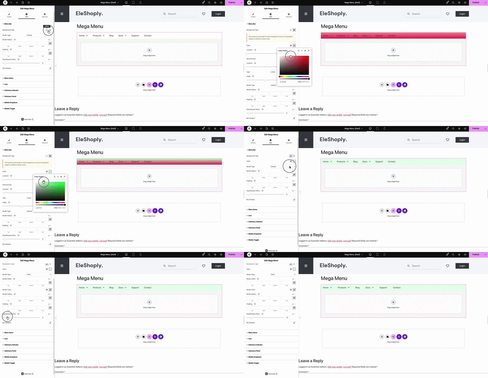
Switch to the ‘Style’ tab and expand ‘Menu Bar’ to style the overall navigation container. You can choose different background type, such as, solid color or gradient. Also select the ‘Border Type’, ‘Border Radius’ and ‘Padding’. You can control spacing between each menut items with ‘Gap Between Items’ navigation.
Step 7: Style Individual Menu Items #
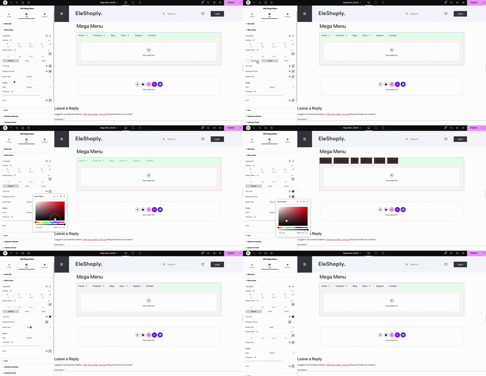
Expand ‘Menu Items’ to style each link. Here you can modify Typography and Paddingm Border Radius. With ‘Normal’, ‘Hover’, ‘Active’ states, set Text Color, Background Color, and Border Type independently for each state. With ‘Divider’, you can style, thickness, and color of the separator between items.
Step 7.1: Style Item Icons #
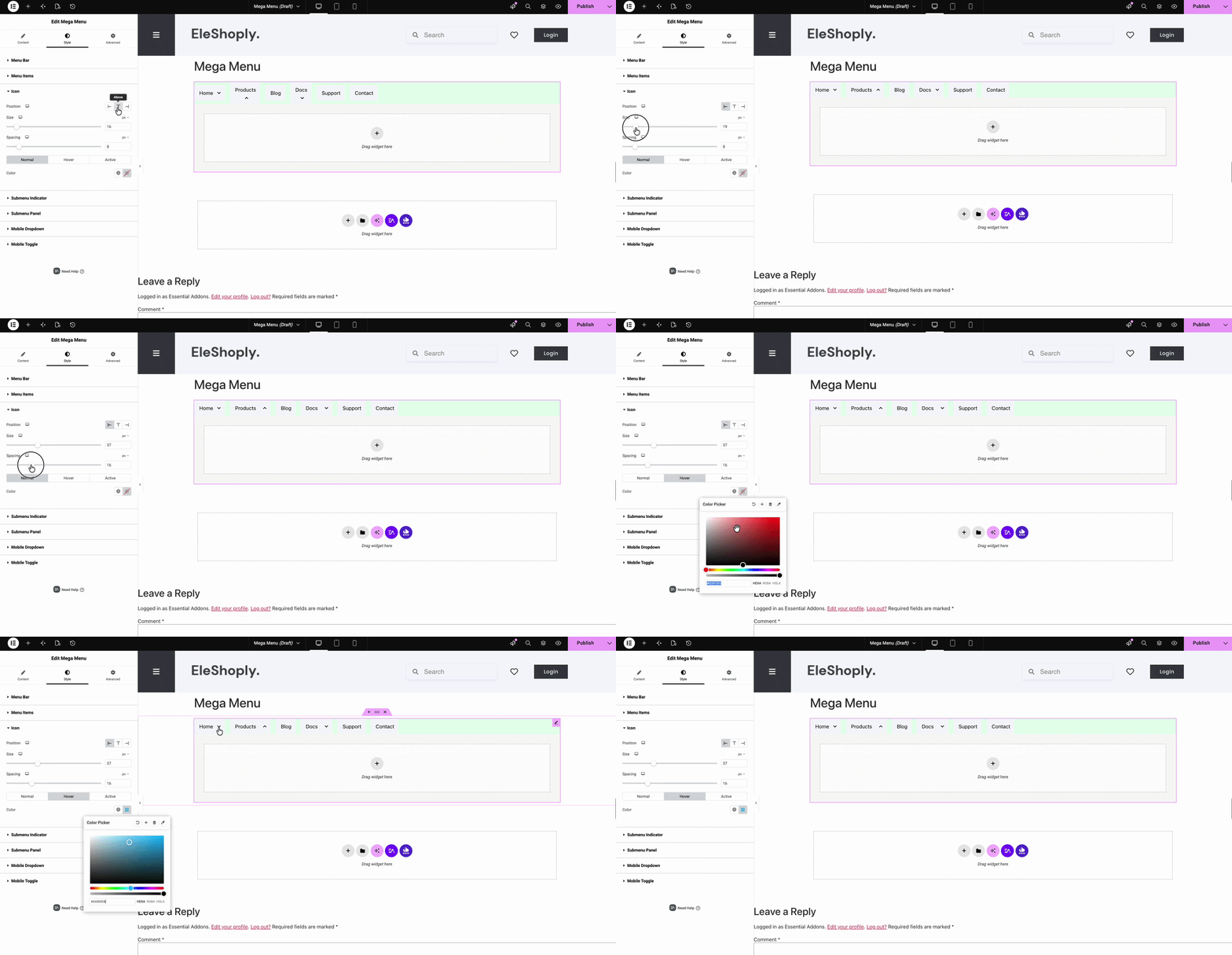
Expand ‘Icon’ to control icons attached to menu items to change the ‘Position’, ‘Size’ and ‘Spacing’, and modify the color states of each icon.
Step 7.2: Style the Submenu Indicator #
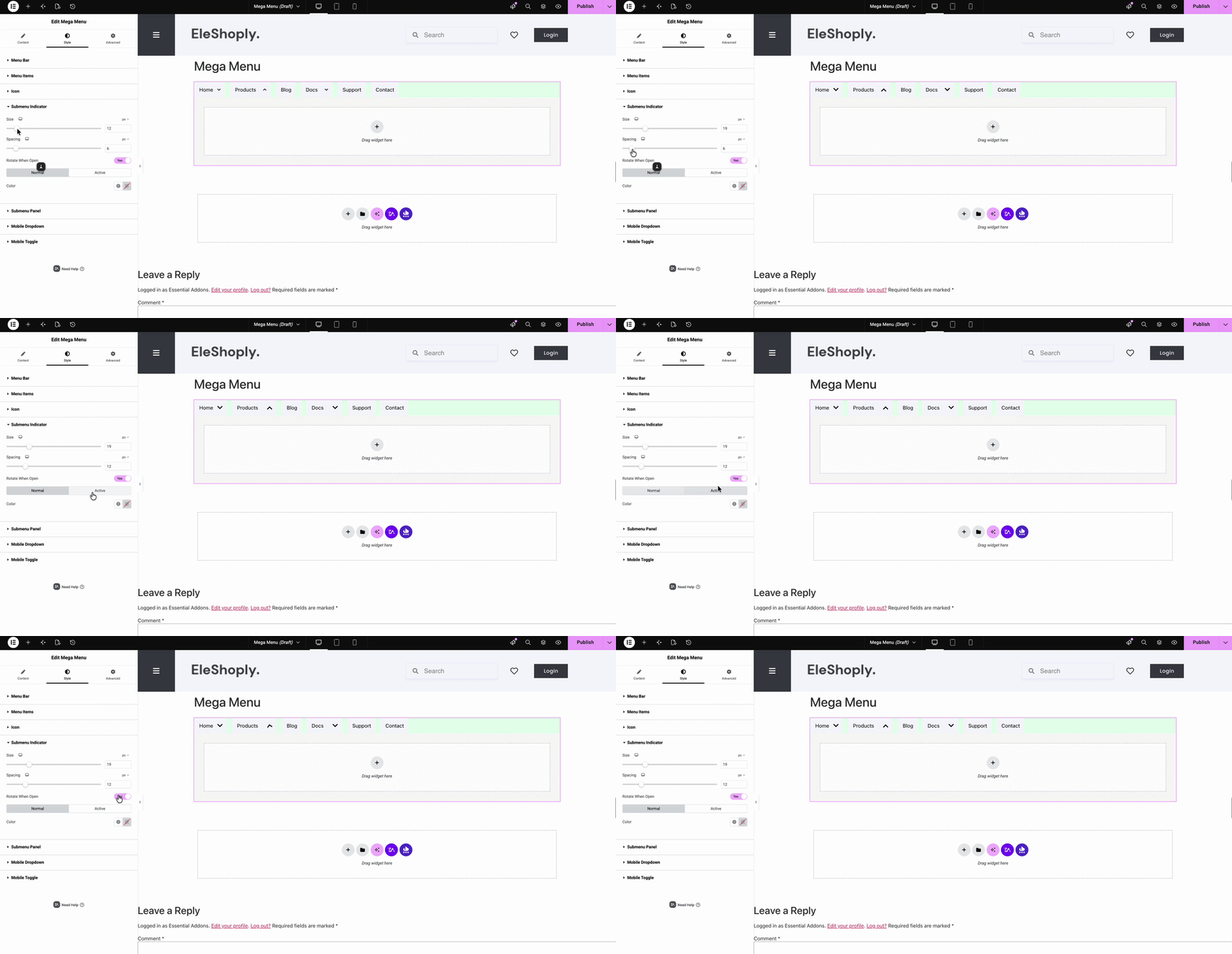
Expand ‘Submenu Indicator’ to style the dropdown arrow. Here you can adjust the Size and Spacing. Flips the indicator when the submenu is expanded by enabling ‘Rotate When Open’
Step 7.3: Style the Mobile Dropdown #
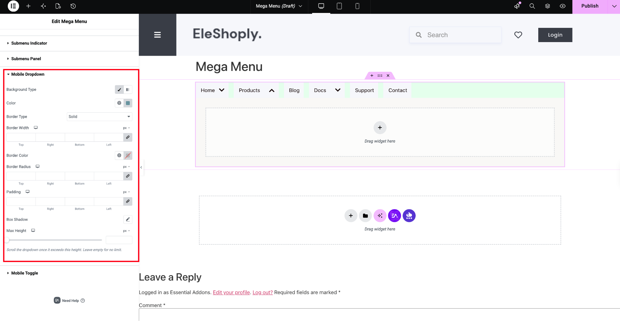
Expand ‘Mobile Dropdown’ to style the collapsed accordion menu shown below your breakpoint. Here you can choose ‘Background Type’, ‘Border Type’, ‘Border Radius’, ‘Padding’, ‘Box Shadow’ and select the ‘Max Height’ for responsiveness.
Final Outcome #
Publish the page, and you’ll have a fully responsive Mega Menu, complete with dropdowns, icons, and a mobile-friendly toggle, live on your site.
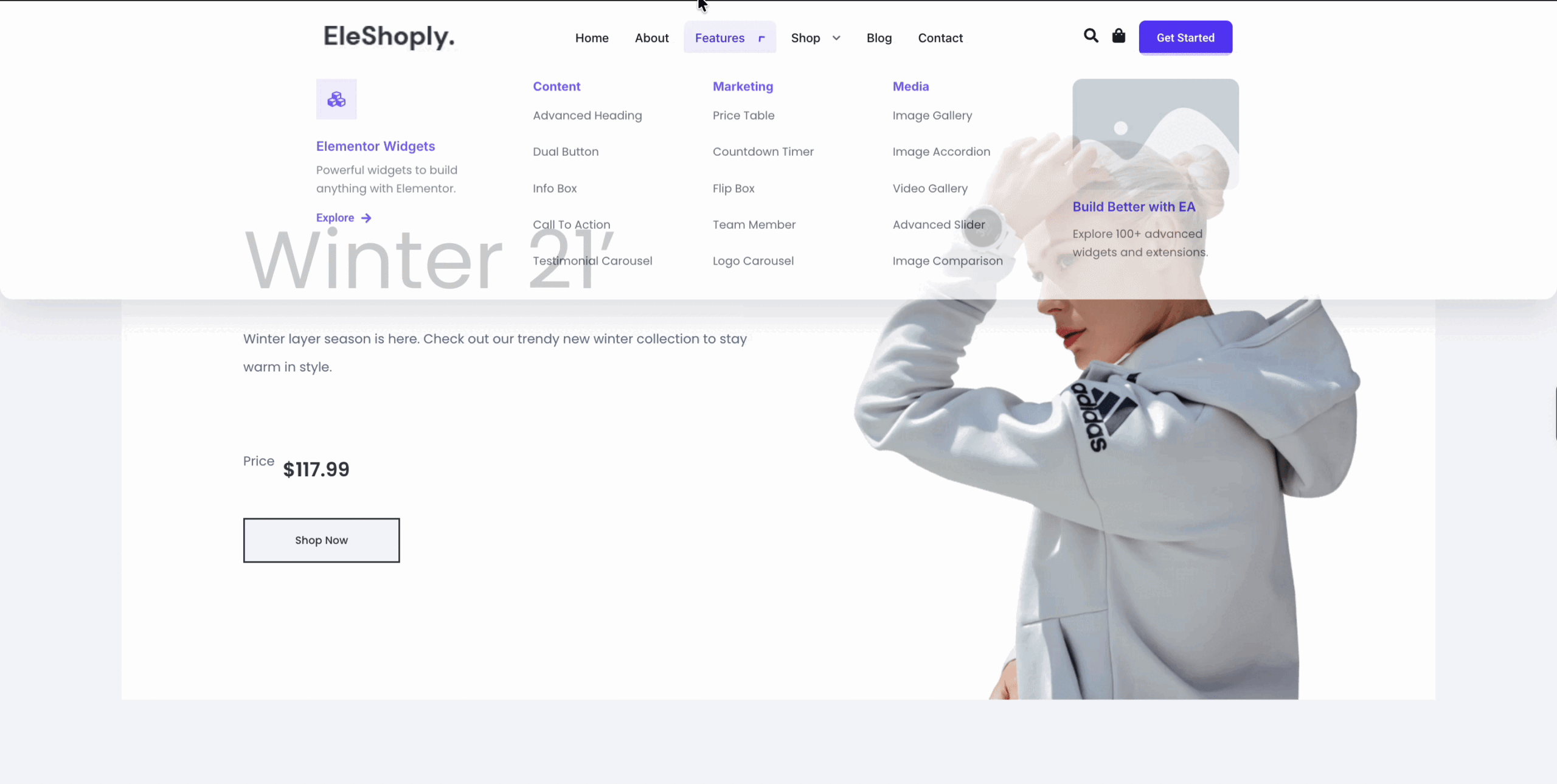
This is how, with the help of Essential Addons for Elementor’s Mega Menu widget, you can build a custom, responsive navigation menu without writing a single line of code.
Getting Stuck? Feel free to contact our Dedicated Support Team.