The EA Fancy Chart is excellent for visualizing important data with interactive charts and graphs on your website. This premium widget from Essential Addons can make your datasets appear lively and easy to understand for your website visitors. So, you can highlight data with dynamic, fancy charts in Elementor without any coding.
Follow this step-by-step guide to add data charts to your website using the EA Fancy Chart Widget in Elementor.
Note: The EA Fancy Chart is a premium widget from Essential Addons. So before you start, make sure that both the Free and PRO versions of Essential Addons are installed and activated on your website.
How To Configure EA Fancy Chart In Elementor? #
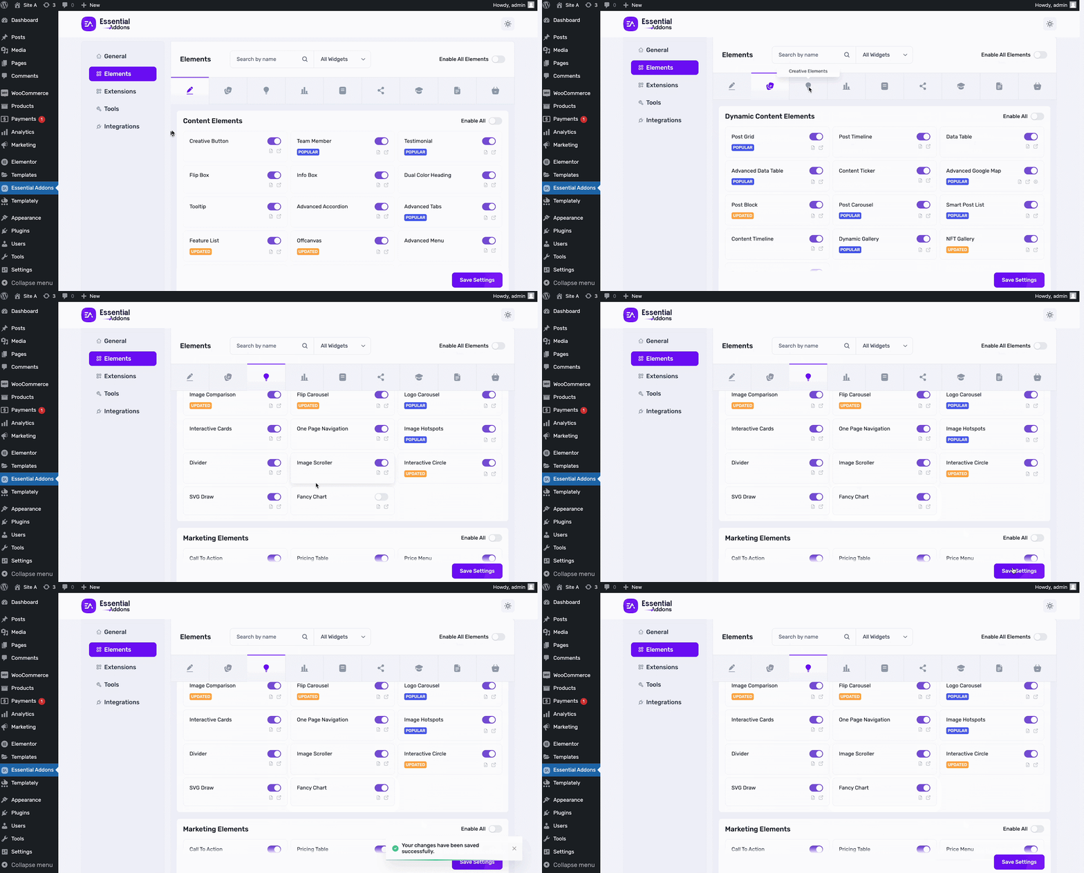
First, from your WordPress dashboard, go to the Essential Addons and move to the ‘Elements’ tab. Now, go to the ‘Creative Elements’ section, find the ‘Fancy Chart’ widget, and toggle to enable it. Then, click on the ‘Save Settings’ button.
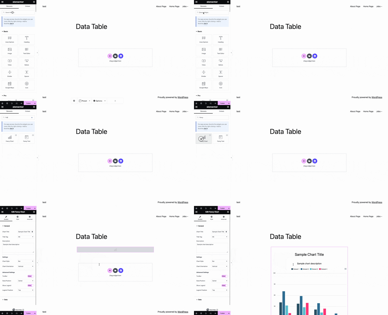
Now, open the page where you want to insert your data chart. Then, search ‘EA Fancy Chart’ in the Widget’s search panel. Simply drag & drop the widget where needed.
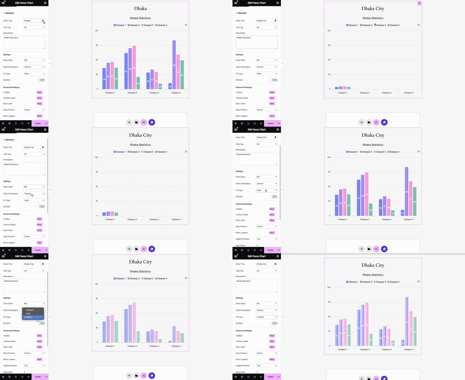
From the ‘Content’ tab under the ‘General’ section in the Widget customizer side panel, add the ‘Chart Title’ and ‘Chart Description’. After that, choose ‘Chart Style’, and ‘Chart Orientation’ ‘Fill Type’ from the ‘Settings’ section. Plus, you can display your data in a stacked format by simply turning on ‘Stacked’ toggle option.
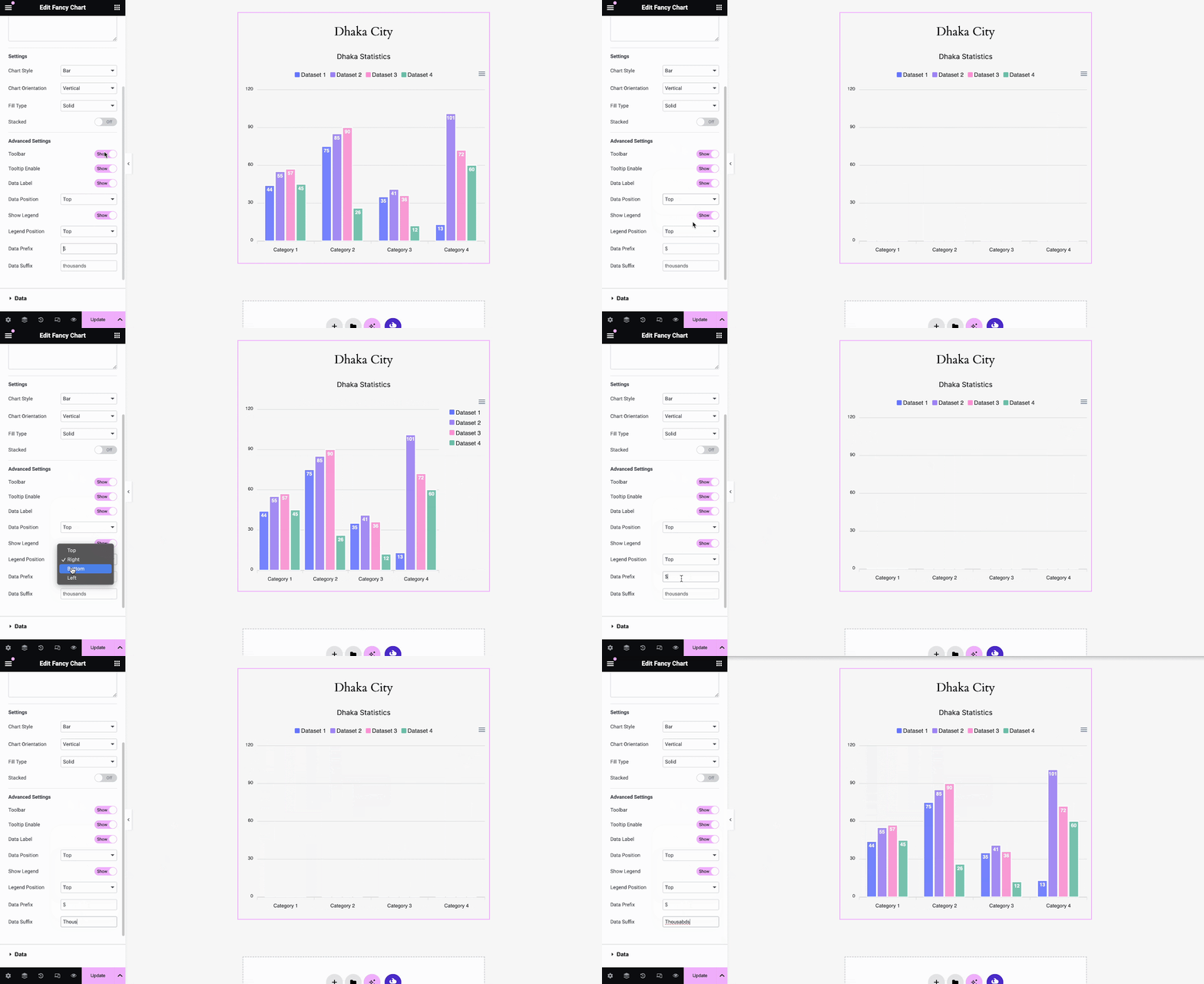
In the ‘Advanced Settings’ section, you will have options to show/hide the Toolbar, adjust Data Position, Legend Position, Data Prefix, Suffix, etc.
From the ‘Data’ section, choose the ‘Data Source’. By default, the ‘Static’ option will be selected with which you have to insert your chart data manually. You can also insert your chart data from CSV, JSON, or any Google Sheets and modify them as you want.
To insert your chart data from a CSV file, choose the ‘CSV’ option from the drop-down and click on the ‘Upload’ option. Now, select the CSV file that you want to upload as shown.
Note: To find the suitable format for populating the Fancy Chart datasets with external CSV files, check out this documentation first.
Similarly, to insert your chart data from a JSON file, choose the ‘JSON’ option from the drop-down and click on the ‘Upload’ option. Now, select the JSON file that you want to upload as shown.
Note: To find the suitable format for populating the Fancy Chart datasets with external JSON files, please check out this documentation first.
If you want to insert your chart data from Google Sheets, choose the ‘ Google Sheets’ option from the drop-down and provide the ‘API Key’, ‘Sheet ID’, and ‘Sheet Name / Range’ there.
Note: By default, the default Google Sheets value is ‘Sheet1’. If your sheet name is different, you need to put that name on the ‘Sheet Name / Range’ field. If you want to insert a specific range of data, input the named range in this field. Please check out this documentation to learn how to collect your API key & sheet ID for Google Sheets.
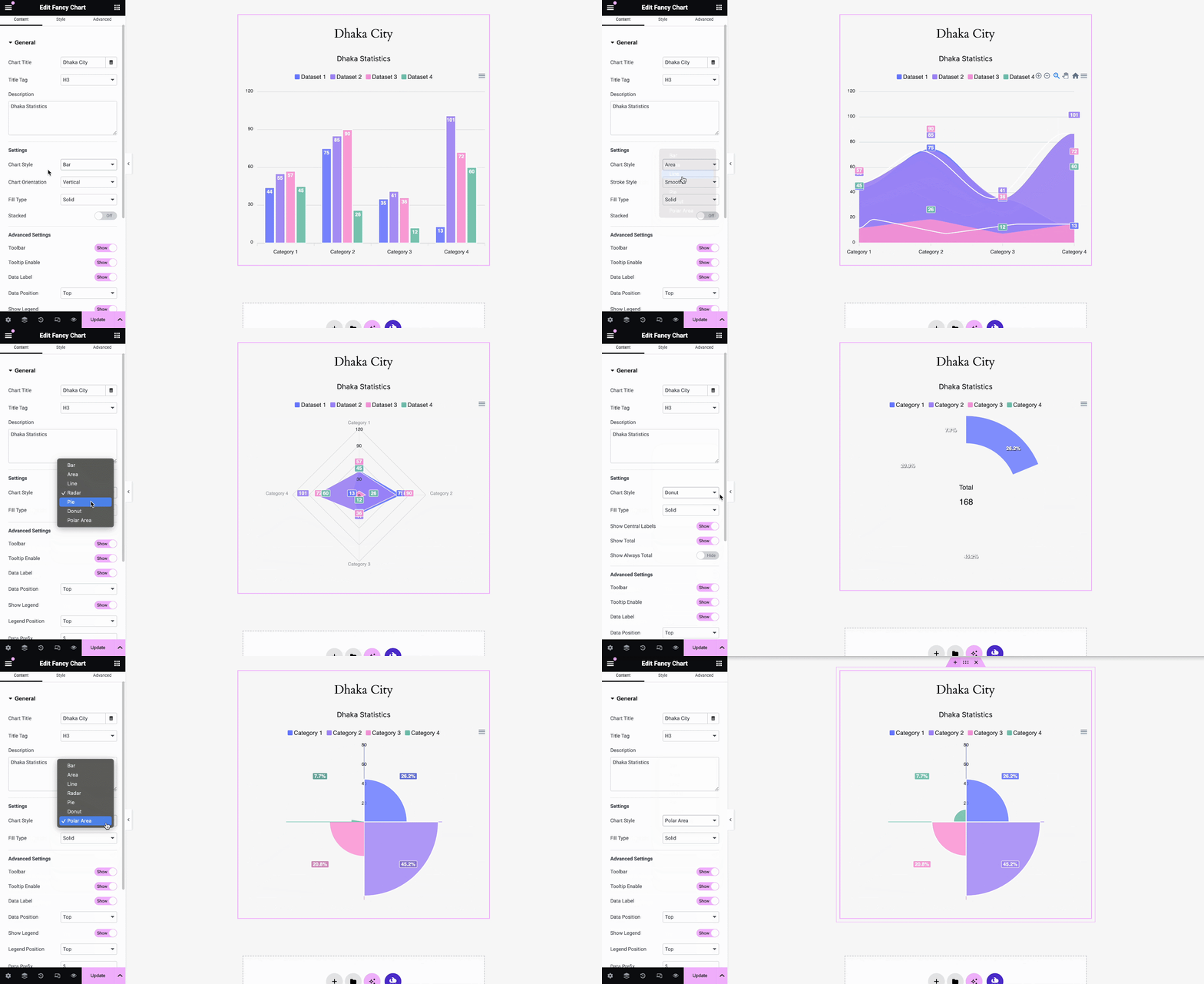
Now, go to the ‘Settings’ option and then set your chart types and other options as you need. Essential Addons Fancy Chart Widget comes with 7 stunning chart types for your data sets which are: Bar Chart, Area Chart, Line Chart, Radar Chart, Pie Chart, Donut Chart, Polar Area.
For the ‘Line Chart’, and ‘Area Chart’ you will get options to choose a different line shape. You can select ‘Smooth’, ‘Straight’, or ‘Stepline’ from the ‘Line Shape’ option as per your preference.
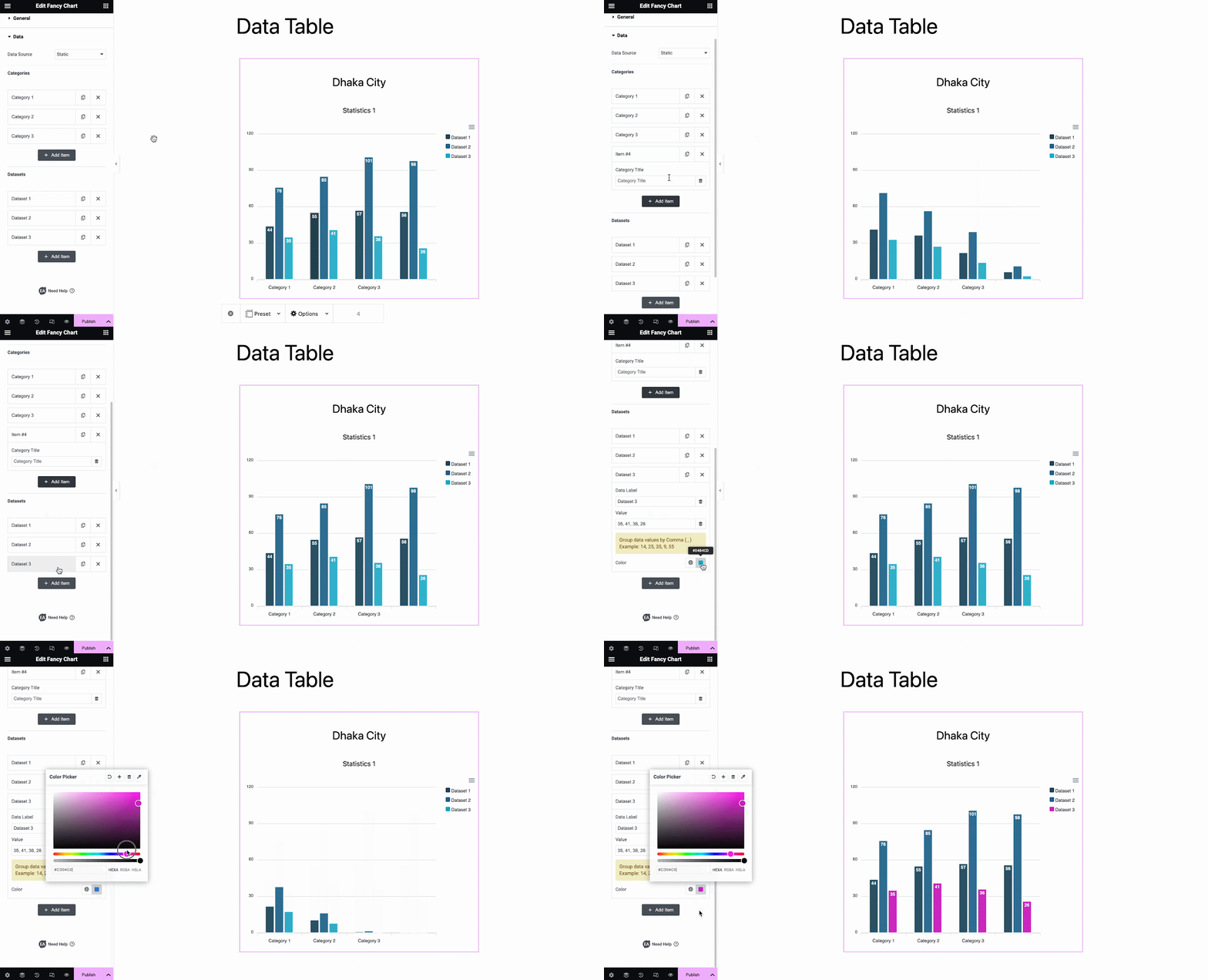
Now, from the ‘Categories’ section, choose how many categories you want to display in your chart. You can move, delete, or add any category from there. Also, add the category name from the ‘Content’ option, which will appear after clicking on any category.
From the ‘Datasets’ option, choose how many datasets you want to display in your chart. You can move, delete, or add any datasets from there. Also, add the dataset name and color from the ‘Dataset Color’ that will appear after clicking on any dataset. You can also add or modify the numbers of your dataset from there.
How To Style The EA Fancy Chart? #
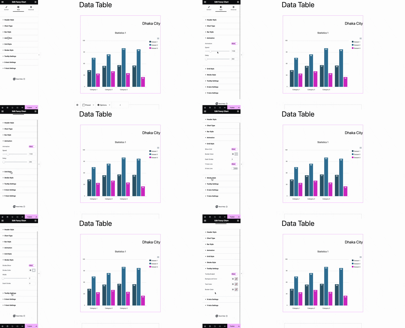
From the ‘Style’ tab you will find the options to customize your data chart appearance. From the ‘Header Style’, change the alignment, text color, typography, etc. From the ‘Chart Type’ section, adjust the background color, height, width, etc. From ‘Bar Style’, change the ‘Bar Width’ as required.
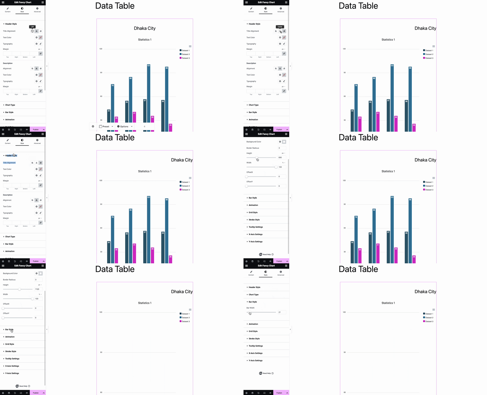
There are multiple styling options available in the ‘Style’ tab. You can play around with the versatile customization options to get the desired outlook of the chart.
From the ‘Advanced’ tab you can control this Widget and make more changes. Go to the ‘Advanced’ tab and adjust the ‘Margin & Padding’ for your Fancy Chart Widget.
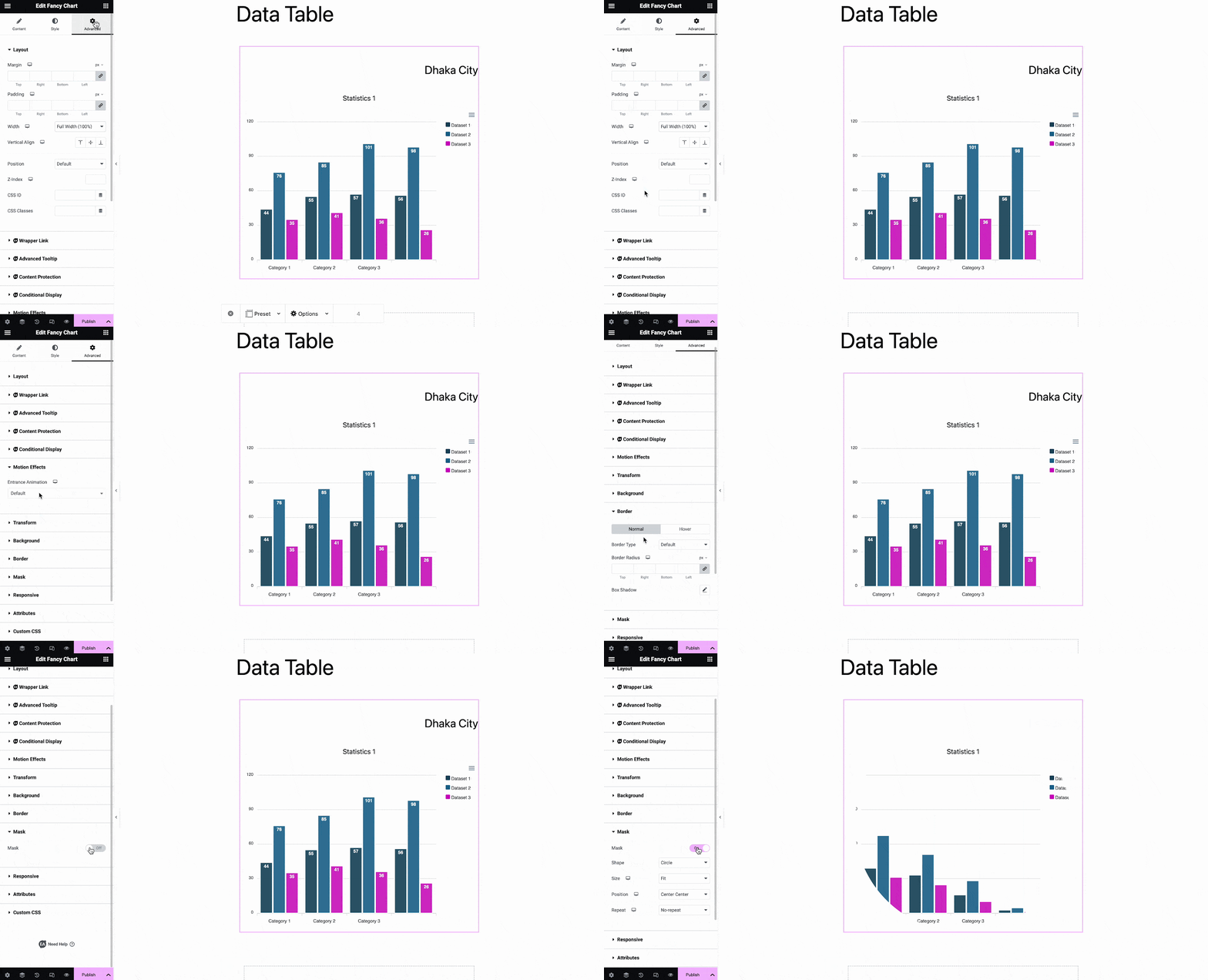
You will have an array of exclusive customization features in the advanced tab. Make the changes as needed. If you want to add any additional Custom CSS codes to the Fancy Chart Widget, just add them from the ‘Custom CSS’ codes option.
Final Outcome #
After making all the changes, hit the ‘Publish’ button to add a Fancy Chart to your website. Check out how the ‘EA Fancy Chart’ will appear on your WordPress website.
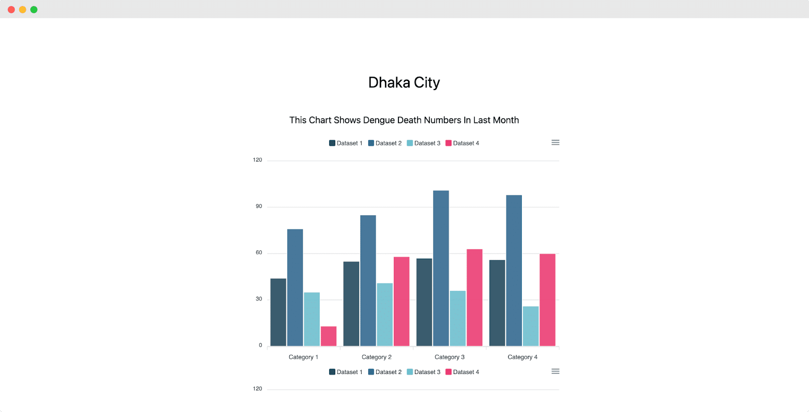
This is how to add an EA Fancy Chart widget to Elementor easily. Still, getting stuck? Feel free to contact our support for further assistance.


