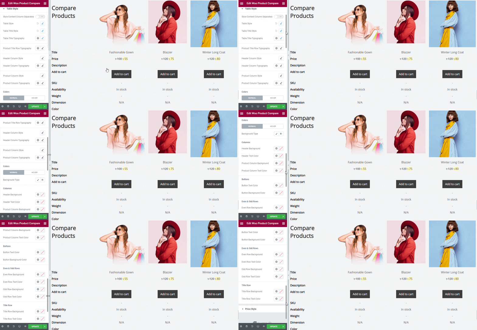
EA Woo Product Compare lets you easily pick and compare any WooCommerce products anywhere your page with plenty of styling options. It comes with amazing ready theme layouts to make your product compare section interactive on your website. Let’s check out the step by step guidelines below to configure and style EA Woo Product Compare:
How To Activate EA Woo Product Compare #
Before you begin, make sure that you have the ‘WooCommerce‘ Plugin activated.
To use this Essential Addons element, find the ‘EA Woo Product Compare’ element from the Search option under the ‘ELEMENTS’ tab. Simply just Drag & Drop the ‘EA Woo Product Compare’ into the ‘Drag widget here‘ or the ‘+’ section.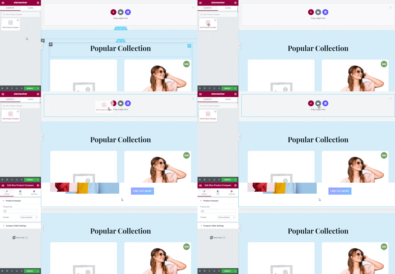
How To Configure The Content Settings #
After you have completed adding the EA Woo Product Compare in your Elementor Editor, now all you need to do is to configure the ‘Content’ tab. It consists of ‘Product Compare’, & ‘Compare Table Settings’ options. 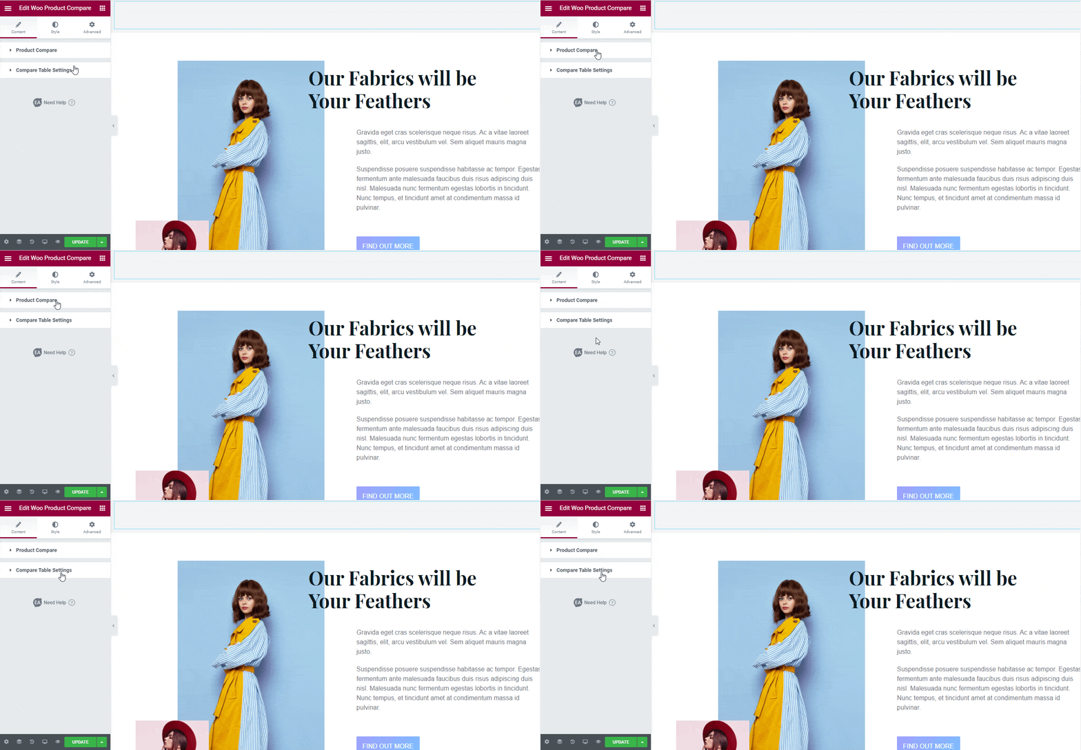
Product Compare #
From the ‘Products’ option, you can add as many WooCommerce products as you want to add to your Woo Product Compare. Just add 3 or more characters of your product name, it will then automatically fetch and display your desired product. You have to check & add it in the ‘Products’ search panel.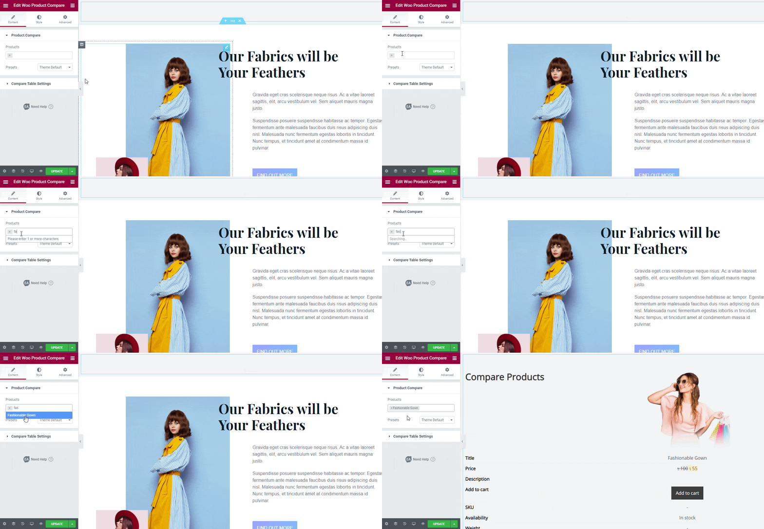
If you want, you can change the default theme layout of EA Woo Product Compare from the ‘Presets’ section. It comes with six separate ready theme layouts. From the ‘Presets’ drop-down menu, Theme 3 & Theme 4 come up with the options highlight specific products. 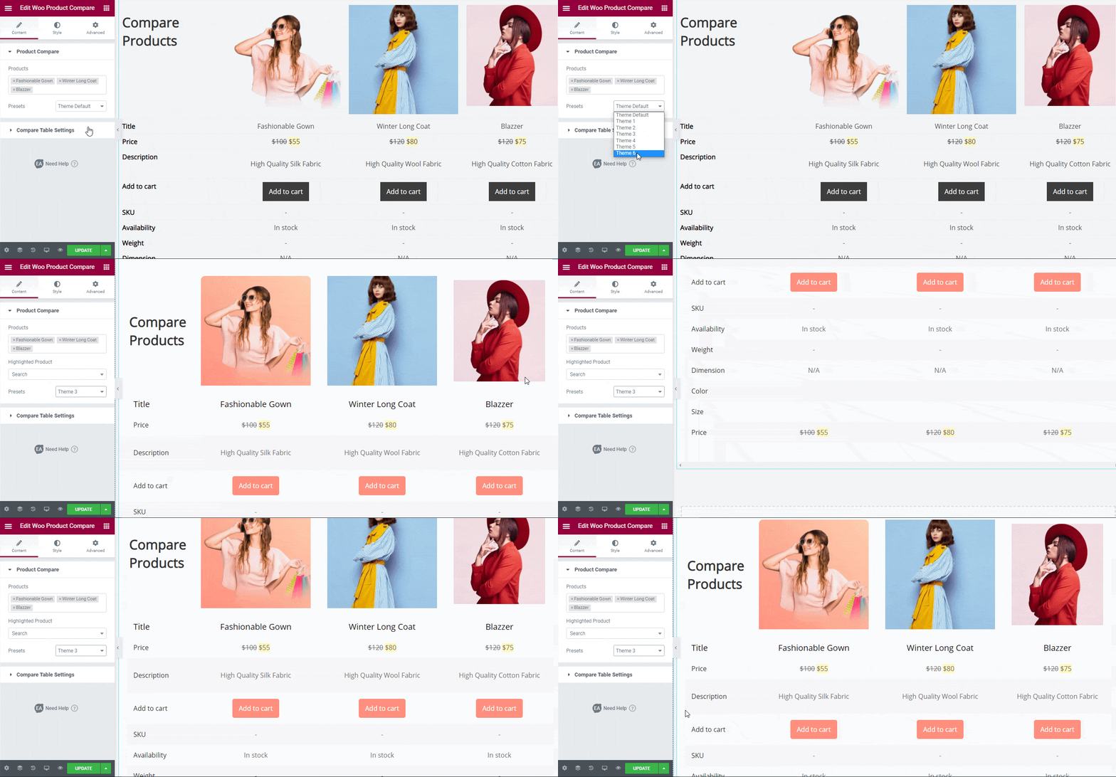
Compare Table Settings #
From ‘Compare Table Settings’ section, you can change the Table Title, and Table Title HTML Tags. 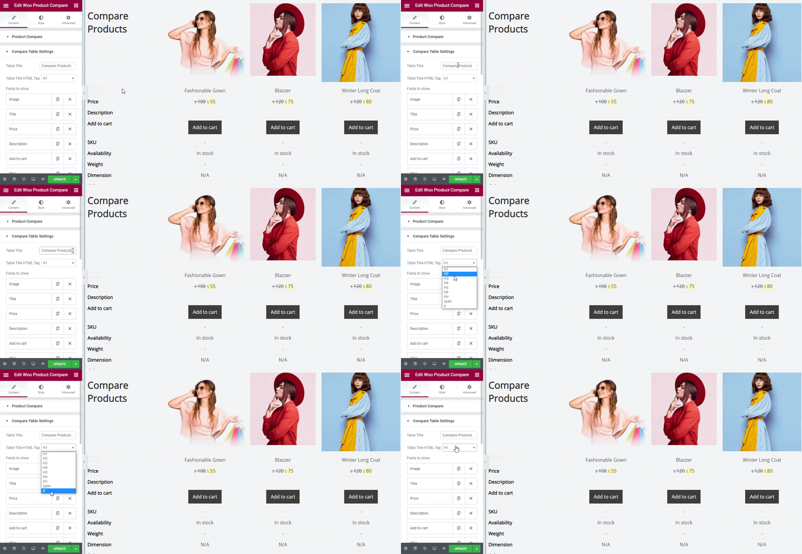
‘Fields to show’ offers options such as Image, Title, Price, Description, Add to Cart, SKU, Availability, Weight, Dimension, Color, and Size. You can decide and configure which field you want to show in your EA Woo Product Compare. 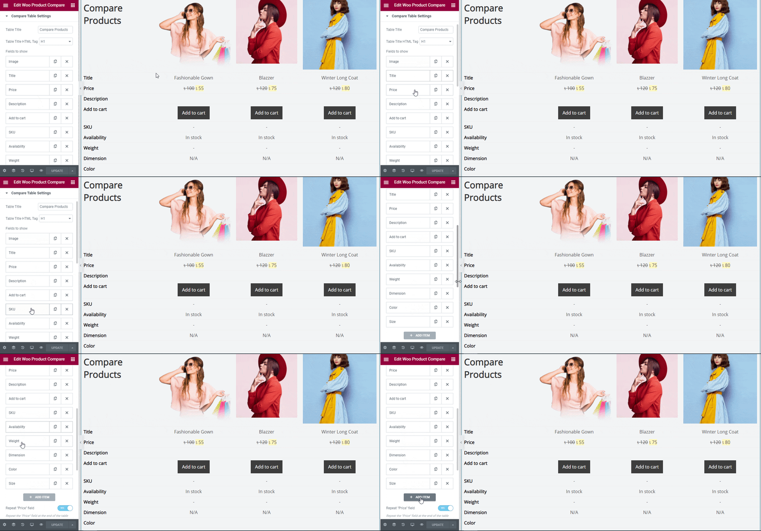
Each of the ‘Fields to Show’ section consists of two options: ‘Types’ & ‘Label’. For example, from ‘Image’ field section you can choose the types to image, title, or pick other options and change the Label title anytime. If you want to add more fields, you can do that easily by using the ‘Add Item’ tab. 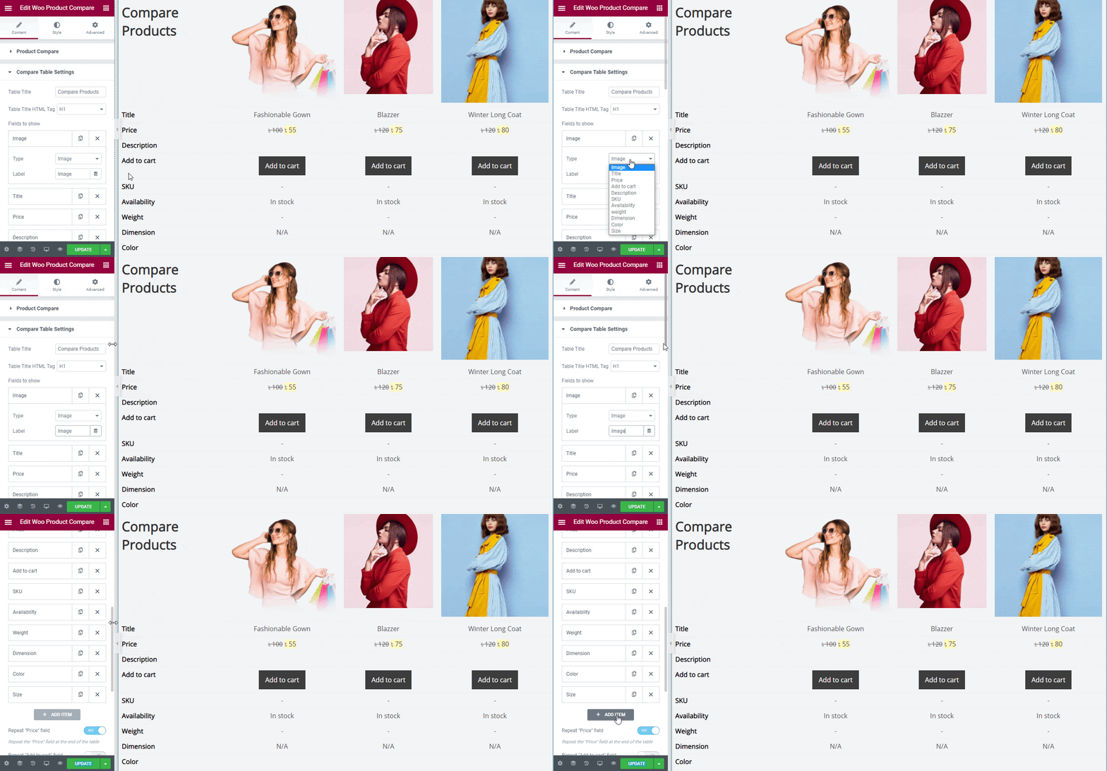
You can even repeat fields like “Price”, and “Add to cart”. Also if you want, you can link your product images by configuring Make Product Image Linkable options and add your preferred field icon.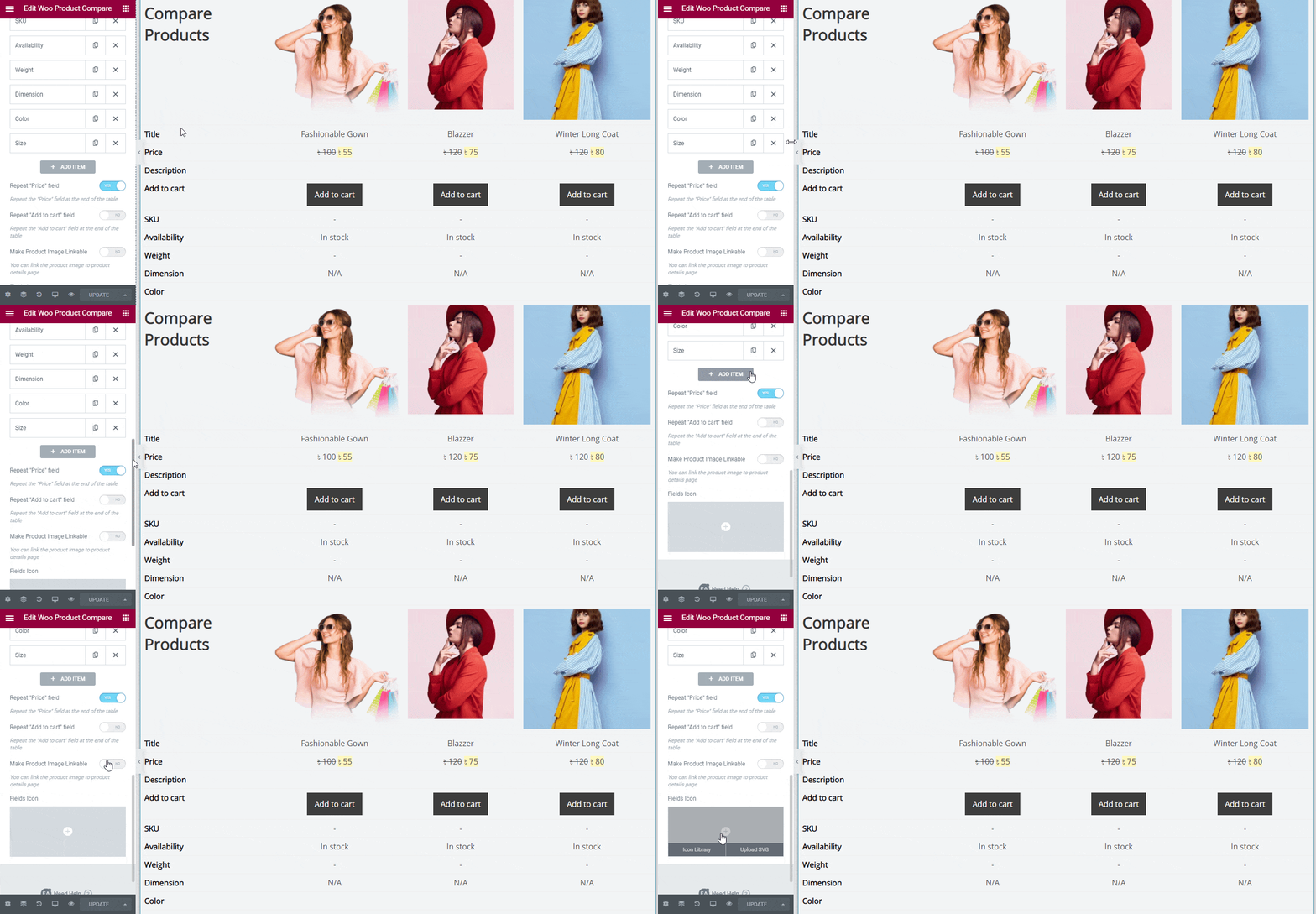
How to Style EA Woo Product Compare #
Switch to the ‘Style’ tab to style all the features of EA Woo Product Compare.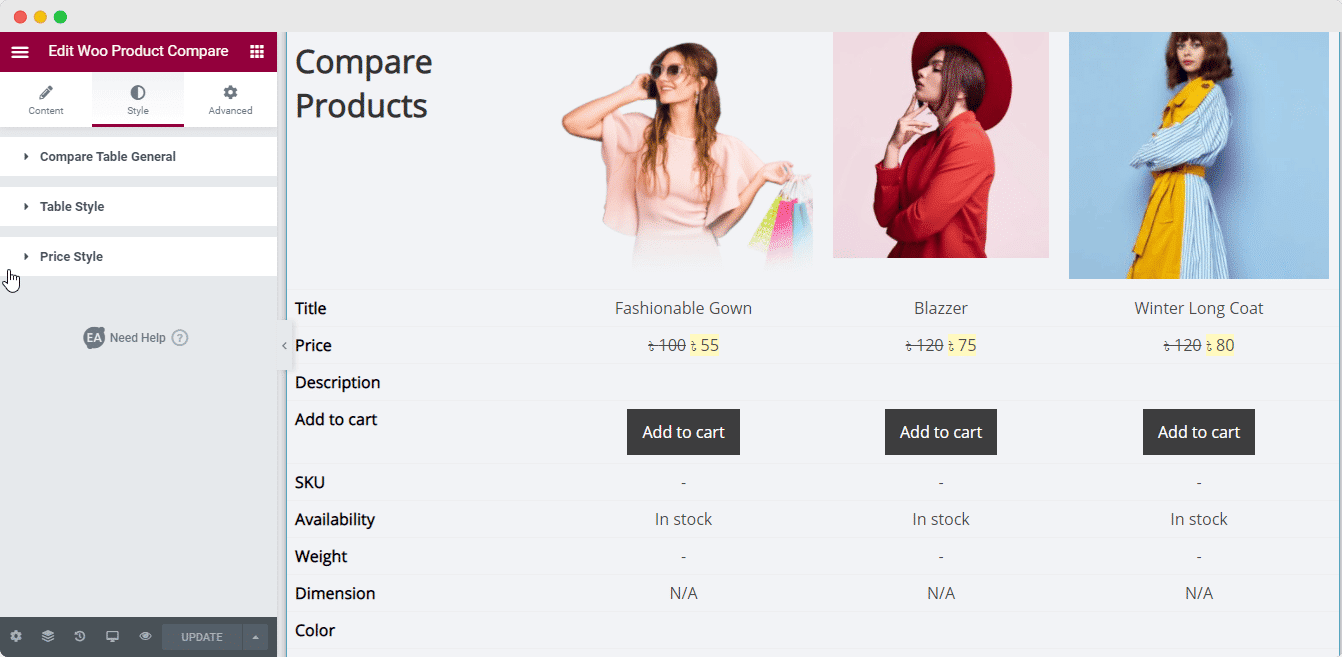
Compare Table General #
From the ‘Compare Table General’ section, you can set the width, margin, padding, border type, and border radius.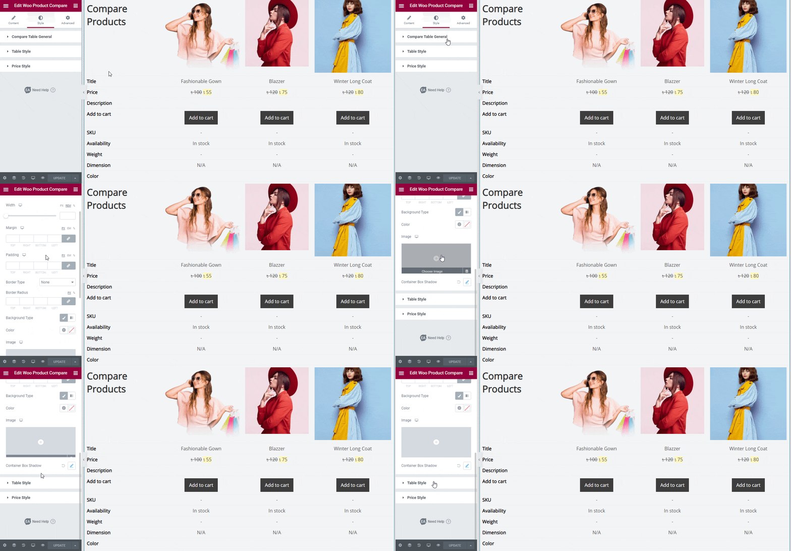
Besides, you can configure ‘Background Type’ in both actions ‘Classic’ & ‘Gradient’, and set your ‘Container Box Shadow’ to change the outlook of your product compare table layout, and style it as per your preference.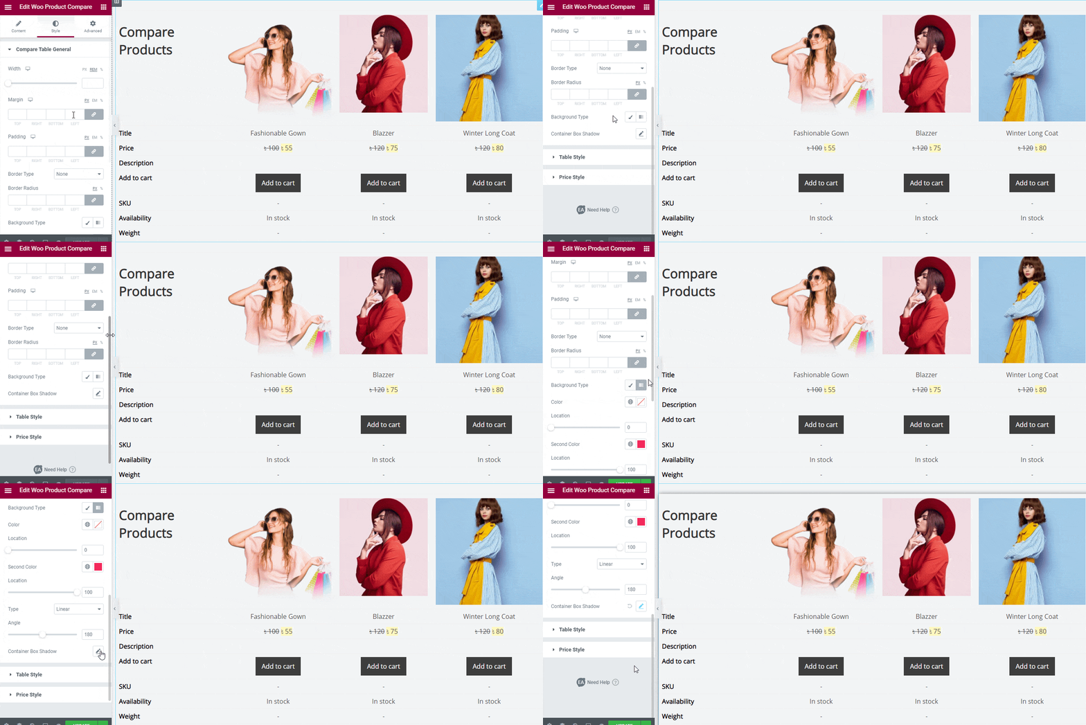
Others #
From the ‘Table Style’ section, you can enable or disable the ‘Style Content Column Separately’. If you go with the default ‘Style Content Column Separately’ section, all of the changes you will make, will be considered for the whole table layout style, product titles, headers, colors, columns, buttons, even & odd rows, title rows, and more. 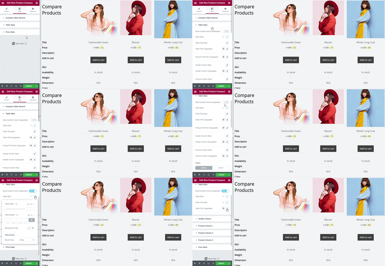
On the other hand, if you enable ‘Style Content Column Separately’, you can separately set your Table Style, Header Column, and more.
For the purpose of this documentation, we have added three products here, so it comes with three separate options ‘Product Column 1’, ‘Product Column 2’, & ‘Product Column 3’.
Besides, you can set your ‘Price Style’ section of your EA Woo Product Compare by configuring the ‘Normal Price Style’ & ‘Sales Price Style’ to make your pricing appealing the way you want. 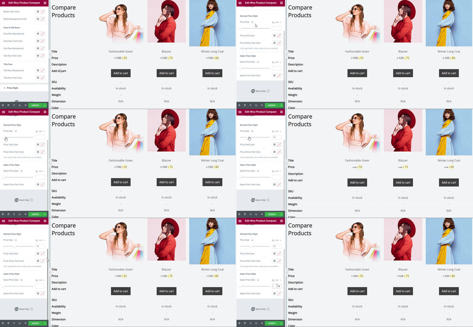
Final Outcome #
By following the basic steps and a bit more modifying, you can style your EA Woo Product Compare as per your preference.
This is how you can simply showcase your WooCommerce Products comparison in a beautiful table layout for your eCommerce website by using EA Woo Product Compare.
Getting stuck? Feel to Contact Our Support for further assistance.
